Auteur/autrice : Jean-Claude

  • Sabine Buchmann

    Sabine Buchmann
    artiste peintre
    162, rue Docteur Elie Lambotte
    1030 Bruxelles
    Belgique
    +32-473-733970
    Buchmann.sabine@gmail.com
    www.sabinebuchmann.com

    Aperçu de mon travail artistique

    Langage de la peinture

    À L’image d’un temps sans peur

    Biographie

    Extrait des expositions individuelles et collectives précédentes

    Informations supplémentaires et projets actuels


    Bruxelles, Octobre 2024

    Sabine Buchmann
    artiste peintre

    Aux estampes de Sabine Buchmann

    Il pleut, il neige le pictural
    En stries floconneuses
    Défiant la verticalité des béances
    Il bruine, il brume le rythmé
    Des miroirs en camaïeu
    Qui sertissent la fenêtre
    Fenêtre – l’Ouvert
    D’où ruisselle, d’où s’étoile
    En sillons, en amers
    La multitude des nuances
    Et les failles, ces traverses – frontières,
    Qui divisent et concilient
    L’espace du mouvement
    Affirmant le repos

    Jean-Claude Marcadé

    De l’image, du concret : Sabine Buchmann

    Texture, tissu, entrelacs la font jaillir
    Des fontaines de la polychromie.
    Sabine Buchmann connaît l’alchimie du pictural,
    La vie cachée des rythmes,
    L’irisation de ce monde.
    Ces espaces qui s’évanouissent,
    Dans lesquels la pensée
    La mémoire se perd en se précipitant,
    Elle donne des hachures et du relief,
    De sorte que sont bannies
    Les plus anciennes de toutes les peurs
    Et le signe, l’image,
    L’icône
    Apparaît suspendue
    Aux frontières de l’invisible.

    Jean-Claude Marcadé


    « Constellation », vinyle, sable, pigments sur toile, 150 x 200 cm, 2022


    À L’image d’un temps sans peur

    Dans les moyens simples de la peinture, il y a une ouverture qui m’émeut. Les moyens pointent vers eux-mêmes et sont plus qu’eux-mêmes dans leur être-là déterminé.

    L’ouverture est « l’espace vide » de la sensation, de l’intuition et du rêve. Thème de l’homme, sa liberté et sa possibilité de non-violence. Sensation dans tous les êtres humains. La vie et l’art sont dans une tension constante.

    L’ouverture de la couleur elle-même et son interaction est sans retenue, sans pouvoir ni but et m’émeut. Les propriétés de la matière colorée, dans ses variations liquide, pâteuse, transparente, pulvérisée et les variations des coups de pinceau, des points, des taches, des éclaboussures de peinture, des lignes, de la peinture liquéfiée, du sable et des pigments, des couleurs et des formes entre elles – tenues comme par hasard – sont ce qui est concrètement visible dans mes tableaux.

    Dans mes tableaux naissent des formes sans objet, des rythmes de couleur, de sable – de transparence et de peinture. Une présence de la plénitude du langage de la peinture.

    De ce langage pictural naissent des images du visage du visage humain.


    « Tète de femme », vinyle sur papier de riz, 130 x 72 cm, 1995 – 2010


    « Repos repli », technique mixte sur bois, 41 x 48 cm, 1993

    Il en résulte des images qui rappellent la nature, des formes faites de sable et de pigments.
    Des images comme épanouissement ou croissance.

    « Croissances – Courant », vinyle, pigment, sable, 100 x 160 cm, 2008


    « Épanouissement – Silence », papier, vinyle, pigment sur bois, 0,70 x 0,73 m, 2022/23


    Langage de la peinture dans lequel la forme du carré est visible dans une variation musicale.


    « La nature est un tableau vivant … Nous sommes le cœur vivant de la nature … «
    (Malévitch), vinyle, sable sur toile,


    « Maison – voix intérieure », technique mixte sur toile, 45 x 45 cm, 2018

    « Croissance musicale », vinyle, sable, pigments sur toile, 150 x 200 cm, 2020-21.

    « Il n’y a pas plus de jardins que ceux que nous portons en nous »
    Octavio Paz

    Dans d’autres tableaux utilisant le même langage de la peinture concrète, on peut voir une maison, une table et, dans les premiers tableaux, des oiseaux et des poissons, non pas comme des représentations, mais comme des rêves issus de l’histoire de la peinture et transcendés par la peinture concrète.

    Les images sont des transitions qui se transforment – se métamorphosent – grâce au langage pictural sur la surface de la toile, du bois, de mes papiers faits main à partir de matériaux naturels. Ce sont des citations de l’histoire de la peinture qui, par leur symbole ou leur emblème, se transforment en une réalité de la couleur de mon tableau (exemple : Hommage à Brueghel, Matisse, Fruhtrunk, Malévitch).

    « Apparition-rêve – Hommage à Matisse », vinyle, sable, pigments sur toile, 150 x 80 cm, 2018

    « Quiétude et inquiétude – Hommage à Brueghel », pigments et sable sur toile, 34 x 48 cm, 2018-19


    Le hasard et l’ordre sont des transitions. Le passage du semblable au dissemblable, c’est le changement et la transformation, comme un thème musical, l’impulsion d’une réflexion profonde.

    Mes tableaux doivent être compris comme un passage de la sensibilité, comme un processus qui se déroule en chaque être humain. Développer l’imparfait comme un possible. Le rapport au cosmique, à la croyance en l’instance créatrice en chaque être humain, au rêve et à la création au quotidien. Il s’agit d’une introspection continue dans laquelle ont lieu la nostalgie de l’harmonie et en même temps le mystère de la compassion. La petitesse des grandes choses est exprimée dans les images sans objet, la grandeur des petites choses, par exemple les feuilles, les poissons, les oiseaux, sont reliées entre elles par la poésie.

    L’indescriptible est matérialisé par l’expression de l’éphémère (pensez à Claude Monet) et se transforme dans nos rêves en quelque chose d’impérissable, l’éternité d’un instant. Le perfectionnement est un processus et non un achèvement. Il s’agit d’une intuition, d’une pensée et d’un sentiment de chaque être humain pour l’ouverture de la vision, comme dans une œuvre musicale.

    Il semble y avoir un certain manque d’ordre au premier abord, mais il est issu du même courant de ma pensée et de mes sentiments. Cette simultanéité du langage de la peinture, qui a lieu dans mon art, est un retour à la nature dans l’homme. Fruhtrunk l’a appelé (1981-82), en parlant de mon travail et de mon enthousiasme de l’époque, le « rousseauisme de la conscience artistique ».

    « Si je regarde attentivement, je vois la nazuna fleurir près de la haie ».

    Basho

    « La maison de Malévitch », technique mixte sur bois, 57 x 51 cm, 2020

    Depuis quelques années déjà, le titre de mes expositions est « À l ‘image d’un temps sans peur ». Cette appropriation signifie « espoir et foi en la force intuitive de la couleur – en la force intuitive de l’homme dans le sens d’une liberté qui aide l’homme.

    La présence de la matière se transforme en immatériel, en art. Le thème de mes tableaux naît d’un matériau coloré qui n’est pas encore chargé d’objectifs : La réflexion qui ramène à la nature.

    L’accord sans questionnement du monde figuratif avec lui-même doit être ébranlé.

    Sabine Buchmann
    artiste peintre
    162, rue Docteur Elie Lambotte
    1030 Bruxelles
    Belgique
    +32-473-733970
    Buchmann.sabine@gmail.com
    www.sabinebuchmann.com


    Biographie

    2000 – 2020
    Enseigne à l’École Européenne de Bruxelles

    Depuis 2016
    Enseigne à l’atelier Betty Scutenaire, Maison des Arts de Schaerbeek, Bruxelles

    Depuis 1986
    Vit à Bruxelles

    2014
    2014
    Séjour au Brésil. Performance « Passages-Partages »

    1985
    Séjour au Brésil. Conférence à l’Université d’Assis (São Paulo) « Aspects de l’abstraction et du pictural »

    1984 – 1986
    Vit à Paris

    1982 – 1984
    Professeure remplaçante de la classe de Günter Fruhtrunk à l’Académie des Beaux-Arts de Munich

    1980 – 1982
    Assistante de Günter Fruhtrunk

    1979
    Certificat d’aptitude au professorat et diplôme de l’Académie des Beaux-Arts de Munich

    1973 – 1979
    Académie des Beaux-Arts de Munich / Maître-élève de Günter Fruhtrunk

    1953
    Naissance à Marburg/Lahn (Allemagne) / Baccalauréat au Lycée Philippinum de Marburg/Lahn
    Sélection Expositions collectives


    Sélection Expositions collectives

    2024
    Peinture Sabine Buchmann / Bruxelles ; Gerry Keon / Londres ; Margot Middelhauve / Darmstadt
    Dans l’Atelierhaus-Vahle, Darmstadt

    2022
    Exposition de la collection de Valentine et Jean-Claude Marcadé au musée Villa Beatrix Enea, Anglet, France

    2017
    Hommage an das Oberfeld, Designerhaus, Darmstadt

    2005
    Aquaactuel, Maison Communale de Schaerbeek, Bruxelles

    2003 – 2004
    Atelierhaus Vahle, Darmstadt

    2002
    La Savonnerie, Bruxelles

    1997
    « Le grand Meaulnes ou la passion d’un regard », Mons et Epineuil Le Fleuriel (achat du tableau par la Communauté française pour le Musée Alain Fournier)

    1996
    Rencontre Euro-Méditerranéenne : « Image de deux rives », Corse.
    Exposition pour le soutien de la construction de la Pinacothèque der Moderne Haus der Kunst, Munich

    1991
    « Mozart de jour, Mozart de nuit », La Rochelle

    1984
    « Continuité – Discontinuité. Hommage à Fruhtrunk», Goethe.
    Institut, Paris (organisation de l'exposition avec Verena Kraft et
    Kurt Petz).
    «Bayerische Kunst unserer Tage»,Vienne

    1983
    «Frauen an Akademien», Hamburg
    «Kontinuität – Diskontinuität. Hommage à Fruhtrunk», Munich

    1982
    «Medium Papier», Städtische Galerie Villa Zanders, Bergisch
    Gladbach

    1980
    Deutscher Künstlerbund, Hannover; Kunstmesse «Art», Bâle

    1975 – 1976
    Haus der Kunst, Munich


    Sélection Expositions individuelles

    2021
    Sons Couleurs Partages, Exposition à la Maison des Arts
    2019
    Domaine de Sengresse (France)
    2014
    Performance et exposition au Brésil (Brasilia- São João d’Agança)
    2012
    « Paradies – im Himmel und auf Erden», Exposition dans plusieurs églises de Darmstadt
    2011
    « Das Format » Atelierhaus Vahle, Darmstadt
    Maison de l’Union Syndicale, Bruxelles
    2010
    «Fliessen, Strömen, Schöpfen», Atelierhaus Vahle, Darmstadt
    et Schloss, Lichtenberg
    2008
    Künstler im Atelier, Bruxelles
    2006
    Atelierhaus Vahle, Darmstadt
    2004
    Künstler im Atelier, Bruxelles
    2001
    Librairie UOPC, Bruxelles.
    Atelierhaus Vahle, Darmstadt
    2000
    «De profundis animae – Dem Bild einer Zeit ohne Angst»,
    Atelierhaus Vahle, Darmstadt
    1997
    «Zaun am Ende der Welt», Atelierhaus Vahle, Darmstadt
    «Künstlerinnen gestalten Kirchenkomplexe», Frankfurt a./Main
    1996
    «Variationen über ein Thema ohne Titel. Dem Bild einer Zeit ohne Angst», Galerie Radegundis Villinger-Schmeller, Würzburg et Schloss, Veitshöchheim
    «Offene Flächen – Brücke», Tielt
    1995
    «Offene Flachen – Brücke», Atelierhaus Vaille, Darmstadt.
    «De profundis animae – Dem Bild einer Zeit ohne Angst», Maison Communale de Schaerbeek, Bruxelles
    1994
    «Dem Bild einer Zeit ohne Angst», Kunstverein, Friedberg
    1993
    De Carnière Art Galerie, Bruxelles.
    Salle du Musée Maison Communale, Jodoigne.
    «Dem Bild einer Zeit ohne Angst », Goethe Institut, Bruxelles
    1992
    Galerie du Temple, La Rochelle
    1991
    « Variation sur un thème sans titre », Maison Communale de Schaerbeek, Bruxelles.
    Chapelle des Dames Blanches, La Rochelle ARECI Réalisation d’une fresque murale à l’Institut Saint Louis, Bruxelles
    1990
    «Offene Flächen – Brücke», «Dem Bild einer Zeit ohne Angst», De Carnière Art Galerie, Bruxelles
    1985 – 1986
    «Surfaces – Traverses, Offene Flächen – Brücke», «Dem Bild einer Zeit ohne Angst», J. C. Marcadé, Paris, Catalogue, Galerie Albert Dumont, Bruxelles
    1983
    «Variationen über ein Thema ohne Titel», Galerie Münchener Freiheit, Hambourg
    1982
    «Dem Bild einer Zeit ohne Angst», Edition e. Munich
    1979
    Edition e. (W. Wassermann), Feldkirchen, Munich
    1978
    Galerie Zimmermann, Munich


    Action du Transport de mon tableau « Rencontre des peintres » du 18e au 6e arrondissement, pour l’exposition chez J. C. Marcadé, Paris, France, 1985

    Informations supplémentaires et projets actuels

    Sélection d’œuvres dans les musées

    Lenbachhaus Munich ; Collection d‘ Art Deutsche Bank, Francfort-sur-le-Main ; Collection d‘ Art BMW Munich ; Modernes Kunstmuseum Karlsruhe ; Städtisches Museum Ratisbonne, Grafische Sammlung Munich …

    Projets actuels

    Publication de mon livre : « Augenblick und Inbegriff – Erinnerungen an Günter Fruhtrunk ».

    Réalisé en 2023-24

    Création de mon catalogue d’œuvres

    Préparation d’une exposition au Brésil en 2025/26 en coopération avec l’Université de Brasilia.

    Informationen

    „ Tête de femme “, Technique mixe sur papier de riz, 18 Variations, à voir des deux côtes, 1,30 x 0,90 m, á la Maison des Arts, Bruxelles. 2021


    Installation „L’oiseau joyeux“ Technique mixte sur sable, 2,50 x 2,50m


    Informations de contact

    Sabine Buchmann
    buchmann.sabine@gmail.com
    www.sabinebuchmann.com
    +32 473 733970

    Anette Kirschling-Lemke
    Management
    Anette.Lemke@outlook.com
    +32 474 526581

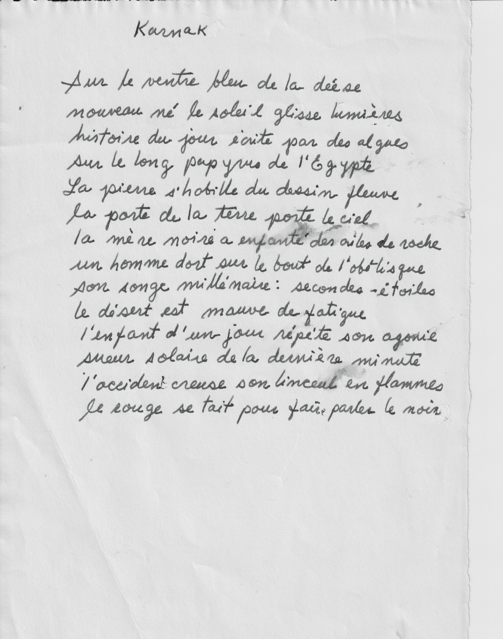
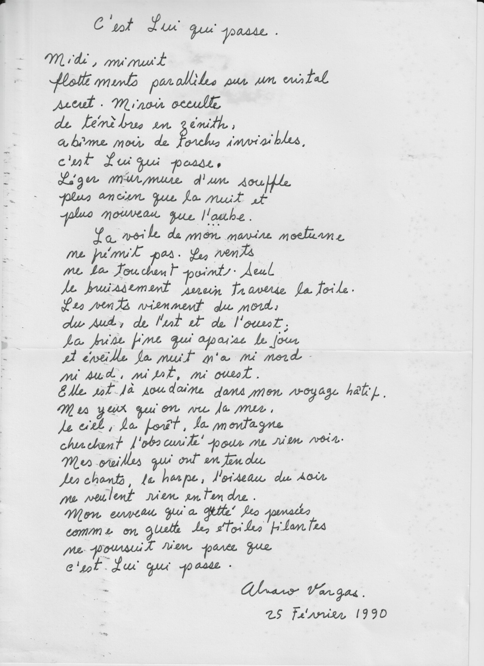
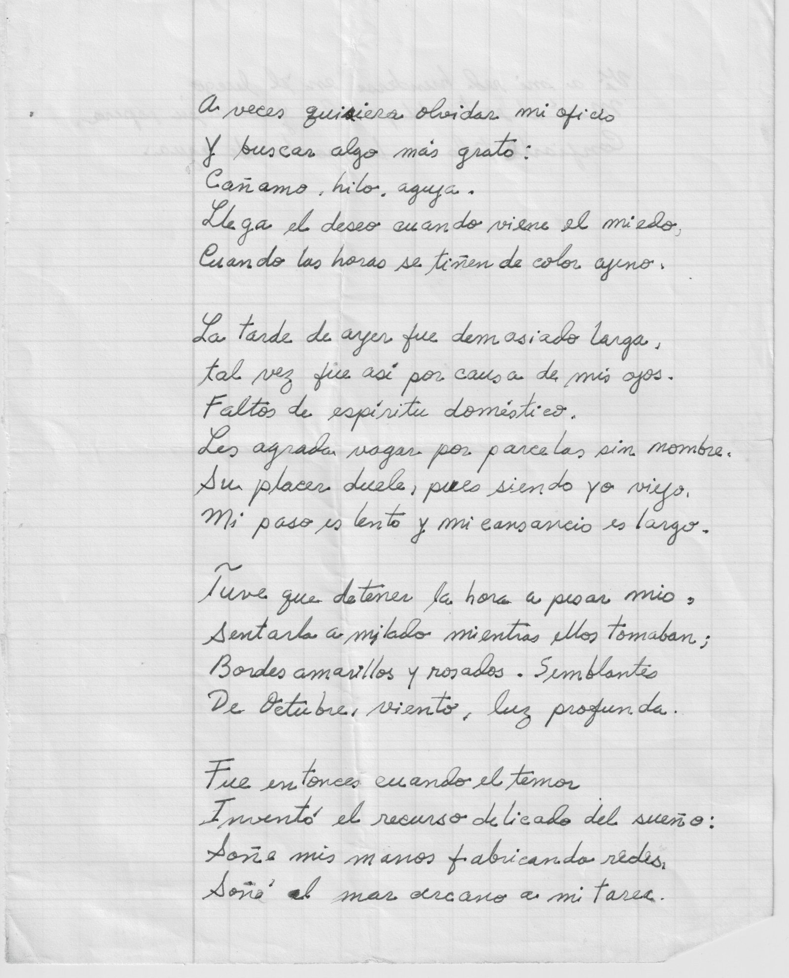
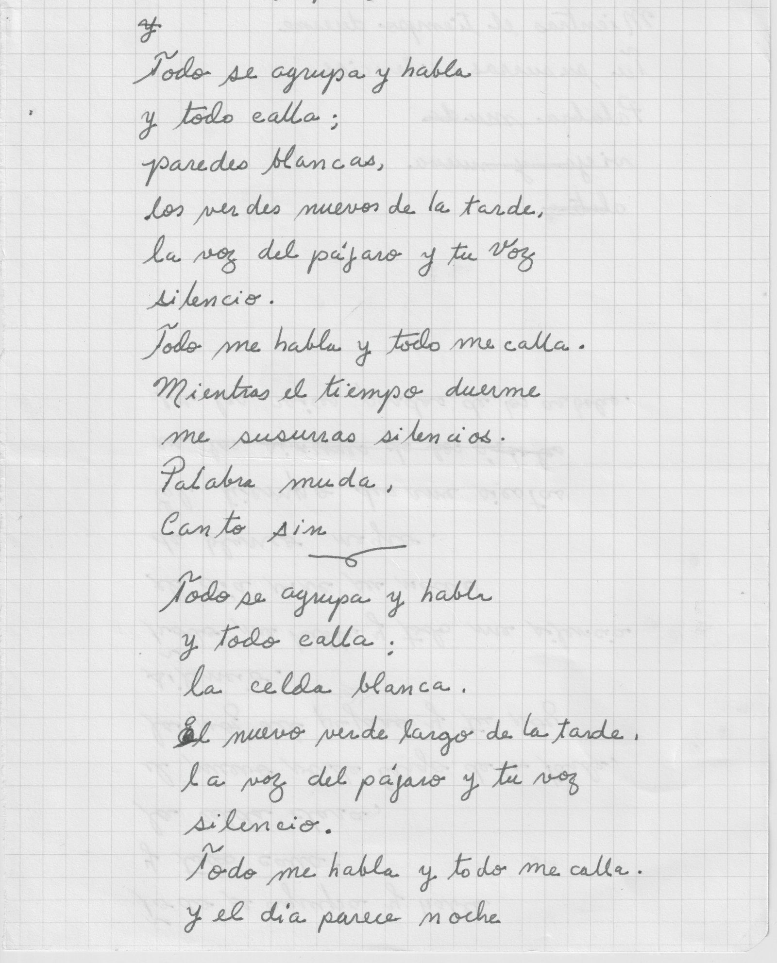
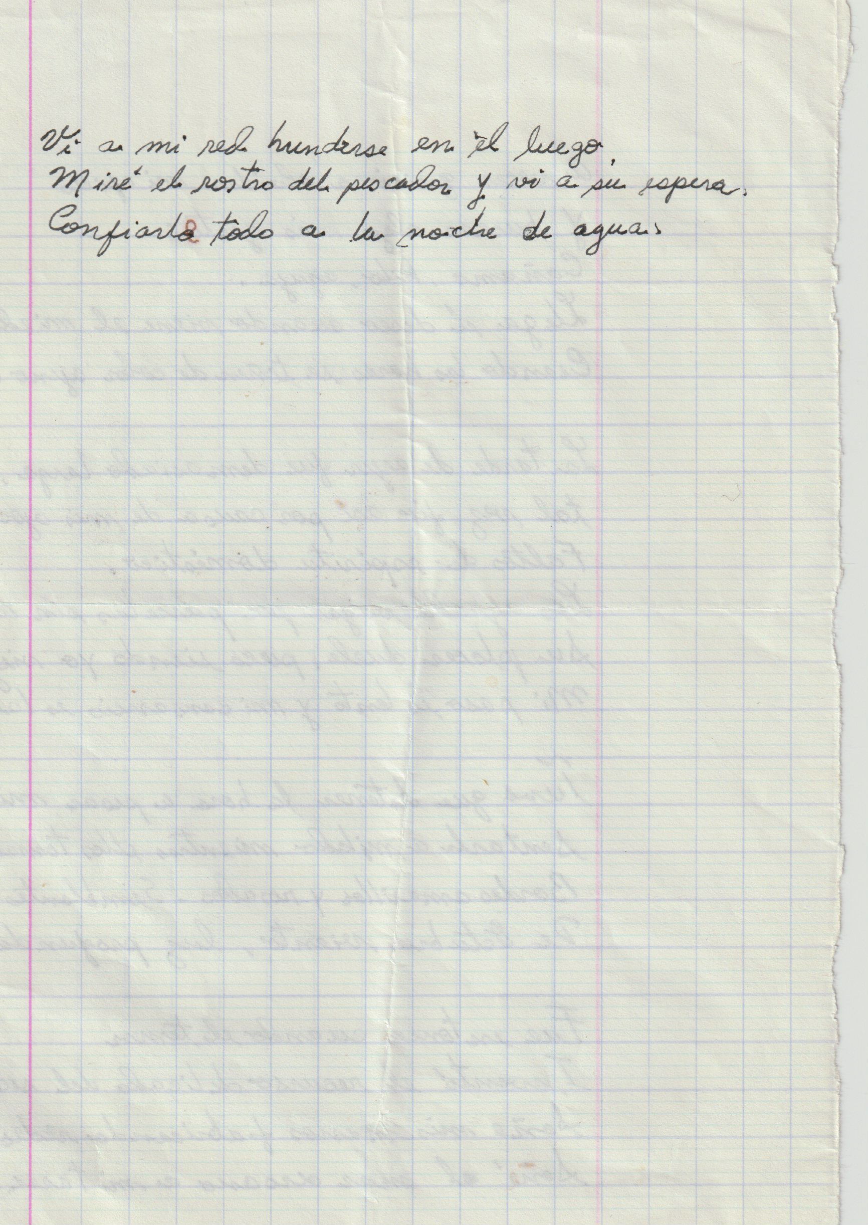
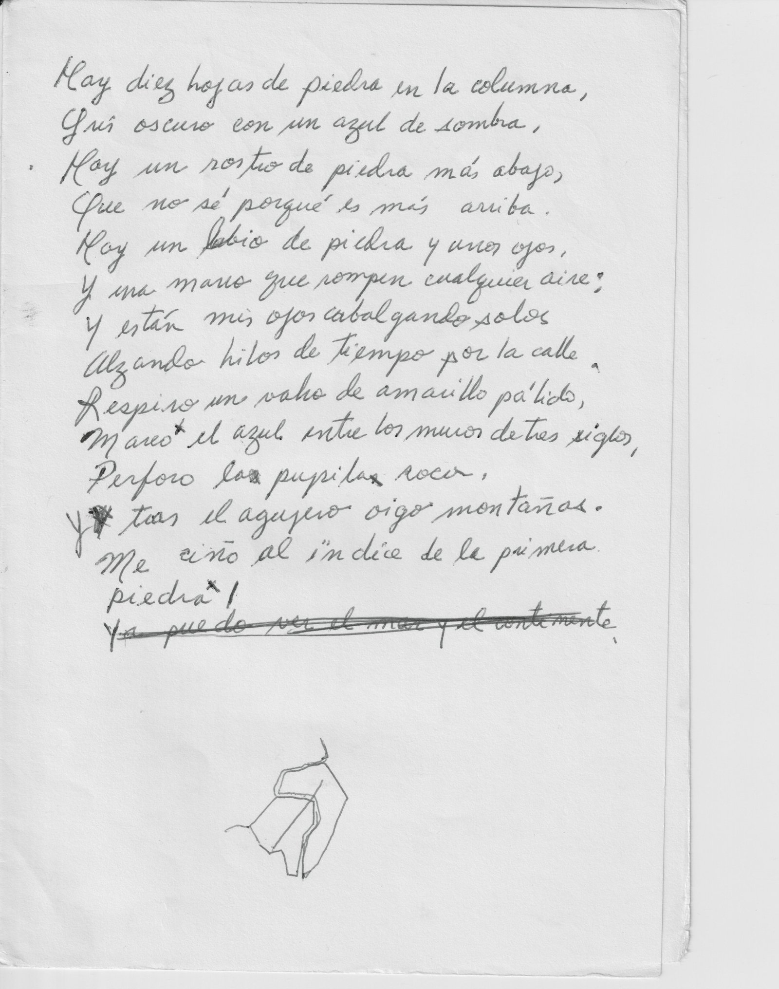
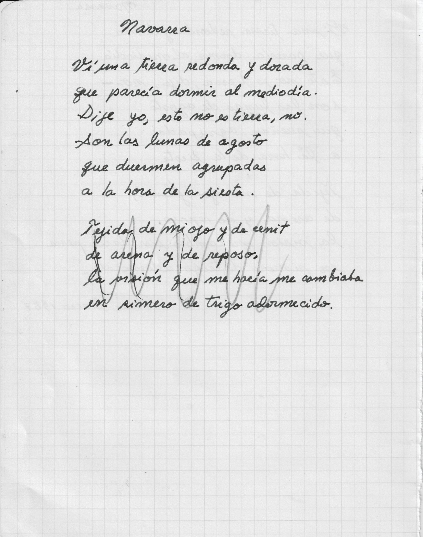
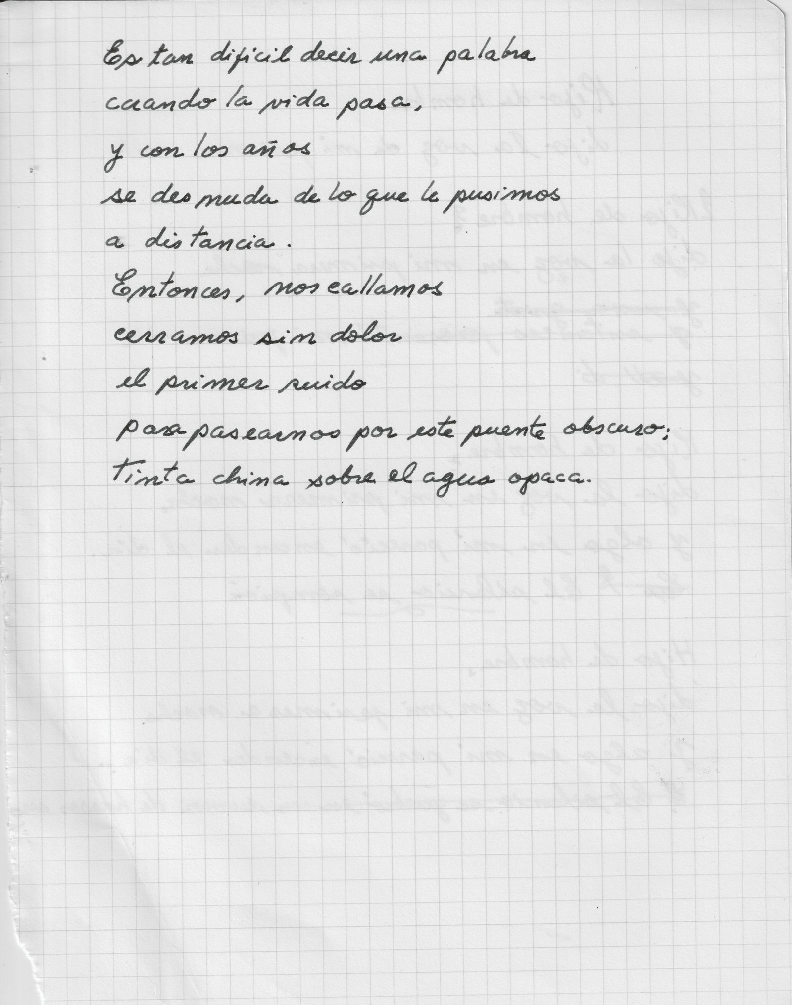
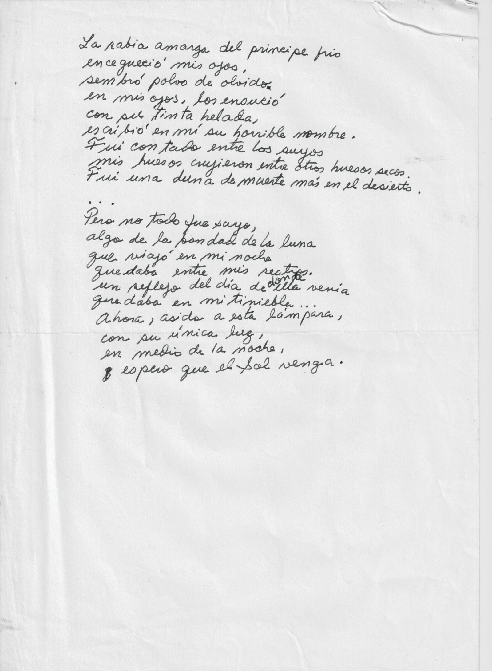
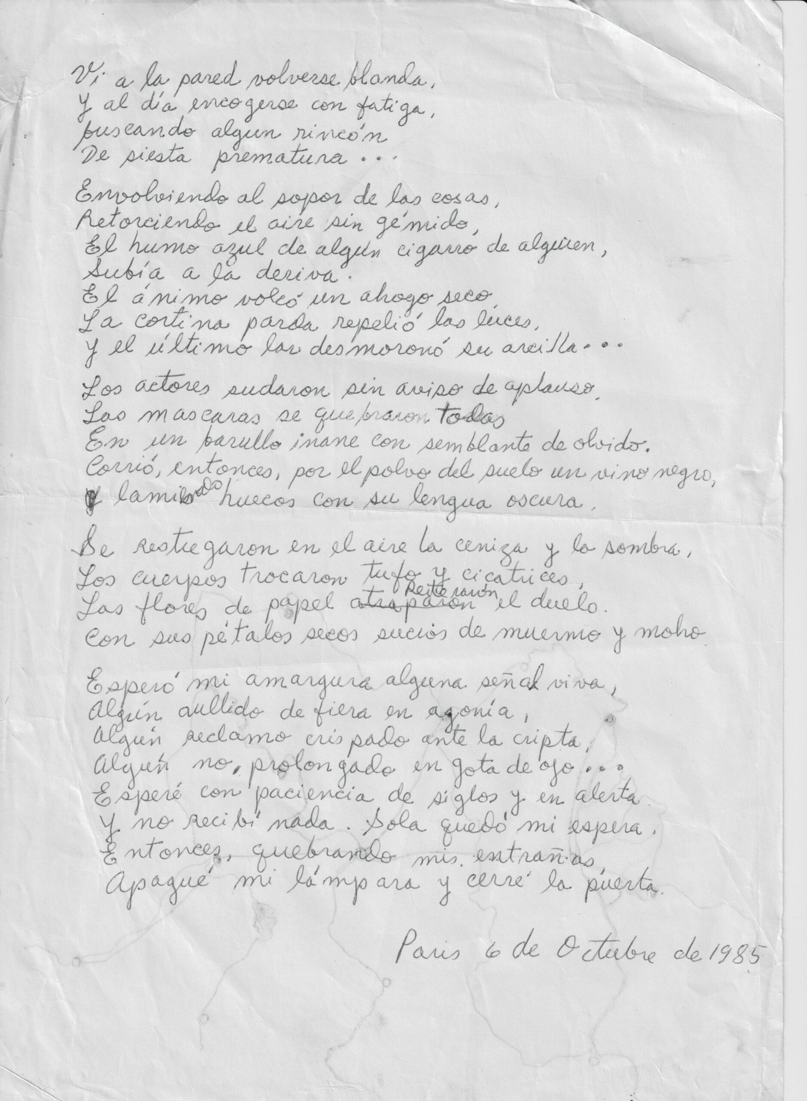
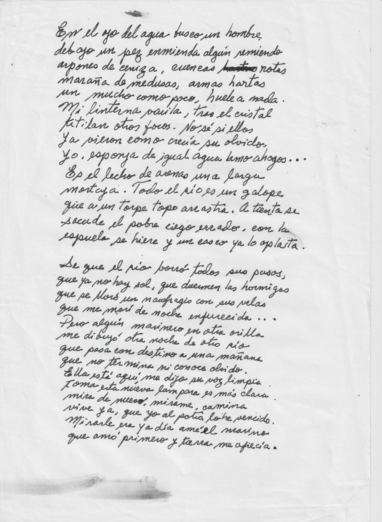
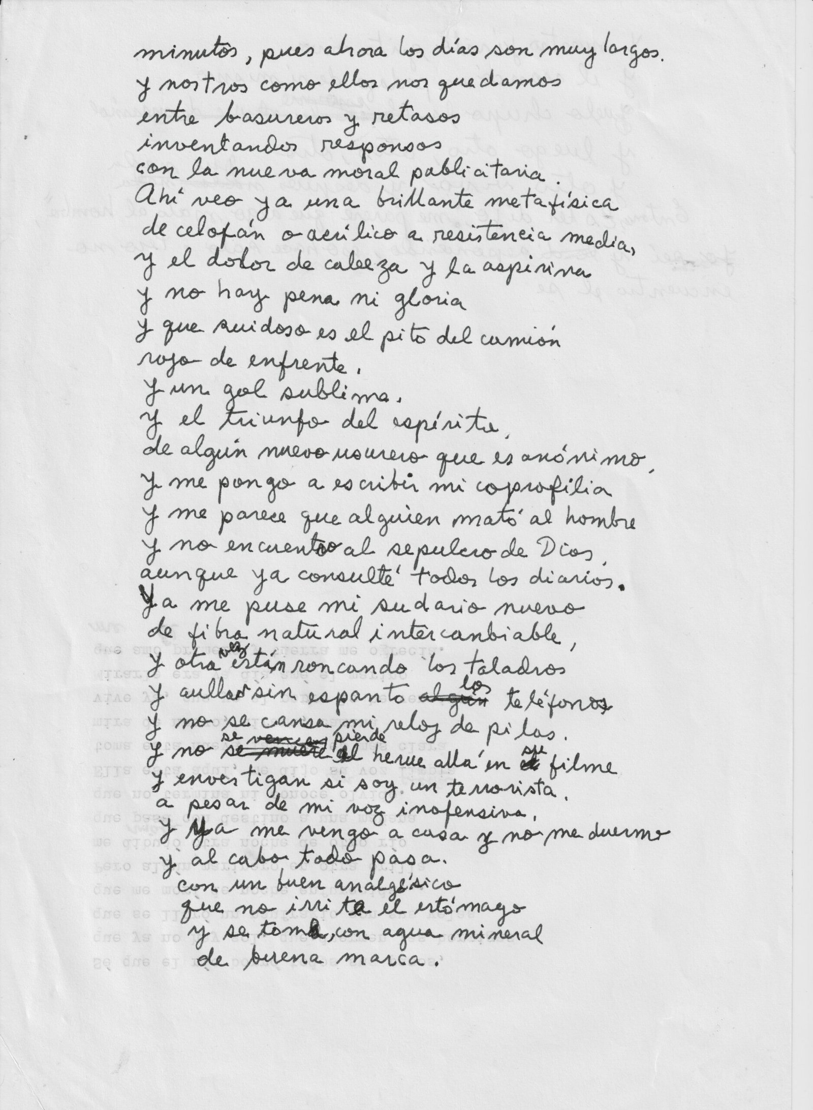
  • Alvaro Vargas Muñoz (1955-1991) – POEMAS (1985-1990) (brouillons)

    Alvaro Vargas Muñoz (1955-1991) – POEMAS (1985-1990) (brouillons)


  • des archives : sur les mœurs des ventes aux enchères en 1990 (et aujourd’hui?)


    des archives : sur les mœurs des ventes aux enchères en 1990  (et aujourd’hui ?)


  • NICOLAÏ TARABOUKINE (1889-1956): « THE PHILOSOPHY OF THE ICON » (1916-1935)

    NICOLAÏ TARABOUKINE (1889-1956): « THE PHILOSOPHY OF THE ICON » (1916-1935)

    Icon comes from the Greek word for religious images of all kinds, in all materials, and of every dimension. Objects of worship but also objets d’art, icons are linked to the Orthodox faith but also to the history of art. They are the tokens of a worldview that has inspired theologians as well as artists. In this regard, Jean-Claude Marcadé reminds us of the importance of Kandinsky’s discovery of painted and printed icons in those izbas of Northern Russia in which the painter says he learned “not to look at the picture sidelong, but to move within the picture, to live in the picture.” He offers us the keys to understanding the contemporary debate within post-Soviet Russia, where the dual status of icons remains of topical interest. Some Orthodox believers would like to see these venerated images returned to the churches, whereas they had previously been moved to museums where one sometimes see the faithful come to pray. Taking the writings of Nicolai Tarabukin (1889-1956) and Father Pavel Florensky (1882-1937) as their starting points, Marcadé, a great specialist of Russian art, as well as Igor Sokologorsky, a philosopher, study the interpretative aspect of these forms in traditional as well as modern art.

    Laurence Bertrand Dorléac
    Seminar of March 5th 2009

    NICOLAÏ TARABOUKINE (1889-1956):
    « THE PHILOSOPHY OF THE ICON » (1916-1935)

    JEAN-CLAUDE MARCADÉ

    Icons and Art in the Twentieth Century

    Icons have played a key role in the liturgical, theological, and intellectual life of Russia, and this is true in the field of Russian music, as well. Let us recall, among other things, that Kandinsky–that “modernist” par excellence of the twentieth century–said that he already had an existential familiarity with the synthesis of the arts (what at the end of the nineteenth century was called Gesamtkunstwerk or synesthesia) in the izbas of the Vologda Oblast and “in the Moscow churches, and especially in the cathedral of the Dormition and the church of St. Basil the Blessed.”

    “In these magical houses I experienced something I have never encountered again since. They taught me not to look at the picture sidelong, but to move within the picture, to live in the picture. . . . The “red” corner (red is the same as beautiful in old Russian) thickly, completely covered with painted and printed icons of the saints, burning in front of it the red flame of a small pendant lamp, glowing and blowing like a knowing, discreetly murmuring, modest, and triumphant star, existing in and for itself. When I finally entered the room, I felt surrounded on all sides by painting, into which I had thus penetrated. The same feeling had previously lain dormant within me, quite unconsciously, when I had been in the Moscow churches, and especially in the cathedral of the Dormition and the church of St. Basil the Blessed.”`


    The choice of these two Moscow churches is no accident. For, both of them are lined with frescos or wall paintings to which are added the wall of iconostases covered with icons.

    Malevich. Head of a Peasant (two versions, late 1920s).

    The link between icons and the Russian avant-garde manifested itself in a striking way, one could say exoterically, during the Last Futurist Exhibition of Paintings 0, 10 in Petrograd in late 1915, when Malevich installed his “Suprematism of Painting” as the “Red/Beautiful Corner” of Russian Orthodox houses with, as central icon, the Quadrangle (what later on people took to calling the “Black Square against White Background”), which he called “the icon of our times.” This gesture was not meant to signify that it was to be an Orthodox icon, with its liturgical-cultural function (in the sense of the Seventh Ecumenical Council of Nicaea II, a tradition that has remained intact in the Eastern Church). For, ecclesiastical icons make no sense without the conjunction of the human and the divine in the incarnation of Christ. From this Orthodox point of view, the Malevichian icon, which could be said to manifest only a deus absconditus, is incomplete and has an air of Monophysitism about it.

    The Art Historian Nicolai Tarabukin (1889-1956)

    Tarabukin is known as a great Soviet art historian who, beginning in 1917, devoted his studies to the innovative arts, and quite particularly to left-wing art (the avant-garde), teaching during the 1920s at Proletkult (Proletarian Culture), at Vkhutemas (Higher Art and Technical Studios), at GAKhN (the State Academy of Artistic Sciences), and at the Meyerhold Theater. In France, people are familiar with translations of his brochures from the very early 1920s: L’expérience de la théorie de la peinture (Towards a Theory of Painting)and Du chevalet à la machine (From the Easel to the Machine), which analyze Soviet Constructivism and Productivism. Most of Tarabukin’s books, like those on the Gothic-Renaissance-Baroque, and the remarkable essay on Vrubel did not appear during his lifetime. The same goes for The Philosophy of Icons, which remained in manuscript form until 1999.

    Transfiguration (16th century, Berat Church, Albania).

    This work may seem to be a surprising one to come from a theorist and historian of art known rather for his rigorous study of forms and styles who relegated the thematic aspect of works to the background. And this choice of subject matter is all the more surprising as, in contrast to Father Pavel Florensky, Tarabukin was a layman–a believer, certainly, but someone whose experience with prayer, he tells us, was “weak.” And yet here we have a man who declares, in the Second Letter of his Philosophy of Icons (entitled “The Meaning of Icons”):

    “When applied to religious creativity, aesthetic criteria become, quite suddenly, extraordinarily impoverished and narrow-minded; such criteria can shed light on but a tiny portion of its brilliant content. The aesthete or the philosopher who goes about analyzing religious creativity aesthetically appears a rather pitiful figure of a man, like one who tries to measure the volume of the sea with a dipper. One can, and one should even, speak of an icon aesthetics, but that is but one tiny feature of a very profound content, one problem in a larger whole. Moreover, that feature is conditioned by this whole; the former can be understood only by starting from the latter. And this whole is the religious meaning of the icon.”

    School of Rublev. Nativity(Moscow, c. 1410-1430).

     Philosophical and Theological Context

     The main part of The Philosophy of Icons is made up of fourteen Letters addressed to his “dear friend,” which is reminiscent of the epistolary format of Father Florensky’s theological dissertation, The Pillar and Ground of the Truth: An Essay in Orthodox Theodicy in Twelve Letters (1914). There is no doubt that the passages in that treatise on art and mathematics gave Tarabukin a decisive impetus to write The Philosophy of Icons, even though he himself was neither a philosopher nor a theologian. Another impulse was to be given to the young Tarabukin by the famous lectures of Prince Yevgeny Trubetzkoy, which appeared between 1915 and 1918 and which took their title from his first lecture, “Speculation in Colors, on Russian Icons and their Place in the Destiny of Russia.” Finally, when he completed his text–clearly sometime in the late 1920s or the early 1930s–Tarabukin undertook a dialogue with Florensky’s Imaginary Numbers in Geometry (1922) and Lev Lossiev’s Dialectic of Myth (1930), traces of which are to be found in The Philosophy of Icons. The head-on opposition to Western art, from the Gothic onward, which is to be found among all Russian authors writing about icons (and particularly in Florensky), becomes in Lossiev and in Tarabukin a violent rejection of Western religious art.

    Various Approaches to Icons


    The Prophet Elijah (School of Novgorod, 14th century).

    Simplifying things, it could be said that there are four types of approaches to icons–approaches that take into account the specificity of this pictorial art form whose status is totally different from the kind that developed in Western religious painting. It is no accident that Russian vocabulary distinguishes ikonopis (iconography, i.e., the painting-writing of images) and zhivopis (zoography, the painting-writing of life). The first type of approach is theological; icons are here considered to be a “theology in colors,” nay, purely religious. In this category, one could mention Theology of the Icon, a remarkable book by Leonid Ouspensky, the lay icon painter who lived and worked in Paris. The second type of approach is purely philosophical and deals with the issue of images as this issue was raised during the crisis of iconoclasm in the seventh and eighth centuries. Works by Marie-José Mondzain in the 1970s, 1980s, and 1990s can be mentioned from this standpoint. The third approach involves taking the onto-theological aspect of icons into account, but it does so while placing this aspect of icons in the service of their formal features, icons being the creation of something beautiful, a branch of painting in general. One finds this approach in Father Florensky, particularly in his Iconostasis or, in the West, in the classic book The Icon: Image of the Invisible; Elements of Theology, Aesthetics, and Technique by the German Jesuit scholar Egon Sendler. Finally, a fourth type of approach considers Russian icons as “the beginnings of Russian art,” to borrow a phrase from Nikolai Leskov, the author of The Sealed Angel (1873), a novel that contains a brief treatise on icons. This type of approach could also be linked to The Russian Icon, a book by the Russo-Ukranian painter Alexis Gritchenko that was published in Moscow in 1916, and quite particularly to the pioneering work done by the painter Lev Fedorovich Zhegin (1892-1969), The Language of the Pictorial Work (The Conventions of Ancien Art), which was published posthumously in 1970.


    Saint John Chrysostom and Saint Paul (Byzantium, 13th century).

     Specificities of Icon Art


    Tarabukin’s Philosophy of Icons belongs, in the main, to the first type of approach, the religious one. That is paradoxical, we said, for an art historian who is reputed to be “formalistic”!
    In the First Letter, entitled “Paintings and Icons,” Tarabukin declares:

    “Paintings, like all artworks, are individualistic; in the case of icons, they are prayers expressed in figurative terms. . . . Paintings can have a religious or worldly content. Icons are not only religious but also ecclesiastical.”

    In the Second Letter, entitled “The Meaning of Icons,” one can read the following:

    “Worldly paintings act in a contagious way. They carry the viewer away, take him by the throat. Icons are not an appeal; they are a path. They show the ascent toward the Archetype. One does not look at icons; one experiences them and prays to them.”

    In the Third Letter, “Miraculous Icons,” he states forcefully that

    “icons, like all rituals, are traditional, canonical, and sanctified by the Church, which, and this goes without saying, would not be the case with just any object.”

    In the other Letters, Tarabukin lays emphasis (as does Florensky) on the opposition between Catholic sacred art and the Orthodox painting of icons:

    “Catholic painting narrates; Orthodox iconography prays.”

    In the Ninth Letter,

    “The Outward Means of Expressing the Inner Meaning of Icons,”

    Tarabukin studies in detail the specific techniques of icon painting. The composition of icons stands out on account of its extraordinary self-enclosure. It is a microcosm that contains in itself the macrocosm. It renounces all that is worldly. To this end, it makes use of the composition’s tripartite division, the parallelism of planes, the repetitions, and the symmetry.

    Synaxis of Mary Mother of God(School of Pskov, 14th century).

    The composition of icons is indissolubly linked to rhythm. Rhythmic repetitions fulfill the role played by meter in versification and poetic rhyming. Iconography does not think in a Euclidean way. It rejects perspective as a form of expressing an endless space. The world of icon painting is finite. In place of a blue-sky background, icons have a golden background, which symbolizes that the events being contemplated in icons come from outside the delimited boundaries of earthly time and space and are represented, rather, sub specie aeternitatis.

    “In icon painting, the spatial moment is not separate from the temporal one. The world is understood, it could be said, in the manner of Hermann Minkowski, who says that neither space nor time exists separately, but that the world exists as a n-dimensional spatiotemporal unity. . . . Inverse perspective is the representation of space that is found beyond the terrestrial world, presented in another (i.e., inverted) aspect than the usual one here below. Inverse perspective is the visual representation of the concept of the other world. But as concepts (any concepts) are not representable on their own, but only thinkable, the visual expression of concepts is imaginary. In Imaginary Numbers in Geometry, Florensky says that in representation there are visual images and there are some images that seem to be visual.”

    Beheading of St. John the Baptist(Northern Russia, 15th century).

    What follows are some quotations from Florensky’s book, which allow Tarabukin to conclude:

    “The world of icons is, in its own way, real and concrete. In icon painting understood as meaning, subjectivism and psychologism are absent. . . . The icon painter has an entirely other relation to the flat surface than the one, for example, that Egyptian painting or Greek vase painting had. . . . The icon painter thinks in four dimensions and constructs a conception of spherical space, with the two-dimensional flat surface as his basis.”

    The place of icons in the transition of the 20th century
    in the 21st century

    The debate that began in post-Soviet Russia bears on the way in which icons are to be presented and considered today. Starting from the evident facts that icons are not works of art like other ones and that their full meaning resides only in an ecclesiastical polyphony-symphony, some Orthodox believers would like to see the most venerated images that had been removed by force be returned to the churches. Today, the Mother of God of Vladimir (12th century) is placed in a church adjacent to the Tretyakov National Gallery in Moscow, and one can see people come into this same museum to pray in silence before Andrei Rublev’s Old Testament Trinity (early 15th century).

    Andrei Rublev. Old Testament Trinity (Moscow, early 15th century).

    The monk Grégoire Krug, an iconographer who died in France in 1969, stated that the presence of icons in the secular world has a meaning:

    “It is in this way that icons that are prayed to, those whose purpose is to serve prayer, complete their salvational action in the world. They can leave the church, be found in a museum or in the homes of collectors, and be part of exhibitions. Such apparently incongruous conditions are neither fortuitous nor absurd.”

    In fact, throughout the twentieth century Russian icons have catalyzed the at-once utopian and prophetic movement of metamorphosis and transfiguration of painting in general, as well as of life as a whole, toward what Bruno Duborgel calls, in opposition to the

    “iconoclasm of a surfeit of naturalistic images and in rupture with it,” “the iconophilic obsession with approaching an experience of the Unfigurable.”


    Bibliographical Hints

    Boespflug, François, and Nicolas Lossky, Nicée II (787-1987). Douze siècles d’images religieuses. Paris: Cerf, 1987.

    Duborgel, Bruno. Malévitch. La question de l’icône. Saint-Étienne: Université de Saint-Étienne, 1997.

    Florensky, Pavel. La perspective inversée/L’iconostase et autres écrits sur l’art. Trans. Françoise Lhoest. Lausanne: L’Âge d’homme, 1992.

    Larchet, Jean-Claude. L’iconographe et l’artiste. Paris: Cerf, 2008.

    Nicéphore. Discours contre les iconoclastes, Trans. and intro. Marie-José Mondzain-Baudinet. Paris: Klincksieck, 1989.

    Ouspensky, Leonid. Theology of the Icon. Trans. Anthony Gythiel with selections translated by Elizabeth Meyendorff. Crestwood, N.Y.: St. Vladimir’s Seminary Press, 1992.
    _____, and Vladimir Lossky. The Meaning of Icons. Trans. G. E. H. Palmer and E. Kadloubovsky. 2nd ed. Crestwood, N.Y.: St. Vladimir’s Seminary Press, 1982.

    Sendler, Egon. The Icon, Image of the Invisible: Elements of Theology, Aesthetics, and Technique. Trans. Steven Bigham. Redondo Beach, CA: Oakwood Publications, 1988.

    Troubetzkoï, Eugène. Trois études sur l’icône. Paris: YMCA-Press/O.E.I.L., 1986.

    Yon, Ephrem, and Philippe Sers. Les Saintes Icônes. Une nouvelle interprétation. Paris: P. Sers, 1990.

    Zibawi, Mahmoud. Eastern Christian Worlds. Preface Olivier Clément. Trans. from French Madeleine Beaumont. English translation edited by Nancy McDarby. Collegeville, MN: Liturgical Press, 1995.
    _____. The Icon: Its Meaning and History. Pref. Oliver Clément. Collegeville, MN: Liturgical Press, 1993.


    Jean-Claude Marcadé PhD, is a director of research emeritus at the French National Center of Scientific Research (Institute for the Aesthetics of Arts and Technologies). Author of Malévitch (Paris: Casterman, 1990), L’avant-garde russe 1907-1927 (Paris: Flammarion, 1995; 2007), Calder (Paris: Flammarion, 1996), and Nicolas de Staël. Dessins et peintures (Paris: Hazan, 2008), he is the president of the “Friends of Antoine Pevsner” association.

  • des archives :   GARRY FAÏF (1942-2002)

    des archives :

      GARRY FAÏF 1942-2002

    GARRY FAÏF ET JEAN-CLAUDE MARCADÉ, 1997


    GARRY FAÏF ET JEAN-CLAUDE MARCADÉ, 1997


    VLADIMIR KRINSKI (1890-1971), ARCHITECTE ET THÉORICEN DE L’ARCHITECTURE, ICI EN 1962 ANALYSANT LES PROJETS DE SES ÉTUDIANTS DU 2ÈME COURS : AU CENTRE LE PROJET DE GARRY FAÏF


  • avant-garde russe à Paris, 1979

    avant-garde russe à Paris


  • С ПОКРОВОМ ПРЕСВЯТОЙ БОГОРОДИЦЫ!

    С ПОКРОВОМ ПРЕСВЯТОЙ БОГОРОДИЦЫ!

  • Sabine Buchmann sur l’art de Günter Fruhtrunk


    *

    Brüssel, Oktober, 2024

    Leserbrief und Aufruf

    „zur Verhinderung des Abrisses des Auditorium Maximum der Hochschule Düsseldorf, ein flacher Kubus-Bau mit der ihn umfassenden Fassadengestaltung von Günter Fruhtrunk aus dem Ende der 60iger Jahre“.

    Augenblick und Inbegriff“ – Die Kunst von Günter Fruhtrunk[1]


    Ich möchte eine Ergänzung zum Verständnis der Kunst Günter Fruhtrunks geben und der in seiner Kunst enthaltenen ethischen Werte; dies im Hinblick den Abriss dieses einzigartigen Gebäudes „Auditorium Maximum der Hochschule Düsseldorf“ zu verhindern. Der Erhaltung des Kubus mit den realisierten Mosaik-Fassadenwänden, in den 60iger Jahren von Günter Fruhtrunk gestaltet, gilt mein Schreiben.

    Fruhtrunks ethisches Engagement, das schon in frühen Jahren seines Schaffens deutlich ist und die konsequente Sprache seiner Ästhetik und seines Bilderverständnisses der konkreten Malerei wird nicht nur in seinen Texten zur Motivation und den Titeln seiner Bilder deutlich, sondern ist ein Grundsätzliches

    „Wiederstehen gegen maschinewerdendes und gewordenes Denken“*1.

    Titel und Text zu seinem Bild „Suprematie“ von 1974:

    „Flut der Auflehnung der Gefühle zum Handeln gegen unterdrückende Macht, verdoppelt durch die der Technologie, die den Menschen direkt aufs Korn nimmt.“*1

    Dies kritisches Bewusstsein verdeutlicht seinen ethischen und gesellschaftspolitischen Anspruch. Seine Kritik an den die Freiheit des Menschen zerstörenden Tendenzen, dem blinden Fortschrittsglauben, begleitet von einem Konsumverhalten einer Wegwerfgesellschaft, lässt uns aufhorchen und unsere Sinne anspannen in einer beunruhigenden Entwicklung der Welt.

    Der Kubus wird durch die Fassadengestaltung Günter Fruhtrunks zum Appell an das eigenständige Sehen des Betrachters: der Augenblick des Sehens und der Inbegriff unseres Denkens und Fühlens. Der gesamte Bau mit den farbigen Fassadenwänden ist ein unzertrennbares und zusammengehöriges Kunstwerk. Es ist nicht angeheftete Kunst an eine Fassade. Fruhtrunks Mosaikfassadenwände umspielen und intensivieren die „archaische“ Form des Kubus. Rhythmus und Farbe, die beinahe miniaturartige Abfolge der Mosaikfliesen (-kacheln) und die wechselnden Seiten des Kubus bringen den Prozess unseres Sehens in Bewegung. Aus der Nähe in ihrem sich öffnenden Konstrukt zu großer bewegender Oberfläche der Fassade, aus der Ferne ein großer Farbenklang, wie ein vitaler Gongschlag, der unsere Augen wie Musik einer Ouvertüre empfinden lässt. Von einer Fassade zur anderen empfinden wir die musikalische Variation, die Öffnung in neue Themen, die verwandt bleiben und die vier Seiten der Fassaden rhythmisch, mit behutsamer Umsicht, zueinander führen. Es handelt sich nicht, wie oft geschrieben wird, um Streifen, sondern es sind expressive rhythmische Farbbahnen oder Vektoren. Fruhtrunks sensitive und aufrüttelnde autonome Ästhetik fordert unseren Blick (den Augenblick des Sehens) und die Verinnerlichung (den Inbegriff des Gegebenen) des Gesehenen heraus. „Augenblick und Inbegriff- Erinnerungen an Günter Fruhtunk“ ist der Titel meines 2023/24 geschriebenen, noch nicht veröffentlichten, Buches. Die einzigartige Setzung der Farben ultramarinblau, rot, weiß, schwarz und die Intuition des Rhythmus, die Staffelung und musikalisch-fugenartige Komposition der Fassadengestaltung erscheint einfach, doch ist sie komplex und fordert die Aufmerksamkeit der Wahrnehmung. Sie vibriert durch die lasierten – glänzenden – farbigen Fliesen. In seinen späten Bildern wollte Fruhtrunk seine autonome Malerei als Sinnbilder verstanden wissen. Sie sind Appell der Existenz des Lebens jedes Menschen „Sinnenfundamente“ Bildtitel 1982 *2.

    An dieser Stelle möchte ich aus Günter Fruhtrunks Werkverzeichnis*2 zur ethischen Begründung im Zusammenhang des Geschenks der Bundesrepublik an die Vereinten Nationen New York 1978 / Quiet Room zitieren:

    „Die Themen, Formen, Melodien und Episoden folgen einander wie Schicksalswendungen einer Lebensgeschichte, mannigfaltig und doch logisch abfolgend, ein bildnerisches Bild wächst aus dem anderen hervor, sie sind nicht einfach nebeneinandergestellt.“

    Dieser Satz fasst das Wesentliche der frühen Werke ebenso wie der späten Werke von Günter Fruhtrunk zusammen.

    Dieser Prozess des Sehens des „Farbmosaik“ des Kubus, des bewegenden Denkens und Fühlens, hat eine dem Menschen beinahe wohltuende, zur Verantwortung, zur Präsenz, zum Engagement appellierende Wirkungskraft. Fruhtrunk antwortet im Gespräch mit Eugen Gomringen auf die Frage: „Welche Rolle spielt das Bild in ihrem Leben?“

    „Ich bin Maler, Bilder sind Bodensatz, Niederschlag, nicht diskursive Spur. Nicht will ich damit sagen nur reagieren. Bilder sind Sprung, Ruf, Ruhe und Spannung und zugleich Kritik daran.“ *3

    Dieser energetische konkrete Rhythmus ist in den Wandmosaiken des Kubus zu erfahren. Eine Wirkungskraft des Lebendigen, die uns sichtbar erhalten bleiben muss und Widerstand leistet gegen technologische Wagnisse ohne Verantwortung in unserer Welt.

    Man kann sich fragen, ist Fruhtrunks Kunst ein Appell für den Frieden in der Welt? Vielleicht ist die Art und Weise seiner konkreten, autonomen, expressiven Kunst seine Antwort eines tiefen existentiellen Engagements für den Frieden in dieser Welt. Die Kriegsverletzungen, an denen er lebenslang litt, haben ihn zu dieser geistigen konsequenten Sicht geführt. In ganz frühen Bildern „Mahnender über Toten“ („See der Toten“), 1944-45, *2, zeichnet er in expressionistischer (realistischer) Malweise dieses Grauen.

    Was ist die Intention, Gesinnung von Ästhetik, wenn sie nicht „Art pour Art“ sein soll, sondern Energie für Lebendiges, Empfindsames. Es ist das freie eigenständige Sehen ohne Dogmen, Ideologien. Es ist Erregung (im Sinne von Malewitsch) unsere konkrete existenzielle Empfindung. Es ist diese „Präsenz“ (Titel einer ganzen Reihe von Fruhtrunks Bildern) *2, die uns diese Verantwortung abverlangt.

    Heute sind wir inmitten der Konflikte zwischen Doktrinen, Ideologien, Technologien, ökonomischen Wachstum und Umweltzerstörung, wo Verantwortung und das Wissen von Wirkungen verdeckt bleiben. In unserer von der Technologie weitergetriebenen Zeit werden Verantwortung und Selbstbesinnung ignoriert. Wir erleben dies mit Beunruhigung und stehen hilflos dem Wahnsinn der Kriege und der Zerstörung unserer Welt gegenüber. Die warnenden Reflektionen kann man in Fruhtrunks Vortragsreihe „Individuum – Zeit und Zukunft“ lesen. *3

    Die Dringlichkeit den Abbruch eines so sprechenden, einzigartigen Kunstwerkes, das uns durch Rhythmus und Farbe belebt, zu verhindern, muss unser aller Sorge sein. Es wäre sonst ein nicht wiedergutzumachender Verlust.

    Ich möchte mit einem weiteren Zitat von Günter Fruhtrunk meinen Aufruf beenden:

    „Rhythmus ist überzeugte Wirkung, ist seelische Wirkung, Freude, Leid, Anklage, Rebellion, Hoffnung und Enttäuschung.“ *1

    *1 = „Günter Fruhtrunk – Gespräch mit Eugen Gomringen“, Josef Keller Verlag

    *2 = „Günter Fruhtrunk – Werkverzeichnis der Bilder 1952-1982“, Hatje Cantz Verlag

    *3 = „Günter Fruhtrunk – Retrospektive“, Prestel Verlag


    [1] Sabine Buchmann, Malerin

    162, rue Doktor Elie Lambotte

    1030 Bruxelles

    Belgien

    +32-473-733970

    Buchmann.sabine@gmail.com

    www.sabinebuchmann.com

    Studentin der Klasse von Günter Fruhtrunk 1973 – 1979

    Assistentin von Günter Fruhtrunk 1979 – 1982

    Stellvertretende Professorin der Klasse Fruhtrunks

    an der Akademie der Bildenden Künste München, 1982 – 84