La aventura pictórica y filosófica de Kasimir Malévich
Jean-Claude Marcadé
Kasimir Malévich nació en Kiev, Ucrania, en el seno de una familia mitad polaca mitad ucraniana, y fue bautizado en la iglesia católica de la ciudad[1]. El artista destacó en sus escritos autobiográficos la influencia indeleble que la naturaleza ucraniana[2] había ejercido sobre él. El arte naif que empleaban los campesinos para decorar las khaty (casas populares de Ucrania), los pyssanky (huevos pintados) y los iconos, considerados «la forma superior del arte campesino», constituyó su primera academia «silvestre»[3].
Entre 1896 y 1905 el pintor en ciernes reside en Kursk, Rusia, donde, con un grupo de artistas aficionados, dedica sus ratos de ocio a una serie de estudios que, según sus propias palabras, evolucionan desde el realismo inspirado en el pintor de género ucraniano Mykola Pymonenko (1862-1912) y sobre todo en Repin (1844-1930), el artista más importante del movimiento realista comprometido de los Ambulantes, hacia el impresionismo. Este período de formación, que se prolongará hasta 1910, nos es prácticamente desconocido. Sólo sabemos que a partir de 1905 Malévich se instala definitivamente en Moscú, donde se inicia profesionalmente en la técnica pictórica en el taller de Fiodor Roehrberg, pintor originario de Kiev. Se entrega entonces al impresionismo y pinta directamente de la naturaleza (como Larionov en aquellos años[4]): «Me gustaba mucho la naturaleza en primavera, en abril y a principios de mayo. Ya no estudiaba y trabajaba en un manzanar, cerca de una casita que había alquilado por doce rublos al mes. Este jardín era mi verdadero taller»[5]. Malévich es contundente: el impresionismo le enseñó que «lo esencial no era pintar fenómenos u objetos al detalle, sino que residía en una factura (o una textura) pictórica pura, y en la única relación de toda mi energía con los fenómenos, con la cualidad pictórica que poseían. Toda mi obra se asemejaba a la de un tejedor que elabora una tela con una textura sorprendentemente pura»[6].
Malévich permanecerá fiel a esta base impresionista a lo largo de toda su carrera, incluso en los estilos en principio más alejados, surgidos de las lecciones del arte geométrico de Cézanne entre 1912 y 1914 (gusto por los degradados, por las luminiscencias en contraste con zonas sombreadas), incluso cuando aborde el suprematismo, donde la textura blanca de los fondos está animada por los surcos ondulados que traza el pincel en su vaivén.
Uno de los escasos ejemplos de arte impresionista de esta época inicial, que Malévich se llevó consigo a Berlín, es La mujer del periódico (hoy en el Stedelijk Museum, Amsterdam[7]), pintado hacia 1905-1906 cuando frecuentaba el taller de Roehrberg, su primera verdadera escuela de aprendizaje. Tenía veintiséis años. El periódico que el personaje femenino tiene sobre sus rodillas lleva escrito en cirílico el título «Kursk» (que corresponde sin duda a las primeras letras del periódico Kurskiyé Gubernskiyé Viédomosti [Noticias del Gobierno de Kursk]). El pintor contó que la ciudad de Kursk, adonde había llegado en 1896 procedente de Kiev para trabajar en una compañía ferroviaria, ocupaba un «lugar destacado» en su biografía[8]. Pinta como aficionado fuera de las horas de trabajo, crea un círculo artístico en el que se integran compatriotas ucranianos como los pintores Loboda o Kvachevski («Ambos éramos ucranianos»[9]). No queda rastro alguno de esta época en la que afirmaba hallarse bajo la influencia del realismo de los Ambulantes Chichkin y Repin. En 1906 le influye sobre todo Monet, cuya obra pudo contemplar en la Colección Shchukin en Moscú (en un texto sobrecogedor relata la impresión que le produjeron las dos Catedrales de Rouen [mañana y atardecer]). Para él, Monet «hace crecer la pintura que se alza sobre los muros de la catedral. No eran las luces y las sombras su principal objetivo, sino la pintura que se encontraba en la sombra y en la luz»[10]. Si esta influencia es particularmente sorprendente en La iglesia de la Colección Costakis (Museo de Arte Moderno de Tesalónica[11]) o en los dos Paisajes del Museo Estatal Ruso de San Petersburgo[12], en La mujer del periódico de Amsterdam ésta se conjuga en connivencia con la poética de Bonnard. Los toques impresionistas juegan con las unidades coloreadas del mantel blanco, de la blusa y la falda rosa y malva del personaje y del objeto que pende del árbol con amplias pinceladas que dan lugar a relaciones cromáticas audaces («los súbitos estallidos de un color franco» en Bonnard): «Algo a lo que llamábamos luz se ha convertido en algo tan estanco como cualquier material»[13].
A estos años de tanteo (1905-1909) pertenece una serie de dibujos y gouaches, muy parecidos a bocetos de taller (retratos, paisajes, viñetas decorativas), que oscilan entre el realismo, la caricatura, el primitivismo, el simbolismo y el Art Nouveau. Hasta 1910-1911 Malévich se nutre de una inspiración simbolista, tomando prestados los temas literarios y las formas estilizadas comunes a los artistas de Mir Iskusstva (El Mundo del Arte) de San Petersburgo o de la Rosa Azul de Moscú. Expone en varias ocasiones (1907, 1908, 1909) en la Asociación de Artistas de Moscú, donde coincide con figuras de vanguardia como Kandinsky, Larionov, Burliuk o Morgunov.
Sabemos que tras su participación en el Primer Salón de Moscú, en 1911[14], no volvió a exhibir en vida sus obras de estilo simbolista o «moderno» (en Rusia se denomina «estilo moderno» a lo que en otros lugares se conoce como Art Nouveau, Jugendstil, Secessionstil o Modern Style [N. T.: modernismo en España]). Por aquel entonces, las había agrupado en tres ciclos: «Serie de los amarillos», «Serie de los blancos» y «Serie de los rojos». Léase, tres variantes estilísticas del simbolismo ruso entre 1900 y 1910: un estilo que mezclaba la estética nabi con las de Carrière, Whistler, Vrubel y Borisov-Musatov[15]; un estilo francamente «moderno», surgido sobre todo del movimiento peterburgués del Mundo del Arte, y un estilo primitivista-fauvista.
La primera exhibición documentada de obras simbolistas del artista tuvo lugar en la XVIª Exposición de la Asociación de Artistas de Moscú, en 1908. Se trata de las aguadas El triunfo del cielo y La oración (ambas en el Museo Estatal Ruso), caracterizadas por la tendencia a la monocromía amarilla. Si por su espíritu místico-esotérico se las puede relacionar con las obras de los pintores de la Rosa Azul que destacan en la escena artística moscovita entre 1904 y 1907, la elección del fondo amarillo-oro constituye un desafío a este movimiento y expresa la voluntad de distanciarse de él. Por otra parte, no se trata de una elección inocente, como se descubre en el Primer Salón de Moscú, en 1911, en el que el artista polaco-ucraniano-ruso pone punto final a su aventura simbolista, de la que ya se ha alejado con sus envíos al primer Valet de Carreau de 1910-1911 en Moscú y a la Unión de la Juventud de San Petersburgo en los meses de abril y mayo de 1911, en los que ya despunta un poderoso estilo primitivista fauvista. Es en el Primer Salón de Moscú donde expone las series amarillas, blancas y rojas antes mencionadas.
Lo realmente importante aquí es el «movimiento del color», que tiene su origen en el impresionismo, pero que se amolda a estructuras estilísticas distintas en cada una de las tres series. En la «Serie de los amarillos», nos hallamos ante el estilo simbolista original, predominante en los pintores de la Rosa Azul. En la «Serie de los blancos», nos las vemos con el Art Nouveau que domina en el Mundo del Arte. Finalmente, en la «Serie de los rojos», encontramos un estilo primitivista fauvista en el que está presente una iconografía de tipo simbolista.
La «Serie de los amarillos» es un buen ejemplo de estilo simbolista. El elemento vegetal se halla omnipresente en todas las obras que la integran. Ya no nos encontramos ante una naturaleza de tipo impresionista (la reproducción directa), sino ante un paisaje imaginario, una síntesis simbólica de una vegetación universal, de un crecimiento universal cuyo ritmo coloreado y formal revela la pintura; la tradición de los nabis se replantea a la luz de la estética del Extremo Oriente. Por otro lado, este color amarillo dominante que explica por qué Malévich no fue aceptado en la Rosa Azul, este color que tiene una fuerte consonancia budista, es también un analogon (equivalente) pictórico de la luz solar, pero de la luz de un sol interior que irradia todo el espacio, que surge de todas partes, sin generar claroscuros, sin proyectar sombras. El amarillo se diluye en dorados, en enrojecimientos. Se trata de un espacio icónico, pero no en el sentido de un icono ortodoxo litúrgico, sino más bien en el de un lienzo al cual le habría sido otorgado el estatuto de imagen esencial, no mimética, de la realidad sensible, que alcanzara el corazón de la realidad mundana, puesto que se alimentaría de las raíces de las apariencias. Conjugar elementos plásticos o conceptuales provenientes de iconos y del arte del Extremo Oriente constituye una síntesis profundamente original con respecto a la tradición francesa, y en particular con la síntesis cristiano-budista lograda por Odilon Redon. Los Cristos de Redon tienen el rostro pensativo, recuerdan al de Buda (suponen un precedente de las magníficas Santas Faces de Cristo de Jawlensky). Se ha destacado a menudo este elemento extremo oriental, sobre todo japonizante, en las obras de Redon, y es una de las filiaciones que habría que buscar en la «Serie de los amarillos» de Malévich. Igualmente, la envoltura floral, los personajes inmersos en una vegetación matizada y lujuriante, forma parte de la herencia de Redon, cuya deuda con Rodolfo Bresdin es bien conocida (Théodore de Banville señaló el carácter cósmico del paso de la planta al mundo animal en la obra de Bresdin: «La transición entre la vida vegetal y la animal se nos escapa al igual que ocurre entre la vida animal y la divina».
Hay que puntualizar que Malévich procedía de una cultura pictórica marcada, entre los siglos xix y xx, por Vrubel. En las obras de Vrubel, los personajes despuntan, emanan de parterres floridos. Malévich lleva el panteísmo, ya muy presente en Redon o en Vrubel, a su máxima intensidad. Esta fusión de seres y del florecimiento del mundo se manifiesta particularmente en Estudio para un fresco, que representa un «bosque sagrado»[16] y que debió de ser una de las tres obras expuestas en 1911 en la «Serie de amarillos» con el título de «Santos». En mi opinión, las otras dos obras a las que podría aplicarse esta denominación son El triunfo del cielo[17] y Autorretrato[18].
El «bosque sagrado» está en la línea de Redon en lo que respecta al estilo, y en la de los nabis, sobre todo de Maurice Denis, en lo relativo al espíritu. Esta aguada representa una patética escena semejante a la de los discípulos de Cristo en los «descendimientos». El cuerpo inerte emerge de la floración y su cabeza se pierde entre los troncos esbeltos de árboles no reales, «simbólicos». Recordemos lo que Mariana Werefkin (Marianna Vladimirovna Veriovkina) escribió a principios de la década de 1910: «El objeto “árbol” no existe, pero la palabra “árbol” sí existe y a ella va unido el concepto de algo que no existe […]. Hay un árbol, y otro, y otro, pero el árbol en sí no existe. Existe empero la palabra “árbol”, y es el símbolo de todo lo que se asemeja a un árbol»[19].
El triunfo del cielo es un ejemplo paradigmático del panteísmo pictórico de Malévich, en general próximo al de los simbolistas rusos. Una divinidad —Buda y Cristo a la vez— forma un árbol-cosmos; la divinidad que abarca el cosmos transfigurado es sustituida en la iconografía plástica ucraniana por el tema del Árbol de la Vida como elemento central del cuadro (por ejemplo en Árbol y dríadas, de la antigua Colección N. Manoukian) y por la Virgen de la Misericordiaque acoge a la humanidad bajo su manto, un tema también presente en los iconos ucranianos. Se observa también el sincretismo de la sinaxis (reunión) de los santos en los iconos ortodoxos con el tema de los mil budas, por ejemplo en el arte de Extremo Oriente, caracterizado por el ritmo de los nimbos. En cuanto al Autorretrato, muestra al personaje emergiendo de ramificaciones arborescentes y de la sinaxis de los «elegidos». Veremos que en la «Serie de los rojos» serán las escenas eróticas las que rondarán al pintor. Recolección de fruta, en la antigua Colección Khardjiev, parece un «bosque sagrado». Exhibida en la XVIIª Exposición de la Asociación de Artistas de Moscú, en 1909-1910, su iconografía nos permite descubrir una tendencia filosófico-esotérica en la línea de los nabis, sobre todo de Maurice Denis, quien, precisamente en 1909 se había trasladado a Moscú para instalar los paneles decorativos de La historia de Psique en el palacete del mecenas y coleccionista Morozov; la realización pictórica de la obra, por el contrario, revela un trazo primitivista, una monocromía y una poética floral en la línea de Redon. La oración está mucho más imbuida del «estilo moderno», en particular las ondas del pelo de la figura, que actúan como una metonimia de la cabeza sumida en la meditación; pero la tendencia a la monocromía, el espíritu panteísta de la unión del hombre inmerso en la naturaleza se nutren del mismo simbolismo que las demás obras de la “Serie de los amarillos”.
En la «Serie de los blancos», por el contrario, nos hallamos ante una estética más próxima al movimiento peterburgués del Mundo del Arte, como, por ejemplo, en Bodas y Sociedad pornográfica con sombreros de copa (Museo Ludwig de Colonia), Descanso. Sociedad con sombreros de copa (Museo Estatal Ruso), Ciudad pequeña (Museo Nacional Radishchev de Saratov) o Sociedad en un parque[20] (antigua Colección Khardjiev). El estilo de la «Serie de los blancos» recuerda a la estética gráfica «secesionista» del Mundo del Arte. Los temas, tratados con ironía y sarcasmo, proceden de la vida contemporánea e incluyen situaciones triviales (el hombre que orina en Descanso. Sociedad con sombreros de copa), próximas a las del «arte de izquierdas» ruso que empezaba a mostrarse por aquellas fechas en exposiciones como «Stephanos-Vienok-La Guirlande», de 1907-1908.
El Árbol preside el centro de la acuarela inacabada Sociedad pornográfica con sombrero de copa; se yergue a la orilla del «río de la vida» (el «paso del agua» como en el Jardín de las delicias del Bosco), tal como lo describe el último capítulo del Apocalipsis. El misticismo de Malévich se inscribe en la atmósfera general de la Rusia de la época, en la que imperan las ansias religiosas, teosóficas, antroposóficas, esotéricas, incluso ocultistas.
Obras cargadas de simbolismo, pero que apuntan claramente hacia el primitivismo fauvista, conforman la «Serie de los rojos». Entre los amarillos y los rojos, una obra de transición, Epitaphios, en la Galería Tretiakov. Se trata de un Santo Sudario, en eslavo Plachtchanitsa, una tabla pintada que representa el cuerpo de Cristo, que se expone y es venerada en la Iglesia ortodoxa el Viernes Santo. Malévich transforma el tema tradicional en una imagen más bien próxima a modelos budistas, si bien la iconografía se inspira directamente en los trabajos de Vrubel para la iglesia de San Cirilo de Alejandría, en Kiev, en los años 1880. Una vez más destaca la floración universal que envuelve el cuerpo.
El rojo domina el gouache Árboles y dríadas. Nos hallamos en este caso ante una síntesis de la tradición griega, la tradición bíblica del Árbol de la Vida y la del «árbol de las iluminaciones» característica de Extremo Oriente. El misterio del cosmos se manifiesta en la unión de los principios masculino (el árbol-falo) y femenino (la matriz en el centro del árbol). Al igual que en el arte budista, lo sagrado es al mismo tiempo místico y está impregnado de erotismo catártico. El contraste entre el rojo y el verde es típico del arte tibetano antiguo.
El Autorretrato de la Galería Tretiakov está impregnado del mundo nabi. Mientras que el mundo de la santidad rondaba el Autorretrato de la «Serie de los amarillos», aquí el artista aparece rodeado por un enjambre de mujeres desnudas, en diversas posturas. Su mirada, como ocurre casi siempre en sus retratos, no se dirige hacia ningún lugar concreto; aquejado por un leve estrabismo, el artista mira hacia el interior.
Así pues, Malévich pagó su tributo al simbolismo más puro durante tres o cuatro años; y no se trata de un «error de juventud», pese a que el fundador del suprematismo será un enconado detractor del simbolismo ilusionista y descriptivo. Toda la obra de Malévich bebe de las fuentes si no del simbolismo (entre 1907 y 1911) cuando menos de lo simbólico, entendido como revelación de la pura sensación del mundo a través de los colores en su quintaesencia en el sin-objeto suprematista e incluso en el retorno post-suprematista a la figura.
A partir de 1910 la obra de Malévich experimenta un cambio. El artista participa en la primera exposición en Moscú del Valet de Carreau (Sota de Diamantes), un círculo de pintores divididos entre el cezannismo de Piotr Konchalovski, Ilia Machkov o Aristark Lentulov, y el neoprimitivismo de Mijail Larionov y de Natalia Goncharova, que pretendía recuperar las fuentes del arte popular nacional[21]. Malévich trabaja por aquel entonces en grandes gouaches que denotan la influencia de Goncharova, pero también la de Gauguin, Matisse, Picasso y Braque (había tenido la oportunidad de contemplar obras de los pintores vanguardistas franceses en los salones del Toisón de Oro, en Moscú, en 1908 y 1909, y en las colecciones de los marchantes moscovitas Iván Morozov y Serguei Shchukin[22]).
El conjunto, que incluye los dos Autorretratos del Museo Estatal Ruso y de la Galería Tretiakov, y el ciclo del Stedelijk Museum de Amsterdam —Bañista, Los enceradores de suelos, El pedicuro (en los baños), Hombre llevando un saco, Jardinero, En el bulevar—, es único por su ejecución y su gama de colores. Guy Habasque fue uno de los primeros críticos que valoró estos gouaches en su justa medida y demostró que, a partir de este momento, el artista se había liberado de todas sus dudas anteriores: «El tema ahora es sólo un pretexto, un punto de partida, el soporte de una composición ante todo plástica. Utiliza el color de manera totalmente instintiva y con una fuerza brutal e incluso casi agresiva. Los colores dominantes son cálidos, al parecer con una preferencia por el rojo, por los tonos intensos y saturados. El dibujo, voluntariamente esquemático y muy marcado, sigue siendo realista, pero adopta un rol esencialmente rítmico. No hay líneas rectas, en efecto, sino amplias curvas que se oponen asimétricamente y recorren el cuadro en toda su extensión»[23].
No insistiré en las filiaciones «cezannianas», «matissianas» y «picassianas», transformadas por la estructura primitivista de las que ya he hablado en otras ocasiones.[24] Como es sabido, el neoprimitivismo ruso se dio a conocer en el III Salón de del Toisón de Oro en Moscú, en 1909[25], siendo Larionov y Goncharova sus principales artífices. El neoprimitivismo suponía el renacimiento de la frescura naif, el dinamismo y el vigoroso esquematismo de los grabados populares rusos (lubok), de los rótulos, de los moldes de pastelería, de los juguetes, etc. La desintelectualización de la pintura se conjugaba con una desintelectualización de los temas. En 1911-1912, Malevitch sigue la estela de Larionov y sobre todo de Goncharova, de la que toma prestados los amplios contornos y los colores lisos a lo Gauguin, la rudeza de las líneas y el hieratismo bizantino, en particular en el dibujo de los ojos. Los había seguido en su escisión de los «cezannianos» rusos del Valet de Carreau en 1911 y participará enteramente en la aventura del neoprimitivismo. Con el grupo de Larionov expone sus gouaches en la Unión de la Juventud de San Petersburgo, en abril de 1911, y en el Oslinyi Khvost (Rabo del Asno) en Moscú, en marzo de 1912[26].
Si bien Larionov fue el detonante, no sólo en el caso de Malévich sino en todos los innovadores rusos de los años 1910, parece que fue Goncharova quien más influyó en el autor de Portadora de cubos (Stedelijk Museum, Amsterdam) para encontrar su propio camino. Nikolai Khardjiev transcribe: «Natalia Goncharova y yo trabajábamos sobre todo en el ámbito de la vida social. Cada una de nuestras obras tenía un contenido: nuestros personajes, pese a estar representados a la manera primitivista, respondían a un ámbito social. Ahí radicaba nuestro desacuerdo de principios con el Valet de Carreau, cuya línea se remontaba a Cézanne»[27].
Las obras de Malévich eran tan originales y tan diferentes de las de los demás neoprimitivistas rusos, y esta diferencia se incrementó tanto a medida que la producción del artista se enriquecía con nuevas propuestas plásticas, que la ruptura con el grupo de Larionov se produjo al año siguiente, en 1913. En una recopilación de textos editada por este último Varsanofii Parkine (seudónimo del poeta Valentin Parnakh) escribe: «K. Malévich cubre una pared con amplias acuarelas de colores chillones, embadurnados, de figuras insípidas, carentes de expresión, con este estilo polaco sin valor tan abundante en las obras de Vrubel».[28]
En realidad, los charcos coloreados que «embadurnan» las superficies pintadas constituyen lo pictórico como tal: las «manchas de color se mueven» y «crecen infinitamente»[29] formando «avalanchas de tonos» surgidos de la mente en ebullición del pintor[30].
Entre 1911 y 1913 Malévich elabora sin duda el ciclo más impresionante que jamás se haya dedicado a la vida campesina; en él ocupa un lugar privilegiado la representación popular de la vida religiosa ortodoxa[31]. El artista aúna el esquematismo y el laconismo naïf del neoprimitivismo con los principios del precubismo «cezanniano» (tratamiento estereométrico de las formas y construcción no ilusionista del espacio). La siega del centeno, El leñador, Rostro de una joven campesina (Stedelijk Museum, Amsterdam), Mañana en el campo después de la tormenta (Solomon R. Guggenheim Museum, Nueva York) son el resultado de la puesta en práctica del célebre precepto de Cézanne en la carta que envía a Emile Bernard el 15 de abril de 1904: «Reproducir la naturaleza mediante el cilindro, la esfera, el cono, todo dispuesto en perspectiva […]. Para nosotros, los hombres, la naturaleza es más profunda que en su superficie». Sabemos la fortuna que esta declaración tuvo entre los pintores cubistas. Podemos decir que la interpretación que de ella hace Malévich es totalmente original respecto a la de los pintores franceses con la que algunos críticos la han querido comparar (las obras de Picasso y de Braque de 1907-1909 o los Desnudos en el bosque[o Leñadores] [1910] de Léger). Lo que, en 1911, Louis Vauxcelles denominó «tubismo» de Léger, no guarda sino una relación superficial con los elementos iconográficos que intervienen en la estructura de los cuadros de Malévich en 1912. La diferencia capital entre el pintor ruso y los pintores franceses reside en que el primero parte de una estructura de base primitivista, la del lubok, el rótulo de tienda, el icono, en tanto que los franceses añaden elementos procedentes de las artes primitivas a una estructura de base «civilizada», «cezanniana». Por tanto, el pintor ruso emprende el camino inverso al de los pintores franceses.
Sin embargo, si bien Malévich mantuvo la estructura de base de sus cuadros primitivistas anteriores, también aplicó a pies juntillas el principio «cezanniano» de la simplificación cilíndrica, esférica y cónica, dando lugar a una mutación iconográfica total. Pese a que los contornos de los personajes, los objetos, los motivos paisajísticos son perfectamente reconoscibles, nos hallamos, de hecho, ante un nuevo realismo, que el pintor calificó de «transmental» (zaumnyi). En efecto, si bien los elementos de referencia (campesinos, cubos, hachas, casas, troncos, haces, gestos) no presentan ninguna ambigüedad semántica y semiótica, su representación en el lienzo ya no responde a las leyes del «sentido común» y de la lógica visual, sino a las de la «creación intuitiva», más allá del sentido común y de la lógica. Oponiendo la razón, que desarrolla lógicamente formas utilitarias para el uso cotidiano, a la intuición, como manifestación del subconsciente, el pintor escribe: «La creación intuitiva es subconsciente y no tiene un objetivo ni una respuesta concreta […] El sentimiento intuitivo ha encontrado una nueva belleza en los objetos: la energía de las disonancias resultante del encuentro de dos formas»[32]. Y añade: «La forma intuitiva debe salir de la nada»[33].
La gama de colores utilizada distingue totalmente al autor de Recolección del centeno de los artistas franceses de su época. Alrededor de 1910, Braque y Picasso habían reducido su paleta a unos pocos ocres, marrones, grises y negros. El pintor ruso, por el contrario, heredero de una tradición eslava de arte popular multicolor (particularmente en su Ucrania natal), cubre los elementos geométricos de sus cuadros con toda suerte de matices rojos, rosas, naranjas, bermellones, azules de Prusia, verdes, índigos, malvas, blancos y negros. Un verdadero universo del color que, pese a ser aplicado con determinación y energía, se mantiene en una vibración constante que integra, como ya hemos destacado, la herencia impresionista merced a degradados sutiles y al juego de luces y sombras. A su vez, genera un contraste vigoroso entre la rigidez sacra y estática de los gestos, fijados en la inmovilidad del instante, y los deslizamientos, los desplazamientos dinámicos de los volúmenes geométricos ensamblados como las ruedas de una máquina, recubiertos con pintura metalizada. Es la primera síntesis del cubismo y el futurismo.
Hasta 1913 Malévich se mantiene fiel a la figura, cuyo contorno primitivista de base mantiene, sin cesar de interpretarlo en diferentes estilos. Se entiende a la perfección cómo pudo pasar en unos meses del «realismo transmental» (Retrato perfeccionado de Ivan Vass. Kliunkov [Museo Estatal Ruso]) a lo que denominó «realismo cubofuturista» (Retrato de Matiuchin [Galería Tretiakov]). En los dibujos para el retrato de Matiuchin, así como en el lienzo, la legibilidad de la representación se oscurece al máximo. Aquí y allá aparecen elementos decorativos (un fragmento de cráneo, un teclado, partes de un piano, etc.), pero su distribución ya no se corresponde con ninguna figuración «reconocible». Nos hallamos ante un equivalente semiótico, un sistema de signos dispuestos únicamente en función de las leyes internas del cuadro. Estamos en pleno cubofuturismo, pues la estructura sólidamente construida se fusiona con la interpenetración de los objetos y del hombre (según los principios y la práctica del futurismo italiano, en concreto de Boccioni y de Balla hacia 1912).
El año 1913 es especialmente fecundo para Malévich. Con los poetas y teóricos del futurismo ruso Velimir Khlebnikov y Alexei Kruchenij, trabaja en las recopilaciones litografiadas Los tres (Troïé) y Juego en el infierno (Igra v adu). Su concepción del espectáculo Victoria sobre el sol, una ópera de Matiuchin basada en un prólogo de Khlebnikov y un libreto de Kruchenij, en diciembre de 1913, marca un punto de inflexión en la evolución de las artes del siglo xx. Desde el punto de vista escénico es el primer espectáculo cubista del mundo, y es también la primera obra teatral enteramente futurista. En definitiva, supone, para Malévich, la primera etapa hacia el suprematismo. Dice al respecto el poeta Benedikt Livchits: «En los límites de la caja escénica, la estereometría pictórica nacía por vez primera; un sistema rígido de volúmenes reducía a la mínima expresión los elementos del azar impuesto desde el exterior por el movimiento de los cuerpos humanos. Los haces de los faros fragmentaban estos cuerpos, que perdían alternativamente brazos, piernas, la cabeza, ya que para Malévich no eran sino cuerpos geométricos sometidos a la descomposición en elementos y a la completa desagregación en el espacio pictórico. La única realidad existente era la forma abstracta que había engullido, sin dejar nada, toda la vanidad mundana de Lucifer»[34]. También en los bocetos de Victoria sobre el solaparece por vez primera el «cuadrado negro», en concreto en el apunte del personaje del Enterrador, cuyo cuerpo forma un cuadrado[35]. Este «embrión de todas las posibilidades»[36] culminará en 1915 en el «suprematismo de la pintura». En las telas de 1913-1914, las superficies cuadrangulares invaden el espacio. Pero triunfa el «alogismo» —una nueva denominación de la «transmentalidad» (zaum) con la que calificó sus obras de 1912. A principios de 1913 escribe a Matiuchin: «Hemos llegado al rechazo del sentido y de la lógica de la antigua razón, pero tenemos que esforzarnos en conocer el sentido y la lógica de la nueva razón que se ha manifestado, el más allá de la razón si se quiere; comparativamente, hemos llegado a la transmentalidad (zaumnost´) […] Empiezo a entender que en lo transmental también rige una ley estricta que justifica el derecho a la existencia de los cuadros»[37]. El triunfo del «alogismo» en las pinturas de Malévich en 1913-1914 se confirma en una serie de obras que podríamos denominar «programáticas». La pintura pierde definitivamente su estatuto de representación del mundo sensible gracias a un «gesto» que introduce el absurdo. Así, en Vaca y violín (Museo Estatal Ruso) una vaca destruye la imagen del violín, el objeto figurativo por excelencia del cubismo; una cuchara de madera auténtica aparecía encolada en el sombrero de Uninglés en Moscú (Stedelijk Museum), confrontando de manera irónica el objeto material, útil, con lo pintado; una reproducción de la Gioconda pegada y tachada con dos cruces en Eclipse parcial con Mona Lisa (antigua Colección Leporskaia) reduce este eidolon de la expresión figurativa del arte del Renacimiento a un objeto de trueque (bajo la imagen de la Gioconda, un recorte de periódico anuncia: «Piso en venta en Moscú»). Sobre la tela, escrito a pincel, leemos: «Eclipse parcial». Con la presentación del Cuadrángulo negro rodeado de blanco en la «Última exposición futurista: 0.10», en Petrogrado a finales de 1915, el eclipse de los objetos es total. Cuadrángulo se exhibió colgado del ángulo superior del muro, al igual que el icono central del «hermoso rincón rojo» (krasny ugol) en todas las casas ortodoxas eslavas. No se podría expresar mejor, esotéricamente, el carácter icónico del «suprematismo de la pintura», nombre con el que Malévich bautizó su iconostasis pictórica en la «Última exposición futurista: 0.10». Si seguimos la progresión de los cuadriláteros en las obras de 1913-1914, observamos que todos los cuadros sin excepción están «saturados» de formas. Respecto a éstas, las formas puras, desnudas del cuadrilátero, del círculo y de la cruz, que en lo sucesivo ocuparán las superficies suprematistas, llaman la atención por su minimalismo.
La práctica poética «transmental» de Klebnikov y la teoría de la reducción de la palabra al sonido-letra de Kruchenij tuvieron un papel significativo en el paso que Malévich obligó a dar a su pintura hacia la reducción minimalista al color «solo», y primero al blanco y al negro, es decir, a la absorción y a la difusión de la gama prismática. «Contemporáneo del naciente formalismo, Malévich estuvo profundamente sometido a su influencia. Así, el blanco sobre blanco deriva de una reflexión sobre el color como tal, que hace juego con el verbo como tal de Khlebnikov, convertido en el sonido como tal de Jakobson […] A esto hay que añadirle el problema de la factura, la pintura concebida en su especificidad material […]. Pero lo que predomina sobre todo en el procedimiento de Malévich es la exigencia básica del formalismo: la reducción a las unidades mínimas.»[38]
Sin embargo, si este movimiento «formalista» ha tenido un papel capital en la evolución pictórica de Malévich, su itinerario filosófico llevará al pintor a afirmar que el arte no es un procedimiento más o menos refinado para conformar los materiales, sino la apertura al ser no-figurativo, sin-objeto, cuya exigencia, al ser reconocido, altera completamente la vida. Para Malévich, que desarrollará su filosofía en numerosos escritos[39], el único mundo vivo es el mundo sin-objeto (mir kak bespredmietnost´). Afirmando la primacía de la quinta dimensión (la economía), definirá el suprematismo en sus diversos estadios, estático y dinámico, como una manifestación estrictamente (económicamente) pictórica de la naturaleza en tanto que physis, el lugar del ser, de la vida, de esta Nada que el pintor libera en la tela. Pues el acto creador no es mimético, sino un «acto puro», que capta la excitación universal del mundo, el Ritmo, allí donde desaparecen todas las representaciones figurativas del tiempo y del espacio y donde sólo subsiste la excitación, esta «llama cósmica» «sin número, sin precisión, sin tiempo, sin espacio, sin estado absoluto ni relativo».[40] Del Cuadrángulo negro de 1915 al Blanco sobre blanco (el Cuadrado blanco sobre fondo blanco del MoMA) de 1917, el espacio del mundo emerge a través del «semáforo del color en su abismo infinito»[41]. Habiendo alcanzado el cero con el «cuadrado negro», es decir, la Nada como «esencia de la diversidad», el «mundo sin-objeto», Malévich explora más allá del cero los espacios de la Nada.
La abstracción suprematista, pues, sólo reconoce un universo, el del abismo del ser. Si la no-figuración abstracta de Kandinsky es aún dualista-simbolista, si la abstracción neo-plástica de Mondrian es un sistema de equivalencias pictóricas semióticas, el sin-objeto de Malévich supone la destrucción radical del puente que tienden sobre el «gran abismo» la metafísica y el arte tradicionales (Kant), y separa el mundo accesible a la razón del que no lo sería. La sensación (ochtchutchénié) del único mundo real, del mundo sin-objeto (bespredmietny mir), quema todos los vestigios de formas en los dos polos del suprematismo, el «cuadrado negro» y el «cuadrado blanco». Una serie de cuadros suprematistas de vivos y contrastados colores se sitúa entre estos dos polos. En este caso, los colores no son equivalentes psicológicos artificialmente (culturalmente) establecidos; Malévich se opone al simbolismo de los colores (el de Kandinsky, por ejemplo). Los signos mínimos a los que recurre, y que nunca son enteramente geométricos, deben diluirse, disolverse, en el «movimiento coloreado». La superficie coloreada es, en efecto, la única «forma viva real», pero como el color «mata el tema», lo que finalmente cuenta en el cuadro es el movimiento de las figuras coloreadas.
Durante diez años, entre 1916 y 1926, Malévich es uno de los protagonistas del arte de izquierdas ruso. Participa en debates, polemiza con tradicionalistas como Alexandre Benois[42], con los constructivistas-produccionistas[43] tras la revolución de 1917, anima grupos suprematistas en Petrogrado y Moscú (1916-1918), Vitebsk (1919-1922), Petrogrado-Leningrado (1922-1927), difunde su experiencia sin descanso y crea una arquitectura utópica (arquitectones, planites, etc.)[44]. Malévich escribe mucho: panfletos («Los vicios secretos de los académicos»[45]), manifiestos en el periódico moscovita Anarquía en 1928, artículos de opinión[46], pero sobre todo, y con gran empeño, textos teóricos y filosóficos —muy pocos fueron publicados en vida del artista—, que no fueron comprendidos por sus contemporáneos y que causaron gran indignación entre los adversarios marxistas-leninistas del suprematismo. Malévich fue violentamente atacado en el número 7 de la revista marxista Petchat´i revolyutsiya [Prensa y revolución], en 1922, por Boris Arvatov, uno de los teóricos marxistas más autorizados del arte constructivista-produccionista, quien calificó el hermoso artículo «De la poesía»[47], de 1919, de «palabrería de iletrado». En la misma revista, el oscuro I. Kornitskii definió el folleto De Cézanne al suprematismo, publicado en Moscú en 1920 en las ediciones oficiales de la Sección de Artes Plásticas (IZO), como «un amasijo de frases ineptas». Arvatov arremetía también contra el tratado Dios no ha sido destronado. El Arte, la Iglesia, la Fábrica: «El lenguaje es ininteligible y revela no sé que mezcla patológica y maníaca de ventrílocuo; es el de un degenerado que se imagina que es un profeta».
Dios no ha sido destronado. El Arte, La Iglesia, La Fábrica (Vitebsk, 1922) es el último folleto publicado en vida del fundador del suprematismo. Se trata de uno de los textos filosóficos más trascendentales del siglo xx. Malévich, que carecía de formación académica, supo desarrollar, gracias a su talento, y a partir de conocimientos adquiridos aquí y allá (es probable que del Tertium Organum (1911) del teósofo Piotr Uspensky, tomara las ideas procedentes de Grecia, la India o Extremo Oriente), un pensamiento complejo, orientado hacia el cuestionamiento del ser, en busca de una nueva figura de Dios y de una nueva espiritualidad. Acerca de Dios no ha sido destronado… el filósofo Emmanuel Martineau, autor de Malévitch et la philosophie [Malévich y la filosofía][48], no ha dudado en escribir: «Así, ¿qué nos dice Malévich? La verdad del ser (y no la esencia de lo que es) como inobjetividad; la inefabilidad divina y la purificación posible de la relación entre el hombre y lo divino; las condiciones de un comunismo superior al humanismo del joven Marx; sobre todo: la libertad propia de la Nada, de una Nada en la que el hombre tiene que aprender a volar libremente. En otras palabras: el objetivo del pensamiento suprematista es exactamente el mismo que la fenomenología heideggeriana llevará más tarde a la palabra. Y resulta más sorprendente aún que, resumiendo de este modo las enseñanzas del pintor, no hayamos añadido nada a sus enunciados, ni ornado ni embellecido nada: pese a una más que probablemente escasa formación filosófica, pese a su desconocimiento de las condiciones históricas que concitaron la eclosión de la meditación de Heidegger, Malévich, consiguiendo lo máximo de lo mínimo, encuentra en diez años de reflexión solitaria el nombre propio de la cuestión suprema: la “Nada liberada”»[49].
El libro de Malévich es de una riqueza inaudita y a día de hoy sólo ha dado lugar a los orígenes de una exégesis y una hermenéutica, en particular en los escritos de Emmanuel Martineau. Seguiremos al filósofo francés, para quien Dios no ha sido destronado… se sitúa en las regiones de la «teología espiritual en sentido amplio, patrística entre otras, incluida la teología negativa clásica» y de «la teología apofática del Dios inobjetivo, presuponiendo, además de un acceso experimental a la vida positiva de la Nada, un replanteamiento “fenomenológico” […] del significado de la apofasis como tal: esta última palabra sobre Dios culmina naturalmente en la cita de la retirada de Dios en el capítulo 32 de Dios no ha sido destronado, un motivo en el que entran, en un eco imperceptible, la palabra de Malévich, la palabra de Hölderlin y la palabra última de Nietzsche».[50]
Para Malévich, la «puesta a cero» de las formas no es más que un trampolín que le llevará más allá del cero, a las regiones de la Nada liberada. Este «más allá» no es una trascendencia en el sentido tradicional sino que se halla inmerso en el mundo sin-objeto, la única realidad.
Hay que citar aquí un extenso párrafo de la carta, hasta ahora inédita, que Malévich escribió a Mijail Gerchenzon el 11 de abril de 1920, precisamente cuando inicia su gran obra filosófica. Esta carta confirma, si fuera necesario, el antimaterialismo innato del pintor y su ambición de hacer del suprematismo pictórico y filosófico una nueva religión del espíritu, llamada a reemplazar todas las religiones, una «religión del acto puro»:
«Ya no considero el suprematismo como pintor o como forma surgida de lo más profundo de mi mente, me enfrento a él como alguien externo que contempla un fenómeno. Durante muchos años, he estado ocupado en mi evolución con los colores y he dejado de lado la religión del espíritu. Han transcurrido veinticinco años, y ahora he vuelto, o he entrado, en el Mundo religioso; no sé por qué ha ocurrido. Frecuento las iglesias, observo a los santos y todo el mundo espiritual en acción, y he aquí que veo en mí, y quizá en el mundo entero, que ha llegado el momento de cambiar las religiones. He visto que al igual que la pintura se ha dirigido hacia la forma pura del acto, también el Mundo de las religiones se encamina hacia la religión del Acto Puro; todos los santos y los profetas recibieron este estímulo, pero no lo lograron porque se enfrentaban a la barrera de la razón que en todas las cosas ve objetivo y sentido, y todo el acto del Mundo religioso se ha estrellado contra los dos muros de la empalizada racional»[51].
Los textos de Malévich permiten captar el alcance de su acto pictórico. Si Malévich empezó a escribir frenéticamente fue tanto para defender su sistema pictórico como por una necesidad ontológica de formular para el verbo lo que formulaba, en silencio, para lo pictórico. Los escritos de Malévich nos conducen por los meandros mismos de la creación en la que «pintar-escribir-pensar-ser» son posturas idénticas o semejantes. Son el fruto de una reflexión posterior a la obra realizada. A un tiempo defensa e ilustración del arte sin-objeto, nos ofrecen la versión filosófica de una práctica pictórica. Malévich no es un filósofo-teólogo profesional. Es un pintor que supo expresar en el discurso, con los medios verbales proporcionados por su entorno cultural, la necesidad filosófica del arte pictórico. Lo extraordinario, lo realmente único en la historia universal de las artes, es que Malévich no es un pintor-filósofo sino un gran pintor y un gran filósofo que supo plantear en términos filosóficos, a menudo, idiolécticos, y al mismo nivel que los grandes pensadores, la cuestión de la verdad del ser.
El 22 de mayo de 1923 Malévich publica El espejo suprematista (Suprematitcheskoïe zierkalo), un credo en forma de manifiesto, que comprende ocho propuestas en las que de nuevo establece los fundamentos de su arte sobre una filosofía de la Nada: «El mundo como conjunto de las diversidades humanas es igual a cero […] La esencia de las diversidades es el mundo sin-objeto»[52]. Posteriormente, en un artículo publicado el 29 de mayo titulado «El tentempié» (Van´ka-vstan´ka), responde de un modo paródico al ideólogo marxista-ortodoxo S. Issakov, quien lo había acusado de «desviación teológica». Aludiendo a la fórmula de Marx según la cual el ser-consciente (das Bewusstsein) está determinado por el ser social (das gesellschaftliche Sein), escribe: «¿La conciencia determina la existencia o la existencia la conciencia? ¿La gallina viene del huevo o el huevo de la gallina? ¿Existe la existencia fuera de la conciencia o la conciencia fuera de la existencia? ¿Qué opina usted, camarada Issakov?»[53].
Elegido director del Museo de la Cultura Pictórica de Petrogrado, el 15 de agosto de 1923, Malévich recibe el encargo de reorganizarlo. Este establecimiento, que había sido creado en 1921 y albergaba 257 obras de 69 artistas que representaban todas las corrientes «desde el impresionismo hasta el cubismo dinámico», constituía de hecho, con otro parecido en Moscú, el primer «museo de arte moderno» del mundo. Malévich decide ampliar las actividades y, con este objeto, lo transforma en el Instituto Nacional de la Cultura Artística (Inchuk), reservándose el derecho de dirigir la sección «Búsquedas formales y teóricas»; Matiuchin y Tatlin asumen, respectivamente, las secciones «Cultura orgánica» y «Cultura material»; Pavel Mansuroff, la «Experimental», y Filonov primero y más adelante Nikolaï Punin, la de «Ideología general».
En 1927 el artista es autorizado a ir a Varsovia, y luego a Berlín, donde, en el marco de la «Grosse Berliner Kuntsausstellung» (del 7 de mayo al 20 de septiembre) se presenta una retrospectiva de su obra. Conoce a Schwitters, a Arp y a Moholy-Nagy e, invitado por Walter Gropius, visita la Bauhaus en Dessau. A finales de aquel año, aparece un volumen de sus escritos, Die gegenstandslose Welt, en la serie «Bauhausbücher». Viendo la precaria situación de la vanguardia en la Unión Soviética, deja sus cuadros y una importante selección de manuscritos inéditos en manos de unos amigos alemanes. El 30 de mayo redacta un testamento hológrafo sobre su obra escrita: «En el caso de que muera o de que me encarcelen definitivamente, y en el caso de que el propietario de estos manuscritos decidiera publicarlos, habrá que estudiarlos a fondo y, posteriormente, publicarlos en otro idioma; en efecto, como me encontré en su momento bajo influencias revolucionarias, podría haber en ellos fuertes contradicciones con mi manera de defender el Arte actual, es decir, en 1927. Estas disposiciones deben ser consideradas como las únicas válidas. K. Malévich, 30 de mayo de 1927. Berlín».
A su regreso a la Unión Soviética, Malevich es arrestado varios días. Entre 1928 y 1934 vuelve a pintar intensamente. Durante estos seis años, pinta más de cien cuadros. Esta vuelta a la pintura de caballete, que había abandonado prácticamente entre 1919 y 1927 en favor de su labor pedagógica, de la creación de una «arquitectura artística» (los arquitectones) y de la formulación de su filosofía, sigue siendo un enigma. Retoma, en efecto, la temática del ciclo de los campesinos, y regresa formalmente a la figuración. Hay algo impresionante en la serie de estos «rostros sin rostro» con franjas de colores vivos, cuya gama ruso-ucraniana recuerda la de la mesa pascual ortodoxa, en estos paisajes campestres en los que la tierra y el cielo conforman un contraste pictórico sobrecogedor, en estos campesinos de hieráticas poses, atravesados por este sin-objeto, este no-ser universal que el suprematismo había hecho aparecer de manera tan enérgica entre 1915 y 1920. En ellos Malévich muestra que no ha renegado del suprematismo. En este postsuprematismo uno se entrega a un espacio icónico donde todo está impregnado por el color, elemento revelador de la verdadera dimensión, de la verdadera medida de las cosas. El color es puro, riguroso, lacónico. El parentesco con la pintura de iconos es aún más claro que en las obras anteriores a 1914. Algunas «cabezas de campesinos» descansan sobre una estructura de base tomada de los iconos de la Santa Faz (o Cristo aquerotipo) o del Pantocrator. Al lado del título que remite al tema (Mujer con rastrillo, Los deportistas, Mujeres en un campo), expresiones como «Composiciones coloreadas» sugieren las intenciones ante todo pictóricas del artista.
El 15 de mayo de 1935 el artista muere en Leningrado.
La singladura filosófico-pictórica de Malévich se inscribe en el ámbito de los grandes interrogantes del pensamiento universal, no sólo como punto culminante de la evolución estética europea a partir de Cézanne, sino también como un sistema ontológico que permite que la «verdad del ser» se revele.
[1] Hoy sabemos que Kasimir Severinovich Malévich nació el 12 de febrero de 1879 (y no en 1878 como afirmaba el propio artista). Su certificado de bautismo ha sido publicado en una obra reciente de gran relevancia por los documentos que recoge sobre su vida y su obra: Malévitch o sebié. Sovremenniki o Malevitchié. Dokumenty. Vospominaniya. Kritika [Malévich sobre sí mismo. Los contemporáneos sobre Malévich. Documentos. Recuerdos. Crítica] (a cargo de Irina Vakar y Tatiana Mikhienko), 2 tomos, RA, Moscú, 2004). Descubrimos, entre otras cosas, que Malévich era polaco, por parte de padre, un «noble hereditario». Su madre, según el testimonio de una hermana del artista, era de origen ucraniano y de religión ortodoxa; se llamaba Ludmila Galinovska y habría adoptado el nombre de Ludwika y quizá la religión católica al contraer matrimonio (no existen documentos que lo prueben, ya que el certificado de matrimonio, en la iglesia católica romana de Kiev, sólo menciona que los esposos eran feligreses de dicha parroquia).
[2]Véase «Autobiography», en Malevich, Essays on Art, 1915-1923, ed. Troels Andersen, Nueva York, George Wittenborn, 1971, t. 2, pp. 147-154; el mismo texto en alemán en Kasimir Malewitsch. Zum 100. Geburtstag, Galería Gmurzynska, Colonia, 1978, pp. 11-19, y en francés en K. Malévitch, Écrits IV. La lumière et la couleur. Textes inédits de 1918 à 1926, L’Âge d’Homme, Lausana, 1981, pp. 49-58; Dietstvo iyounost’Kazimira Maliévitcha. Glavy iz avtobiografii khoudojnika [Infancia y adolescencia de Kasimir Malévich. Capítulos de la autobiografía del artista] (1933), en The Russian Avant-Garde, Almquist & Wiksell, Uppsala, 1976, pp. 85-129; el mismo texto en francés en: Malévitch. Colloque International, L’Age d’Homme, Lausana, 1979, pp. 153-168.
[3]Malévitch. Colloque International, op. cit., p. 163.
[4] Jean-Claude Marcadé, «De quelques impulsions méridionales dans l’œuvre de Larionov», en el catálogo Nathalie Gontcharova-Michel Larionov (a cargo de Jessica Boissel), Centre Georges Pompidou, París, 1995, pp. 195-196.
[5] Malévitch. Colloque International, op. cit., p. 167.
[7] Acerca de la colección del Stedelijk Museum de Amsterdam, véase el catálogo Malévitch. Un choix dans les collections du Stedelijk Museum d’Amsterdam (a cargo de Suzanne Pagé y Rudi Fuchs), Paris-Musées, París, 2003.
[8] Malévitch. Colloque International, op. cit., p. 161.
[10] K. Malévich, «Des nouveaux systèmes en art», op. cit., p. 102.
[11] Angelica Zander Rudenstein, Russian Avant-Garde. The George Costakis Collection, Thames and Hudson, Londres, pp. 252, núm. 474.
[12]Véase el catálogo razonado del Fondo Malévich del Museo Estatal Ruso: Kasimir Malevich in the State Russian Museum, Palace Editions, San Petersburgo, 2001, lám. 1 y 2 (el catálogo existe también en ruso y en sueco).
[13] K. Malévich, «La lumière et la couleur» (a principios de los años 1920), en Ecrits IV. La lumière et la couleur, L’Age d’Homme, Lausana, 1993, p. 68.
[14] Las obras de estilo simbolista y moderno fueron mostradas por vez primera en toda su amplitud en la memorable exposición holandesa-soviética de 1988-1989 en el Museo Estatal Ruso, en la Galería Tretiakov y en el Stedelijk Museum de Amsterdam. La Galería Jean Chauvelin había expuesto en 1977 Árboles y dríadas de la antigua Colección N. Manoukian; véase el catálogo Suprématisme, Galerie Jean Chauvelin, París, 1977, p. 115; la retrospectiva en el Centro Georges Pompidou en 1978 mostró también una serie de dibujos simbolistas y modernos pertenecientes a la antigua Colección Anna Léporskaya; véase: Malévitch. Colloque International, op. cit., núm. 21-36.
[15] He intentado mostrar que existía verdaderamente un «estilo» simbolista ruso específico, distinto del simbolismo del art nouveau europeo y del simbolismo en el fauvismo; véase Jean-Claude Marcadé, «Le Symbolisme russe dans les arts plastiques», en el catálogo Le Symbolisme russe, Museo de Bellas Artes, Burdeos, 2000, pp. 11-17.
[16]Véase el catálogo razonado Kasimir Malevich in the State Russian Museum, op. cit., núm. 5.
[19] Marianne von Werefkin, «Causerie sur le symbole, le signe et sa signification dans l’art mystique» (1914), en L’année 1913. Les formes esthétiques et l’œuvre d’art à la veille de la première guerre mondiale, Klincksieck, París, 1971, t. 3, p. 203 (el texto ruso original apareció publicado en la revista rusa de Nueva York Novy Journal, núm. 85, 1955, pp. 115-122).
[20]Véase la reproducción en Malévitch. Un choix dans les collections du Stedelijk Museum d’Amsterdam, op. cit., p. 69.
[21] Véase Jean-Claude Marcadé, «The Russian Cézanneists-Fauvists-Neoprimitives of the Knave of Diamonds (1910s) and Western European Fauvists and Expressionists», en The Knaves of Diamonds in the Russian Avant-Garde, San Petersburgo, Palace Editions, San Petersburgo, 2004, pp. 21-26.
[22]Véase la lista de exposiciones en el Toisón de Oro y de las obras de las colecciones de Morozov y de Shchukin en Valentine Marcadé, Le renouveau de l’art pictural russe. 1863-1914, L’Age d’Homme, Lausana, 1972, pp. 271-295 y ss. En el tratado publicado en Vitebsk en 1919 O novykh sistemakh v iskousstvié [Acerca de los nuevos sistemas en el arte], Malévich destacó la importancia de la colección de pintura francesa de Serguei Shchukin en la vanguardia rusa así como las polémicas que suscitó: «Mientras visitaba la colección de S. Shchukin, pude ver cómo varias personas se acercaban a un Picasso y se esforzaban en reconocer a toda costa el motivo; como hallaban defectos en la pintura de Cézanne con respecto al modelo natural, decidieron que este pintor veía de manera primitiva y que pintaba bastamente. Acercándose a la Catedral de Rouen, de Monet, entrecerraban los ojos y se esforzaban en hallar los contornos de la catedral; pero como las manchas borrosas no reproducían nítidamente las formas, el guía comentó que había visto el cuadro anteriormente y que recordaba que estaba más definido; era evidente que había perdido color; al mismo tiempo, describía el embrujo y la belleza de la catedral. Propusieron entonces colgar una fotografía junto al cuadro, de modo que, como el pintor habría reproducido los colores y la fotografía el contorno, la ilusión de realidad sería completa. Pero nadie veía la pintura, nadie veía que las manchas coloreadas se movían, que crecían infinitamente: para ellos, Monet, al pintar esta catedral, se había esforzado en reflejar la luz y las sombras de las paredes. Sin embargo, no eran las luces y las sombras su principal preocupación, sino la pintura que se encontraba en la sombra y en la luz. Cézanne, Picasso y Monet perseguían lo pictórico como si fuera una madreperla», K. Malévitch, Ecrits I. De Cézanne au Suprématisme, op. cit., p. 102.
[23] Guy Habasque, «Documents inédits sur les débuts du Suprématisme», Aujourd’hui, septiembre de 1955.
[24]Véase Jean-Claude Marcadé, Malévitch, Casterman, París, 1990, pp. 51 y ss.
[25]Véase Valentine Marcadé, Le renouveau de l’art pictural russe. 1863-1914, L’Age d’Homme, Lausana, 1972, pp. 295-296.
[27] N. Khardjiev, Maïakovski i jivopis’ [Maiakovski y la pintura], 1940, p. 359, citado a partir de Valentine Marcadé, op. cit., p. 205.
[28] Varsanofii Parkine, Oslinyi khvost i Michen [El Rabo del Asno y la Diana], Moscú, 1913.
[29] K. Malévitch, «Des nouveaux systèmes en art», op. cit., p. 102.
[30] K. Malévitch, «De la poésie» (1919), Ecrits II. Le miroir suprématiste, L’Age d’Homme, Lausana, 1993, p. 74.
[31] Véase Valentine Marcadé, «Le thème paysan dans l’oeuvre de Kazimir Sévérinovitch Malévitch», Malévitch. Cahier I, L’Age d’Homme, Lausana, 1983, pp. 7-16 (el mismo texto en inglés y en alemán en Kasimir Malewitsch. Zum 100. Geburtstag, op. cit., y en ucraniano en la revista Soutchastnist’, núm. 2 [218], 1979, pp. 65-76).
[32] K. Malévitch, «Du Cubisme au Suprématisme. Le nouveau réalisme pictural», (Petrogrado, 1915), en Ecrits I. De Cézanne au Suprématisme, op. cit., pp. 40-41.
[33] K. Malévich, «Du Cubisme et du Futurisme au Suprématisme. Le nouveau réalisme pictural» (Moscú, 1916), en Ibid. , p. 61.
[34] Bénédikt Livchits, L’Archer à un oeil et demi, L’Âge d’Homme, Lausana, 1971, p. 181.
[35] Remito a mi artículo «La Victoire sur le Soleil ou le merveilleux futuriste comme nouvelle sensibilité», en la edición bilingüe de la ópera La Victoire sur le Soleil, L’Âge d’Homme, Lausana, 1976, pp. 65-97 (el Enterrador aparece reproducido por vez primera en la p. 62).
[36] K. Malévich, carta a Matiuchin en mayo de 1915, publicada en francés en: Malévitch. Colloque International, op. cit., p. 173; en alemán, en: Sieg über die Sonne, Akademie der Künste, Berlín, 1983, pp. 48-49.
[37] K. Malévich, carta a Matiuchin del 3 de julio de 1913, en: Malévitch o sebié. Sovremenniki o Malevitchié. Dokumenty. Vospominaniya. Kritika [Malévich sobre sí mismo. Los contemporáneos sobre Malévich. Documentos. Recuerdos. Crítica], op. cit., t. 1, p. 53.
[38] Dora Vallier, «Malévitch et le modèle lingüistique en peinture», Critique, núm. 334, marzo de 1975, París, pp. 294-295.
[39] En ruso, destaca K. Malévitch, Sobranié sotchinénii v pyati tomakh [Obras en cinco tomos], Guiléïa, Moscú, 1995-2004; en inglés, K. Malevitch, Essays on Art (4 tomos, ed. de Troels Andersen), Borgen, Copenhague, 1968-1978; en francés, K. Malévitch, Écrits (4 tomos, ed. de Jean-Claude Marcadé), L’Age d’Homme, Lausana, 1974-1994; en italiano: K. Malevic, Scritti (ed. de Nakov), Feltrinelli, Milán, 1977; en alemán, K. Malewitsch , Die gegenstandslose Welt (trad. de A. van Riesen), Bauhausbücher, Munich, 1927; Suprematismus. Die gegenstandslose Welt (trad. de H. van Riesen), DuMont Schauberg, Colonia, 1962; K. Malevic, Gott ist nicht gestürzt. Schriften zu Kunst, Kirche, Fabrik(ed. De Aage A. Hansen-Löve), Hanser, Munich y Viena, 2004. [N. del T.: Una traducción en español está en preparación (ed. Marta Llorente)].
[40] K. Malévich, Dieu n’est pas détrôné. L’Art, L’Eglise, La Fabrique, L’Âge d’Homme, Lausana, 2002, párrafos 1 y ss.
[41] K. Malévich, «Le Suprématisme», en Ecrits II. Le miroir suprématiste, op. cit., p. 83.
[42] Véase la carta de Malévich a Alexandre Benois en mayo de 1916 en K. Malévich, Écrits II. Le miroir suprématiste, op. cit., pp. 44-48.
[43]Véase, entre otras, la carta de Malévich a la redacción de la revista constructivista de arquitectura Sovrémiennaya Arkhitektoura en 1928 en K. Malévich, Écrits II. Le miroir suprématiste, op. cit., pp. 112-113.
[44] Véanse Patrick Vérité, «Malevic et l’architecture», Cahiers du MNAM, núm. 65, 1998; Patrick Vérité, «Sur la mise en place du système architectural», Revue d’Etudes slaves, núms. 1-2, 2000; Malévitch, peintures, dessins (textos de Jean Hubert Martin, Jacques Ohayon, Paul Pedersen, Chantal Quirot), Centre Georges Pompidou, París, 1980; véase también: Jean-Claude Marcadé, «Le Suprématisme de K. S. Malevič ou l’art comme réalisation de la vie», Revue des Ětudes slaves; K. Malévich, Ěcrits II. Le miroir suprématiste, op. cit., pp. 61-77.
[45] K. Malévich, Ěcrits II. Le miroir suprématiste, op. cit., pp. 48-99.
[46] Ibid., pp. 49-61.
[47] K. Malévich, «De la poésie», en K. Malévich, Ecrits II. Le miroir suprématiste, op. cit., pp. 73-82.
[48] Emmanuel Martineau, Malévitch et la philosophie, L’Âge d’Homme, Lausana, 1977. Este libro, a un tiempo «panfleto juvenil» y profunda reflexión sobre la abstracción, pretende sentar las bases de una «fenomenología apofática» a partir del pensamiento suprematista de Malévich.
[49] Emmanuel Martineau, «Préface», en K. Malévich, Écrits II. Le miroir suprématiste, op. cit., p. 9.
[50] Ibid., p. 12.
[51] K. Malévich, Carta a M. O. Gerchenzon del 11 de abril de 1920, en Sobranié sotchinénii v pyati tomakh [Obras en cinco tomos], op. cit., t. 1, p. 341.
[52] K. Malévich, «Le miroir suprématiste», en Ecrits II. Le miroir suprématiste, op. cit., pp. 96-97.
[53] K. Malévich, «Le Poussah» [El tentempié], en Ibidem, p. 100.
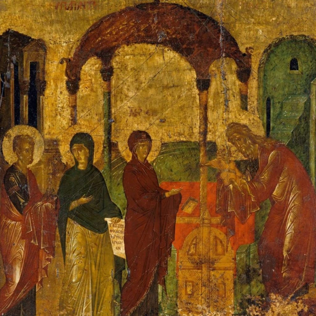
La Présentation fait partie des fêtes du Seigneur, consacrées directement au Christ, mais par son contenu liturgique elle est parti- culièrement proche des fêtes de la Mère de Dieu et dans les temps anciens, lors de son apparition, elle était considérée comme une fête dédiée à la Mère de Dieu. Sur l’icône de la fête, les représentations du Christ et de la Mère de Dieu sont égales en importance : l’Enfant- Sauveur assis sur les bras de Syméon, Celui qui a reçu Dieu, qui reçoit dans ses bras le Sauveur et apparaît comme le monde Ancien qui s’emplit de la Divinité –, et la Mère de Dieu qui s’engage sur Son chemin de croix – le don de Son Fils pour le Salut du monde. Et toute l’icône exprime dans sa construction cette double nature de la fête, la joie de la Rencontre et l’affliction de la Passion, ce qui est contenu dans les paroles de Syméon, Celui qui a reçu Dieu, dans le sens prophétique des paroles du vieillard: «Vois! cet enfant doit amener la chute et le relèvement d’un grand nombre en Israël ; il doit être un signe en butte à la contradiction » (Luc 2, v. 34). Ces paroles sont pleines d’un sens eschatologique qui se rapporte à la mission du Sauveur ; elles sont emplies d’une vision prophétique de la fin des temps et de l’attente du Jugement et du Siècle à venir. Et c’est du même sens eschatologique que sont emplies les paroles adressées à la Mère de Dieu: «Tu portes toutes les afflictions du monde pour le salut du genre humain déchu.»
Moine Grégroire Krug, Carnets d’un peintre d’icônes
The term « Russian avant-garde » made its first appearance in European Marxist or Marxist-influenced circles in the 1960s. In the 1910s and 1920s the creative innovators of the Russian Empire, and then of the Soviet Union, spoke out for a « art of the left » – not in the political sense before the revolutions of 1917, but in the sense of a struggle against the conservatism of the art schools and academies. The « inventors » of the « Russian avant-garde » appellation then adopted it as a product of the October Revolution and used it to fabricate the myth of the « Twenties », an era when every success was supposedly due to the Bolshevik revolutionary impetus. During the years of the Stalinist Terror, however, this form of art was consigned to oblivion in the storerooms of the USSR’s museums, when it was not actually destroyed in the autos-da-fé of the late 1920s.[1]
Russia’s visual arts were long the poor cousins of international art history, victims of the deep-rooted notion that while the country undeniably possessed a splendid literature, as well as music and ballet of great originality, it was not a land of painters. Some critics even went as far as damning Russian painting as no more than an imitation of Byzantine art.[2]Louis Réau’s classic book L’art russe des origines à Pierre le Grand (« Russian Art from the Beginnings until Peter the Great », 1921) was a pioneering work in many respects, but some of its overall aesthetic judgements ring false today: the author speaks, for example of the « relative inferiority of Russian art » as compared to the Western – and the Japanese and Islamic – varieties, attributing this to its « lack of outreach »;[3]judgements like these are accompanied by generalisations about the influence of soil and climate, very much in the tradition of Hippolyte Taine’s philosophy of art. Ultimately it took Paul Valéry to break with these mandatory correlations between art and things other than itself, and consider it in terms of its being, presence and specific aura. From this changed point of view the Russian art of the left of the 1910s and 1920s represented a crucial advance in the perception of the painting of icons as one of the essential loci of universal art.
Moreover, the Russian artists who were working in Paris helped maintain this notion of the absence of original painting in their homeland. As late as 1956 we could find André Salmon writing, « It has to be said that Russia has never had any visual artists apart from the craftsmen who painted icons strictly in the Byzantine tradition, and the delicious painters of signs: of the baker with his golden loaves, of the caterer with his plates of kasha, his bottle of vodka and his serviette worn like an archimandrite’s hat – when in fact there was no serviette at all; together with the popular image makers inspired by national folklore, turning out instinctive little masterpieces from which the only person who has succeeded in drawing some benefit for real art was the simultaneously, or by turns, innocent and crafty Chagal [sic], who is Jewish.
« At the age of twenty in Saint Petersburg, when early exile had left me ignorant of almost everything in French painting since Courbet, I needed no great skill to recognise this total absence of painterly genius among the Russians. »[4].
It was not until the 1960s that art historians in the West called attention to the sheer breadth of painting in Russia in the first quarter of the twentieth century, and to an art scene as original and universal as the one that had seen the flowering of the Russian schools of icon painting from the fifteenth to the seventeenth centuries. English art historian Camilla Gray’s book The Great Experiment: Russian Art 1863–1922came as a revelation in 1962.As the wife of Oleg Prokofiev, son of the composer, Gray had access to the reserves of the museums in the two Russiancapitals, as well as to private collections. Magnificently illustrated, the book made public a hitherto unknown body of innovative works by Russian artists; and at the same time it enabled its author to highlight the work of émigré Russians living in the West – mostly in France and mostly unknown – and give them a place in a common history: that of the pre-Revolutionary era and the splendid upsurge that followed. This discovery was fêted in a host of exhibitions in Germany, the United States and Japan; and the artists of the Russian Empire who were working in Paris, and whose Russo-Soviet past had been somewhat played down, now saw their « avant-garde » period brought into the spotlight. Among them were Larionov and his companion Natalia Goncharova, Kandinsky,[5]Chagall, Pougny, Pevsner etc.. It became clear that the experiments of Russia’s innovators had coincided with the bold work that had been going on in the West in the early twentieth century, actually pre-empting it in some cases and in others providing a decisive stimulus. It now became vital to tell the full truth about an avant-garde threatened by oblivion, and at the same time to get to know the circumstances that had forged it; only thus would the issues be made clear. Thus it became fashionable to display, in one way or another, a fondness for the golden age of the 1910s and 1920s in Russia and the Soviet Union.
Gray’s book caused a furore in official Soviet circles, and for more than a decade all access to the reserves at the Tretyakov and the State Russian Museum was denied. Even so, Western specialists had the chance to become better acquainted with the avant-garde through the extraordinary collection of Georgy Costakis, whose Moscow apartment, a veritable museum, remained open to visitors throughout the 1960s and up until Costakis left for the homeland of his Greek ancestors in 1977. His departure entailed leaving behind at least half his collection, now the jewel in the Tretyakov crown. The remaining 1275 pieces followed him Westwards; they were acquired by the Greek state in 1997 and are now the basis of the collection of the Museum of Contemporary Art in Salonika.[6]
Probably the first events throwing some (still very partial) light on avant-garde Russian art were the 1968 exhibition L’art d’avant-garde russe. 1910–1920, organised in Montreuil by Pierre Gaudibert, and an issue of the bilingual magazine Cimaisedevoted to the subject.[7]Limited to works available in the West, the Montreuil exhibition used photographs to round out its survey.
The 1970s were marked by a number of dazzling events instigated by Pontus Hulten, the Swedish director of the new Centre Pompidou. The Malevichretrospective, curated in 1978 by Jean-Hubert Martin, was followed by the first international colloquium devoted to the founder of Suprematism and, most notably, the monumental Paris-Moscowexhibition of 1979. He had already attracted attention with a Vladimir Tatlin show in Sweden in 1968, curated by Troels Andersen.[8]It was Hulten, too, who initiated the reconstruction of the model of Tatlin’s Monument to the Third International, based on the plans and photographs of the three earlier models built by Tatlin in his Petrograd studio with the aid of his « creative collective » (which included Sophia Dymshits-Tolstaya) between 1920 and 1925. Tatlin’s Tower, as it is also known, was famed for the violent debates it had triggered among architects, painters and politicians. A spiral ultimately meant to be higher than the Eiffel Tower, it combined some of the latter’s features with elements of traditional representations of the Tower of Babel, Geometrical Cubism and Futurist dynamism. Hanging from steel cables inside the spiral and revolving at different speeds were a cylinder, a pyramid and a cube, intended as a meeting room, exhibition space and concert hall.[9]
WithParis-MoscowHulten had succeeded where André Malraux, General de Gaulle’s minister for culture, had failed: with the help of Soviet museums he put on show a selection of the art created in the USSR during the first three decades of the twentieth century.
DespiteParis-Moscow‘s « art bazaar », holdall character, which did little to facilitate viewer reception of the Russian avant-garde,[10]it had an impact that earned the twentieth-century Russian School a place on the world art scene, especially as it was part of the series of enormous exhibitions that also included Paris-New York, Paris-Berlinand Paris 1937–Paris 1957.
Significantly, it was at the Malevich retrospective and Paris-Moscowthat Hulten revealed his discovery of all Malevich’s post-Suprematist paintings in the reserves of the State Russian Museum. He had only been able to include some of them in the Malevich exhibition, but he emphasised their importance. One of the dominant – and dogmatic – critical approaches of the time was that of American art critic Clement Greenberg, who saw this return to the figurative as « reactionary ». Rejecting this judgement, Hulten spoke of « an inspired, visionary art » indicative of « total independence and freedom » and « the fundamental importance of artistic creation and its autonomous power over supposedly logical and teleological theory. »[11]
There had not been an exhibition on this scale in the West or the USSR since 1922 and the famous Soviet exhibition at the Van Diemen gallery in Berlin.[12]The Russian avant-garde was still present, albeit to a lesser extent, in the USSR pavilion at the 1924 Venice Biennale, which featured the three fundamental Suprematist images – Black Square, Black Crossand Black Circle– accompanied by five of Malevich’s spatial architecture drawings: the planitsor space houses. The same exhibition included the first European appearance of the Organicist School, with works by Matyushin and his disciples Maria, Xenia and Boris Ender. Similarly in Paris in 1925, the International Exhibition of Modern Industrial and Decorative Arts created a significant but unfortunately short-lived stir with its highlighting of Constructivist architecture: the Soviet pavilion was built by the Constructivist master Konstantin Melnikov, and Rodchenko presented his celebrated « Workers’ Club ». The theatre sets and costumes triumphed – with Yakoulov and Meller receiving first prizes – as did all the applied arts: textiles, clothing, ceramics, display stands, kiosks, posters and books.[13]
But to come back to Paris-Moscow: it needs to be pointed out that for this exhibition and other, similar ones up until the collapse of the USSR in 1991, contributions by Soviet museums involved negotiation and ideological compromise, with French curators who wanted to show masterpieces by the « Russian avant-garde » finding themselves forced to submit to the bargaining demands of Soviet officials: you want Malevich, Kandinsky, Chagall, Lyubov Popova? – okay, but you also have to take the Socialist Realists BorisIoganson, Grekov, Plastov, Laktionov, the Kukrinskys and so on. Even so, the 1980s saw a series of exhibitions highlighting the unique contribution of avant-garde art from Russia and the Soviet Union, in London,[14]New York,[15]Los Angeles,[16]Budapest and Vienna.[17]
At the beginning of the 1990s the Centre Pompidou organised the world’s first retrospective of the great artist Pavel Filonov, whose concept of painting went directly counter to that of the Russian avant-garde: contrary to the tendency towards minimalism and extreme reduction of figurative elements – which were totally eliminated in Malevich’s Suprematism – the « Analytic Art » of Filonov and his school aimed at an uncompromising, atom by atom, saturation of the picture surface. Probably the most Russian of all the practitioners of his country’s art of the left, Filonov was greeted with bafflement by French critics and the French public. Doubtless there should have been greater contextualisation and explanation of the total, multivocal specificity of Filonov’s theoretical approach, imagery and polysemy. His magnificent Formula of Spring, included in this exhibition, is an absolute masterpiece that sums up all its creator’s splendid implexity. The « atomistic » technique of its finish, and of the relentless work on each tiny section of the canvas, shows the work’s gradual construction in wave after wave of microcosms drawn-painted with incredible meticulousness until a new, macrocosmic organism takes shape. The « painterly rain » of Formula of Springis that of light-hatching, of universal colour-hatching, to borrow from some of Filonov’s titles. Matyushin was the first to decipher his ever-enigmatic creativeness, and the following brief passage provides a key to seeing and understanding Filonov’s pictures:
« Filonov’s style-texture is astonishing both in its variety and its method of combining areas of thick impasto with others laid in so subtly that they almost vanish into the air, strangely, while at the same time form is condensed or deployed with incredible vigour and boldness. The old masters could only have dreamed, maybe, of such colossal technique, but their tasks and their means were different . . .
« Filonov understands movement not as included in the visible periphery of things, but rather as going from the centre outwards, and vice versa . . .
« This is not cerebral analysis, but the intuitive deduction of a clairvoyant able, thanks to his stunning mastery, to disentangle the Threads of Fate of the Norns. »[18]
The collapse of the USSR in 1991 cleared the way for numerous exhibitions which, by drawing extensively on the collections of the Tretyakov Gallery and the State Russian Museum, clarified and broadened our knowledge of the historical sequence of artistic innovations. In 1992, for example, Frankfurt welcomed a huge ensemble of paintings, sculptures and examples of the applied arts: theatre sets, industrial design, posters and photographs. This was a kind of variation on Pontus Hulten’s Paris-Moscow, but this time freed of all the politico-ideological constraints and thus well structured and more comprehensible. The exhibition in question was The Great Utopia: The Russian Avant-Garde, 1915–1932, which later travelled to Amsterdam and New York.[19]
« The Great Utopia » was a direct reference to « O Velikoi Utopii », a brief article written by Kandinsky in 1920, in which the author of Concerning the Spiritual in Artputs forward the « utopian idea » of an international art congress for which « one would have to mobilise, apart from the three arts already mentioned [painting, sculpture, architecture], all the others: music, dance, literature in the broad sense, and poetry in particular, as well as theatrical artists from all branches of the theatre, including the intimate stage, variety, etc., right up to the circus. » The result of this « Congress of Representatives of All the Arts of All Countries », Kandinsky hoped, would be « the building of an international house of art » which « would have to accommodate all branches of art . . . but also those which have existed and which exist only in dreams – without any hope of these dreams ever being realised. »[20]
The Die große Utopieexhibition helped shore up the myth, widespread among Western critics, that in a way the Russian avant-garde, in what had become the Soviet Union, had failed to fulfil its aspirations, and that this utopianism was conditioned by the Marxist-Leninist political utopia and its monstrous outcomes. I have already pointed out elsewhere the inexactness and skewed perspective of this myth of a utopia.[21]The « utopian » project of this art of the left was in fact directed towards the world to come, which means, in these early years of the twenty-first century, that the huge formal, intentional and conceptual reservoir created by the avant-gardists has not been drained and remains a fertilising influence for art forms including choreography,[22]architecture[23]and even fashion.[24]
The other historiographical myth regarding the Russian avant-garde of the early twentieth century is that of the « Twenties », mentioned at the beginning of this article. In a way the Great Utopiaexhibition in Frankfurt set out to reinforce this view of things. The choice of dates is far from innocent, tending as it does to make the history of Russia’s art of the left begin in 1915 – a year which did, it must be said, see the appearance on a massive scale of a new art form: Tatlin’s pictorial reliefsand counter-reliefs(at the Tramway Vexhibition) and Malevich’s Suprematism (at the 0. 10 exhibition). And before 1915? Can one really not know that L’Année 1913(« The Year 1913 »), the three-volume work edited by Liliane Brion-Guerry in the early 1970s, demonstrates that when the War of 1914–1918 broke out, virtually all of the radical innovations had already taken place – completely or embryonically – and that the developments to come only added to the formal notions of the first half of the 1910s?[25]
I should point out here that I was one of the first, if not the first, to demonstrate the flimsiness – not to say the outright erroneousness – of the « Twenties » myth.[26]Let us not forget that in less than a decade – that of the « Nineteen-Tens » – all the recent artistic codes (Impressionism, Post-Impressionism, Cézannism, Fauvism, Primitivism, Cubism, Italian Futurism) had been assimilated in Russia; and that the totally new pictorial cultures that emerged remain even now, as I have already emphasised, a continuing source of ways of apprehending reality: the Neo-Primitivism of 1907–1909; Cubo-Futurism (1912–1914); Larionov’s Rayonism (1912–1913); Suprematism (1913), including the scenery forMatyushin’s sets for theopera Victory Over the Sun, in which Malevich’sblack squareappears in the gravedigger’s costume; Tatlin’s « pictorial reliefs » (1914); Filonov’s Analytic Art, outlined in his « Made Art » manifesto of 1914; and the Organicism of Matyushin and his wife Elena Guro, who died in mid-1913. The first rooms of the Grimaldi Forum exhibition cover these trajectories and the movements associated with artists who are among the greats of the century: Larionov, Malevich, Tatlin, Filonov, Yakoulov, and the astonishing, unique series of women painters that included Natalia Goncharova, Alexandra Exter, Olga Rozanova, Lyubov Popova and Nadezhda Udaltsova.
What emerges from all this is that it was not the sociopolitical revolution that sired the avant-garde in Russia and Ukraine, but rather, as Malevich asserted, the artistic revolution which, while it did not sire the social revolution, prefigured it.
This is not to say that the « Twenties » do not represent a glorious moment in the history of the arts. One of the great « merits » of this era of radical sociopolitical revolution is that it gave unexpected resonance to the avant-garde revolution of the pre-Revolutionary years; all the more so in that progressive movements all over the world were dutifully looking to the October Revolution as a driving force for every kind of avant-garde audacity. In reality, though, relationships between the authorities and avant-garde artists were never harmonious, even under People’s Commissar for Education Anatoly Lunacharsky, a writer and Marxist-influenced thinker. Lenin himself preferred Gorky’s poetics to Mayakovsky’s and, in the visual arts, the committed realists of the nineteenth century to the « Futurists » – the blanket term for the miscellaneous avant-garde movements. After five years of tolerance and relative freedom, in 1922 the Communist Party took up arms against the « art of the left » whose aesthetic was declared « bourgeois » because it had taken shape during the « imperialist era ». This latter term was used to designate the avant-garde works on show in the State Russian Museum in Leningrad, directed by art historian Nikolai Punin; a self-declared « Communist-Futurist » alongside Mayakovsky in 1919, Punin would have to capitulate to the prevailing Stalinist diktats by 1925–1926. In March 1922 this shift by the Communist Party found expression in the formation of the Association of Artists of Revolutionary Russia (AKhRR, 1922-1932), the most virulently anti-avant-garde of all the artistic-political organisations. The association and the eleven exhibitions it organised were the source of the dogma of « socialist realism », whose basic concept would be laid down by Gorky at the First Congress of Soviet Writers in 1934.
And yet the « Twenties » saw the birth, in 1921–1922, of the last historic European avant-garde movement: Soviet Constructivism. Rodchenko shattered the age-old precepts of sculpture with his constructed objects – his rectangular, spherical and vertical Spatial Constructionson stands, and hisHanging Spatial Constructionssuspended on wires from the ceiling – which comprised triangles within triangles, hexagons within hexagons, quadrilaterals within quadrilaterals, circumferences within circumferences and ellipses within ellipses. In these two types of sculpture, shown at the Society of Young Artists (OBMOKhU, 1921–1923) in Moscow in May 1921, we can see precursors of Calder’s stabiles and mobiles, first shown in Paris ten years later. In January 1922 three OBMOKhU artists, Konstantin Medunetsky and the brothers Georgy and Vladimir Stenberg, presented their Constructivistsexhibition in Moscow – the first public use of the term. It had been preceded in September 1921 by 5 x 5 = 25,a manifesto exhibition by recognised avant-garde painters Varvara Stepanova and her husband Rodchenko, Alexandra Exter, Lyubov Popova and Alexander Vesnin. The pieces on show owed nothing to easel painting, being in fact the preliminaries to spatial constructions and productivist art. The « death of the picture »[27]– the end of all « contemplative » art, and the concomitant proclamation of the advent of « active » art – led to artists turning en masse to the designing of constructed theatre sets. Art was now intended to serve technology and industry. Strictly speaking, it could even be said that there was no such thing as « Constructivist painting », Constructivism having emerged in opposition to easel painting. « Composition » was replaced by « construction », the picture by « spatial forms » and the artist by the « engineer » or « constructor », the aim being a radical transformation and modelling of the human environment. Such was the self-set task of Constructivism’s practitioners in the 1920s.
At the same period two major schools of the Russian-Soviet art of the left were developing: Matyushin’s Organicist School (1918–1934) and the Masters of Analytic Art, revolving around Filonov (1925–1933). Opponents of the Futurist cult of the machine, Matyushin and his circle stressed the organic and indissoluble nature of the reciprocity between man and nature. This led them to set up the Zor-Ved (Seeing and Knowing) research centre, where Matyushin’s ideas on expansion were implemented and tested out through everyday visual functioning. This « new perception of space » – this « expanded vision » – was a « deliberate act aimed at unifying not only the eye’s central vision, but also the vision of the peripheral areas. » The goal of these experiments was to activatevision, to cause it to develop its existing receptive capacities and discover a new organic substance and rhythm in the apprehension of space. A striking feature of Xenia Ender’s work is the unmistakable analogy between the divisions within her images and the cellular poetics of the work of Serge Poliakoff thirty years later. When Georgy Costakis showed visitors Ender’s pictures in his Moscow apartment, he never failed to point out this similarity.[28]
The collapse of the USSR in 1991 brought a worldwide avalanche of exhibitions, an impactful early example being curator Henry-Claude Cousseau’s The Russian Avant-Garde 1905–1925: Masterpieces from Russia’s Museums, at the Musée des Beaux-Arts in Nantes in 1993. Cousseau’s tour de force consisted in bringing together unknown masterpieces from the reserves of museums in the Russian Federation’s provinces: from Astrakhan, Yaroslavl, Ivanovo, Nizhny Novgorod, Nizhny Taghil, Ufa, Samara, Simbirsk, Slobodskoy and Tula. In doing so Cousseau offered the French public access to hitherto unseen works by artists like Kandinsky, Malevich, Larionov, Natalia Goncharova, Alexandra Exter, Olga Rozanova, Lyubov Popova, Varvara Stepanova and Ivan Kliun. Thus the exhibition represented a significant addition to our knowledge of this innovative current, and all the more so in that it included artists – among them Sofia Dymshits-Tolstaya, Mikhail Le Dentu, Alexei Morgunov and Polish painter Władysław Strzemiński – who had not yet found their place in art history.
France, though, would have to wait another ten years for a comparably impressive exhibition of the art of the left in Russia and the Soviet Union: Jean-Louis Prat’s Russia and the Avant-Gardesat the Maeght Foundation in 2003. Rather than a summary of what was already known about artistic events in Moscow and Saint Petersburg/Petrograd/Leningrad, this was a totally original overview of the historic avant-garde of the 1910s and 1920s, now an integral part of the global art landscape. It included works never shown in France before, among them Filonov’s extraordinary Formula of Spring, an unqualified masterpiece and a splendid summary of its creator’s « analytic art ». The Grimaldi Forum has had the good fortune to be able to show this work, which almost never leaves the State Russian Museum in Saint Petersburg because of its size and the transport problems it poses.
The Maeght Foundation exhibition also presented, for the first time in France, Black Square, Black Crossand Black Circle. I wrote of them at the time that Jean-Louis Prat had displayed these fundamental forms of Malevich’s Suprematism « like an introductory and closing chord. » This minimalist trilogy revealed the supremacy of Nothingness, of the objectless, and of colour emanating not from the sun, but from the depths of this objectlessness. The coloured surface « kills the subject », leaving manifest only the movement of its coloured forms. While black and white are « the energies that unveil form », the painter would also use polychromy to point up the quadrilaterals which, like planets, are suspended at the heart of the white ground of infinite space.
Beginning in 1920, as flat Suprematism evolved towards architectonic Suprematism, the « Suprematist straight line » came to the fore. In Berlin in 1927, in the film Malevich was working on with Hans Richter, this « volumetric straight line »[29] »is compressed into a square » and forms « two colonies »: « a cruciferous colony » which, « through spinning, forms a circle. » The Black Squareis systematically the base of the development – via the stage of « Suprematist volumo-construction objects »[30]– towards what Malevich calls architectony. Out of the extension of the square through a horizontal and a vertical plane intersecting perpendicularly, comes the Black Cross, whose spinning gives rise to the Black Circle. The Black Circlethen becomes the culmination of the movement of the Universe – of « cosmic thought ».
Jean-Louis Prat’s exhibition also revealed, for the first time in France, the painting of Matyushin and the Enders. As I see it, this presentation of the avant-garde definitively cut the ground from under the one-sided sociopolitical interpretation of Kandinsky’s spiritual concept of the Great Utopia. It did so simply by foregrounding one of the apogees of human creativity, a miraculous moment in the history of art: the combination of a vigorous primitivism, a radical abstraction (objectlessness) founded on the energy of colour, robustness of formal composition, and an unrivalled rightness of conception.
Among the many major exhibitions in Europe between 2003 and 2015, I shall briefly mention three: Kazimir Malevich: Suprematismus (Berlin/New York/Houston, 2003–2004), curated by Matthew Drutt; La Russie à l’avant-garde, 1900-1935(Brussels, 2005–2006), curated by Evgenia Petrova and Jean-Claude Marcadé; and Kazimir Malevich and the Russian Avant-Garde: Featuring Selections from the Khardziev and Costakis Collections(Amsterdam, 2013–2014), curated by Bart Rutten et al. Matthew Drutt’s exhibition offered for the first time the most exhaustive possible coverage of Suprematism as radical abstraction.[31]For the Brussels exhibition Evgenia Petrova opted in both Russian and English for the title The Avant-Garde: Before and After: this enormous grouping of 400 works was intended not only to retrace the trajectory of the art of the left in Russia and the Soviet Union, but also to interconnect the avant-garde’s forms of radicalism with what had preceded them (in particular Symbolism and Art Nouveau) and what had followed (Post-Suprematism, the late works of Filonov, the romanticism of Alexander Samokhvalov). The third – magnificent – exhibition, in Amsterdam, included the Stedelijk Museum’s extensive Malevich holdings, together with many previously unshown works from the collection of the great historian of Soviet art, Nikolai Khardzhiev, who had died in exile in Amsterdam.[32]
Now, at the Grimaldi Forum, we find Jean-Louis Prat taking up the same challenge as just over ten years ago at the Maeght Foundation. And doing so not only with a host of absolute, « must see » masterpieces, but also with new or rarely shown works. Among the latter are the imposing sculptures by Baranov-Rossiné, which round out our knowledge of the reliefs this Russian-Ukrainian artist produced around 1913–1915 (Symphony No. 1from MoMA, Counter-relief(conventionally named « Disabled Artist »)from the Wilhelm Lehmbruck Museum in Duisburg, and Toreadorfrom a private collection in Paris). There is, too, Tatlin’s Blue Counter-Relief, one of the very rare constructions from the period to have survived the vicissitudes inflicted on the avant-garde by the Communist authorities. Of Blue Counter-Reliefthe great Russo-Soviet specialist Anatoly Strigalev has written, « This relief is an especially clear example of the ‘choice of materials’ method, at a time when the immediate constructional tasks were still completely ancillary to the plastic ones. This work exactly matches Tatlin’s ideas during the period, limited to 1914, of his ‘pictorial reliefs’. »[33]Still with regard to the rarities, I should like to mention a Rayonist picture by Alexander Shevchenko, mainly known for his geometrical primitivist Cézannism. This painting comes from the Museum of Fine Art in Perm, in the Urals, where Serge Diaghilev spent the first twenty years of his life. Rayonism, as we know, was one of the very first non-figurative approaches to appear between late 1912 and 1914. It consisted in interpreting reality through a cluster of coloured rays which illuminate the figurative elements from within and thus transfigure them. Rayonism was invented and theorised by Larionov and his companion Natalia Goncharova, who remain its best-known exponents, but it had other practitioners whose work is little known, and the « discovery » of Shevchenko’s Rayonist painting is a valuable addition to the canon. We also find here Rodchenko’s Abstraction (Rupture), from the Costakis Museum, rarely shown because it was painted in late 1920 and does not jibe with its creator’s advance towards constructed art. For while he was developing the « linearism » that was the basis of Soviet Constructivism, Rodchenko was also working on a series of non-constructed works, some of them « cosmic » and others verging on an abstract, lyrical-Expressionist poetics. This approach offers a fit with one of Jean-Louis Prat’s curatorial characteristics: an imperious challenging of the viewer with contrasts driven not by any urge to astonish, but by the certainty that seemingly contradictory poetics can fuse in their quest for essential rhythms. Prat’s intentions are less didactic (in the historical sense) than aesthetic. Thus for him the Russian and Soviet avant-garde is a model of energy profusion which, without discounting the topical backdrop, allows him to play on the visual faculties by stressing the dynamics of form and colour emanating from the objects portrayed. There is, of course, a degree of subjectivity in this kind of approach. But as the Romans used to say, quod licet Iovi non licet bovi. This grounding, depth and solidity of experience and culture ensure a carefully honed sensibility.
From this point of view the choice of the title From Chagall to Malevich may surprise, given that these two great artists seem to be at opposite poles in their concept of painting and their Kunstwollen. Chagall and Malevich have even fewer points in common than Matisse and Picasso, who exist, as a previous exhibition convincingly demonstrated – as if it were necessary – in the absolute irreducibility of their respective poetic-picturological drives. A Picasso reclining nude is subjected to a surgical operation that transforms it from a « tableau vivant » into an example of pure painterly expression. A Matisse reclining nude is subjected to a calligraphy of its contours, which, even when they are deformed or simplified, retain the mellow roundedness of the living model. Chagall and Malevich both addressed subjects taken from provincial life. The latter’s powerful primitivism of 1911–1912 transfers people and things from the sociopolitical context of their time into the zone of the timelessly paradigmatic exemplified here by MowerorReaper. Chagall, in his portrayals of the exotic world of the shtetlsof Belarus, emphasises illuminations, in both the everyday and the Rimbaud-inflected sense.
Chagall’s and Malevich’s primitivist alogicality – one might call it their « pre-Surrealism » – also expresses this polarity. Chagall’s picturology brings out the subject’s expressiveness by accentuating and even exaggerating the figurative elements; making them « grimace », the better to capture their singularities. Malevich, on the other hand, offers a juxtaposed jumble of figurative elements, frequently incongruous and arranged in a totally unorthodox, hieratic fashion that stands reality on its head.
Nonetheless the Chagall-Malevich pairing can seem justified, if for no other reason than their joint presence in 1919–1920 at the Vitebsk Fine Arts School, famously founded by Chagall himself in his home town. In a letter of 2 April 1920 to the Russian-Polish art critic and collector Paweł Ettinger, Chagall mentions the existence of two groups: « 1) the youngsters linked to Malevich and 2) the youngsters linked to me. Both of us are identically making our way towards the art of the left circle [i.e. the « avant-garde »], while having different opinions of the aims and methods of this art form. » The crucial decision was ultimately taken by Chagall’s own pupils, for the most part Jewish teenagers: on his return from a trip to Moscow in May 1920 they informed him that they were leaving him and joining Malevich’s Suprematist UNOVIS (« The Champions of the New Art »).
The Chagall-Malevich comparison, like the one already mentioned between Picasso and Matisse, raises the issue of the « interplay of influences » in the creative process of each. We see Picasso endlessly incorporating, engulfing and recasting figurative elements from painterly practices other than his own, including Matisse’s. Matisse, meanwhile, imperturbably followed his own creative line, never letting himself be led astray and never borrowing anything at all except the exhilaration of painting. Great creative figures – I am thinking here of Wagner in music and Kandinsky in painting – have drawn on the work of their contemporaries without diminishing their own originality. Chagall had no qualms about using figurative elements from other pictorial cultures of his time and bending them to his own purposes. Malevich, though, even if decisively prompted sometimes by Natalia Goncharova, Larionov, icons and Russian popular art as a whole, never directly included elements from elsewhere; he always recreatedthese influences in images for which it would be difficult to find exact models.
One of the real highlights of the exhibition is the complete set of murals Chagall painted for the lobby of Alexei Granovsky’s[34]Jewish Art Theatre in Moscow immediately after leaving Vitebsk in 1920. Many of these works bear the aesthetic stamp of Malevich’s Suprematist innovations. Initially sprung from the pen of the great Russian-Ukrainian Yiddish writer Sholem Aleichem, the figures – fairground entertainers, acrobats, violinists, exotic creatures and animals – move through settings made up of geometrical strips and Suprematist circles. The most extraordinary example of this Suprematist pervasiveness is the panel Love on Stage, from the Tretyakov Gallery in Moscow, which pushes pictorial dematerialisation to its outer limits.[35]Never again would Chagall resort to the Cubo-Futurist or Cubo-Suprematist systems. The Chagall-Malevich skirmish in Vitebsk was brief (1919-1920) but electrifying.
This exhibition at the Grimaldi Forum Monaco is proof that Chagall was not, as André Salmon would have it, the only artist to draw successfully on the enormous arsenal of vigorous, expressive forms offered by the popular arts of the Russian Empire. Its title –From Chagall to Malevich: The Revolution of the Avant-Garde – says exactly that.
[1]Decisions to destroy works of art on the grounds that they were valueless were taken by special committees. There was one such committee at the Tretyakov Gallery, but liquidations took place in several other USSR museums. To my knowledge no study of this subject has yet been made. We do know, however that Malevich’s Guitaristdisappeared from the museum in Samara and that some ten of the fifteen Cubist paintings by Andreenko in the museum in Lviv were destroyed.
[2]I recall a lecture at a seminar organised by Pierre Francastel at EHESS in Paris, in which the eminent Soviet art historian Mikhail Alpatov raised the issue of Byzantine and Russian art with regard to the painting of icons. Alpatov said that anyone who could not see in these two forms identical but dissimilar modes of expression made him think of someone who could not tell Bach from Mozart.
[3]Louis Réau, L’art russe, des origines à Pierre le Grand(Paris, Laurens, 1921), p. 14.
[4]André Salmon, Souvenirs sans fin. Deuxième époque (1908-1920)(Paris: Gallimard, 1956), p. 228
[5]Even in the 1960s Nina Kandinsky preferred to refer to her husband as « European » rather than « Russian ». And at the Hermitage the imposing Composition VIwas exhibited as part of the « German School ».
[6]The most comprehensive account of the Costakis Collection as a whole is Angelica Zander Rudenstein’s The George Costakis Collection: Russian Avant-Garde Art(New York, HarryN. Abrams, 1981).
[7]Cimaiseno. 85-86, February-March-April-May 1968, included « The Situation of the Avant-Garde in Russia » by Michel Hoog; « Malévitch the Misunderstood » by Miroslav Lamač; articles on Pevsner, Pougny, « From Russian Futurism to the Morrow of October by the Voice of Maïakovsky », and « The Architectural Revolution in the USSR from 1921 to 1932 » by Michel Ragon, together with an introduction to the « unknowns » Mansouroff, Yakoulov and Baranoff-Rossiné.
[8]See Troels Andersen (ed.), Vladimir Tatlin, exhibition catalogue (Stockholm: Moderna Museet, 1968).
[9] Cf. Jean-Claude Marcadé, « La Tour à la IIIème Internationale », in L’Avant-garde russe. 1907–1927(Paris, Flammarion, 2007), pp. 252–260.
[10]I refer the reader to my review « The International Exhibition ‘Paris-Moscow’: The Problem of Reception and Museography of Russian Art in the West », in Hans-Jürgen Drengenberg (ed.), Art in Eastern Europe in the 20th Century(Berlin: Arno Spitz, 1991), p. 389.
[11]Pontus Hulten, « L’idée d’avant-garde et Malévitch, homme de ce siècle », in Malévitch(Paris: MNAM, 1978), p. 8. At the International Malevich Colloquium I emphasised the power and enduring character of these works and a return to the figurative that was totally unexpected given the European climate of the famous « return to order » of the late 1920s and early 1930s. The post-Suprematist paintings, I said, heralded a new figuration. See Jean-Claude Marcadé, « Allocution d’ouverture », in Malévitch. Actes du Colloque international tenu au Centre Pompidou (Lausanne; L’Âge d’Homme, 1979), p. 10.
[12] See Moskau-Berlin. Erste russische Kunstausstellung: Berlin 1922: Galerie van Diemen & C°(Cologne: W. König, 1988); and Helen Adkins, « Erste russische Kunstausstellung », in Eberhard Roters et al. (eds.), Stationen der Moderne(Berlin: Berlinische Galerie, 1988), pp. 185–215.
[13]For a sound overview of the International Exhibition of Modern Industrial and Decorative Arts, see the special issue of Waldemar George’s magazine L’Amour de l’Art, no. 10, October 1925.
[14]Abstraction: Towards a New Art, The Tate Gallery, 1980
[15]An exhibition of the Costakis Collection at the Solomon R. Guggenheim Museum, 1981-1982.
[16]The Avant-Garde in Russia 1910–1930: New Perspectives, County Museum of Art, 1986. Stephanie Barron, co-organiser of the exhibition with Maurice Tuchman, visited my wife Valentine and myself in Paris to ask us to contribute to the catalogue. When she named Ermilov as one of the exhibitors, we remarked in surprise, « But that’s not the Russian avant-garde, that’s the Ukrainian avant-garde! » To which she replied, « Is there such a thing as a Ukrainian avant-garde? » The upshot was the article Valentine Marcadé, »Vasilii Ermilov and Certain Aspects of Ukrainian Art of the Early Twentieth Century » on pages 46–50 of the catalogue.
[17]The coming of perestroika brought to light hitherto unknown masterpieces. See the exhibition catalogueKunst und Revolution. Russische und Sowjetische Kunst 1910–1932(Vienna: Vertrieb, Gesellschaft fur Österreichische Kunst,1988).
[18]Mikhail Matiouchine, « La création de Pavel Filonov » [1916], in Continent, no. 1 (Paris: Albin Michel, 1989), pp. 168–169.
[19]See the catalogue, The Great Utopia: The Russian and Soviet Avant-Garde, 1915–1932(New York: The Solomon Guggenheim Museum, 1992).
[20] Kenneth C. Lindsay and Peter Vergo (eds.), Kandinsky: Complete Writings on Art, (New York: Da Capo, 1994), pp. 444-448, 464.
[21] Jean-Claude Marcadé, « Utopisme ou prophétisme? », in Jean-Louis Prat(ed.),La Russie et les avant-gardes(Saint-Paul de Vence: Fondation Maeght, 2003), pp. 237–245.
[22]I am thinking, among other examples, of Decouflé’s choreography for the Winter Olympics in Albertville in 1992, and of the specific references to the Russian avant-garde at the splendid Sochi Winter Olympics in 2014.
[23]There seems to me to be a strong Suprematist influence in contemporary Japanese architecture; likewise, in many buildings by Frank Gehry– in particular the Bilbao Guggenheim – we find decisive stimuli traceable back to Tatlin (especially the Monument to the Third International) and the Constructivism of Pevsner and Gabo.
[24] The mathematician Etienne Ghys, in an extremely knowledgeable talk on « geometry and fashion » given in Lyon on 14 November 2014 (see dailymotion.com, « La géométrie et la mode avec Étienne Ghys »), cited among other examples Issey Miyake’s « developable dresses » and, from the art world, Antoine Pevsner’s sculpture Developable Surface, now in the Peggy Guggenheim Collection in Venice.
[25] Liliane Brion-Guerry(ed.), L’année 1913. Les formes esthétiques de l’œuvre d’art à la veille de la première guerre mondiale, 3 vols. (Paris: Klincksieck, 1973). See also Duccio Colombo and Caterina Graziadei (eds.), L’Anno 1910 in Russia(Salerno: Europa Orientalis, 2012).
[26]See, for example, Jean-Claude Marcadé, Le Futurisme russe 1907–1917: aux sources de l’art du XXème siècle(Paris: Dessain & Tolra, 1989).
[27] Emblematic of this « putting to death » of traditional painting were the three Rodchenko paintings shown at the 5 x 5 = 25 exhibition, each a primary-coloured monochrome: Pure Red Colour, Pure Yellow Colourand Pure Blue Colour. Red, yellow and blue would seem to represent the degree zero of painting as the colours that are the simplest, the least variable, the purest, and also the only ones that the retina can perceive quintessentially. At the same time they are the most neutral and thus open to repetition. This entails, as Varvara Stepanova wrote, the destruction of « the sacred value of the artwork considered as something unique ». Rodchenko’s three monochromes can also be seen as a Duchamp-style act, but his annulling of easel painting does not signify an annulling of the painterly, of which the picture is only one, historically outdated incarnation. Duchamp’s act, by contrast, was intended to replace painting with products resulting from a conceptually inflected decision. [28] It is not impossible that the young Poliakoff, who was twenty-four when the work of Matyushin and the Enders was first shown in the West – at the Venice Biennale of 1924 – actually saw these pictures, and that the event remained buried in the depths of his visual memory. The ways of creativity are inscrutable…
[29]Kazimir Malevich, « Lettre de Malévitch à la rédaction d’Architecture contemporaine » [1928], in Écrits(Paris: Allia, vol. 1, to be published in October 2015), p. 407.
[30]Ibid. This term is clarified and expanded on in Patrick Vérité, « Malevič et l’architecture. À propos des ‘objets-volumo-constructions suprématistes’ », Les Cahiers du Mnam, no. 65, autumn 1998, pp. 39–53
[31]This is the only chance the West has had to see the famous black Quadrangleof 1915 (and then only at the Guggenheim in New York), which had vanished into the reserves of the Tretyakov Gallery in 1920, resurfaced there in 1991 and stayed there, having been judged untransportable. See Matthew Drutt, Kazimir Malevitch : Suprematism(New York: Guggenheim Museum, 2003).
[32]See Geurt Imanse and Frank van Lamoen, Russian Avant-Garde: The Khardzhiev Collection(Amsterdam: Stedelijk Museum, 2013).
[33]Anatoli Strigalev, « Les Reliefs picturaux de Vladimir Tatline: Le Contre-relief bleu« ,Connaissance des Arts, no. 498, September 1993, p. 83.
[34]See Béatrice Picon-Vallin, Le théâtre juif soviétique pendant les années vingt(Lausanne: L’Âge d’Homme, 1973).
[35]See Benjamin Harshav, « Note sur l’ Introduction au Théâtre juif « , in Marc Chagall. Les années russes. 1907–1922, catalogue of the exhibition curated by Suzanne Pagé et al., (Paris: Musée d’Art Moderne de la Ville de Paris 1995), pp. 200–217.
Первые связи Самуила Аккермана со священной землей Израиля завязались через насыщение литургией, писаниями, раздумьями над иудейской традицией на его родной Украине, в этой карпатской местности на стыке славянского, венгерского и цыганского миров. Здесь в 1970-ых годах художник разработал целую «флоральную» эстетику, повествующую о мире в беспредметных притчах, красота которых идет от искусства, настоенного на узоре, от формального вдохновения, источником которого послужили частично гуцульское народное искусство, частично Врубель киевского периода.[2] Физический контакт с землей Израиля, начиная с 1980-ых годов, позволил художнику расширить живописное видение и воплотить его в новом свете и новом пространстве. Он, вне сомнения, еще продолжает свои исследования цветения мира и размышления в символических линиях и цветах удивительной сложности – наследие Врубеля, и даже Филонова, – чередующихся с произведениями значительно более минимальной иконографии, наследием супрематизма Малевича, цитируемого неоднократно. Диалог с ним никогда не прекращался, и многочисленные вариации живописного словаря Малевича мы обнаруживаем, например, в Красной заповеди, в которую вовлекается «кривая мира» из Супремуса N° 58, находящегося в Государственном Русском музее; она повторяется в сочетании с черным крестом, в который вписана еще одна малевичевская метонимия вселенной, «слеза» из Супрематизма N° 55 Краснодарского музея, преображенная Самуилом Аккерманом в череп, и, таким образом, превращающая это произведение в синтез супрематизма и алогизма. Та же «кривая мира», которую Малевич именует в одном из набросков руссифицированным польским словом «тарча»,[3] появляется в Надсолнухе (типично хлебниковский неологизм, совсем во вкусе художника[4]). В Супрематической горе чаш, как и в Чаше-лике, Радуге всекрасного или Супрематических чашах, супрематические элементы выходят из чаши, любимой художником формы, которую он использовал в многочисленных вариациях. Эту чашу, со всеми подтекстами, которыми она наделена в иудейско-христианском образном представлении о мире, Самуил Аккерман заимствовал из иконы, символизирующей все русское искусство, Троицы Ветхозаветной преподобного Андрея Рублева, находящейся в Государственной Третьяковской галерее.
В 1980 году эта икона стала предметом диалога карпато–русского художникав форме акции на земле Израиля. Сюжет иудео-христианский в полном смысле этого слова, поскольку он символически изображает «гостеприимство Авраама», как оно поведано в Книге Бытия (18:1-16): три мужа явились патриарху у дубравы Мамре – это «явился Господь», говорится в библейском тексте, и Авраам поклонился им до земли и назвал их Владыка (Адонай). Христианская Традиция увидела в этом явлении трех «странников» образ Бога в трех ипостасях, Элохим (под этим именем во множественном числе Господь говорит с Авраамом в первой книге Ветхого Завета).
Таким образом, этот фрагмент Библии делят между собой иудейская и христианская Традиции. Глубоко иудейский во всех аспектах своей жизни и искусства художник, Марк Шагал дал очень личную интерпретацию этого эпизода в многочисленных ему посвященных произведениях: в серии гуашей-иллюстраций к Библии 1931 года (Авраам, поклоняющийся трем ангелам; Авраам, принимающий трех ангелов, Ницца, Национальный музей Библейского послания Марка Шагала, или холсты Aвраам и три ангела, вариант 1940 года, частное собрание, и вариант 1960-1966 годов, Ницца, Национальный музей Библейского послания Марка Шагала). Шагал обращается в своем примитивистском стиле, близком русскому лубку, к христианской иконографической интерпретации, а именно: равенству трех ангелов по своей форме и сущности.
Поэтика Самуила Аккермана отталкивается от противоположного, поскольку его искусство отрицает миметическую фигуративность существ и мира, даже если то здесь, то там он населяет свои картины персонажами (сам художник, его жена, дочери), это скорее едва намеченные пиктограммы, чем истинные «портреты», – то, что Марсель Коэн назвал «знаками-пиктограммами», «говорящими рисунками», которые «несут значение сами в себе».[5] Единственный элемент, связывающий выбор иудео-христианских тем у Шагала (вспомним десятки его картин с распятием[6]) и у Самуила Аккермана, – это стремление иудаизировать или ре-иудаизировать ветхозаветные темы, столь полно проиллюстрированные христианским искусством, в то время как иудейское искусство, из-за моисеева запрета, под страхом идолопоклонничества, не дало систематической их разработки в пластических изображениях вплоть до второй половины XIX-го века.[7]
И однако, еще со времен ковчега, по обоим концам которого золотые херувимы простирали вверх свои крылья, покрывая его (Исх. 25:18-20), а в христианскую эру – фресок Дура-Еуропос(245 н.э.), иллюстраций из многочисленныхсредневековых иудейских рукописей, возможность пластических изображений, и не только орнаментальных, не прекращала напоминать о себе. XX-ый век стал свидетелем расцвета иудейских художников и скульпторов, принявших участие в самых разнообразных эстетических движениях. В начале 1920-ых годов были даже предприняты попытки создания национального иудейского искусства, будь то под эгидой Культурлиги Киева, Москвы, или Берлина.[8]
Но вернемся к Самуилу Аккерману и его иерусалимской акции, отталкивающейся от иконы Троицы Ветхозаветной Рублева. Эта акцияопределенным образом вписывается в историю сближения христианских ветхозаветных сюжетов с иудейским мировоззрением. Этот же процесс обнаруживается и у поэта из Черновиц, Пауля Целана, с которым Самуил Аккерман ведет напряженный диалог. Вспомним стихотворение «Duseiwiedu» [Tы, будь как ты][9], в котором стих Исайи (Ис. 60:1) в старонемецком варианте Мейстера Экхарта перемежается с современным немецким языком и заканчивается ивритом, транскрибированным латиницей: «kumiori» [Восстань, воссияй]. Как пишет Джон Фелстинер, «Стихотворение Целана отталкивается от немецкого мистика, проведующего Исайю, обращается к иудейскому поэту, возобновляющему свою связь с традицией, и заканчивается образом самого слова, держащего мрак.»[10]
Само собой разумеется, что ни в чем не отрываясь от мира, от своей традиции, от своей веры, Самуил Аккерман нисколько не пытается скрыть или подорвать идею иконы, к которой, нaоборот, он проявляет самое глубокое уважение как человек, и как художник – самое глубокое восхищение. Самуил Аккерман принадлежит своему времени, будучи при этом вскормлен на живописных, религиозных, мистических, поэтических опытах прошлого. Между ним и сакральным произведением Рублева устанавливается диалог. Выбор Иерусалима преднамеренный: речь идет о том, чтобы вернуть Троицу в символическое место, место встречи странника. Для иудейского художника Иерусалим представляет собой именно встречу Другого. Акция, как свидетельствуют созданные на ее основе произведения и снимки, заключалась в развертывании свитка, на котором вырезаны одноцветные гуашевые плоскости. Этот свиток лежит на охряной земле пустыни, в своей обнаженности готовой предаться ласкам духовного дуновения; художник стоя совершает священнический обряд. В начале свиток свернут. Первая часть – это золотое поле, иерусалимский свет; вторая часть сворачивается, оставляя на виду золото; третья линия разрезается на три гуаши; в четвертой появляются четырехугольник (Храм) земли Иерусалимской, рисунок треугольника на свитке, престол и чаша – элементы иконы Рублева, к которым Самуил Аккерман возвращается в многочисленных вариациях, на протяжении всего своего творчества; и наконец, в последней части свиток заново свернут с двух концов, указывающих на перекресток дорог, ведущих в Вирсавию и Вифлеем. Вирсавия – место союза Авраама, отца верующих, где он «призвал имя Господа, Бога вечного» (Быт. 21:33); Вифлеем – для иудеев – место гроба Рахили, а для христиан – земля Иудейская, из которой вышел Добрый пастырь.
xxxxxxxxxxxxxxxxxxxxxx
В Париже Самуил Аккерман с 1984 года. Здесь он живет и работает сегодня, непрестанно при этом возвращась в Израиль. Его интеллектуальное пространство, постоянно обогащаемое библейскими текстами с их иудейской герменевтикой, столкнулось с художественной жизнью французской столицы, сконцентрировавшей в себе все импульсы, пришедшие со всех четырех концов света, с жизнью бурлящей, противоречивой, обостренной, подверженной различным модам. Здесь он преследует свое собственное видение мира, продолжая при этом постоянный диалог с близкими ему по духу художниками, писателями и поэтами, в особенности с Малевичем, Йозефом Бойсом, Вальтером Беньямином и, главным образом, Паулем Целаном.
Коллекционер Беньямин напоминает о поездке немецкого художественного критика в Москву, где «он приобретает множество сделанных вручную деревянных детских игрушек со всех краев Советского Союза, игрушек, которые он скупает на рынках и в лавках»[11]. Ясно, что именно здесь Самуил Аккерман черпает материал для своей иконографии, которая зачастую заимствует у мира детства полный арсенал живописных знаков: с особой настойчивостью повторяется мотив детской коляски, или скворечника и веера. Его раскладная книга Осеменение раскрывает иероглифический словарь Аккермана: детская коляска, веер, одуванчик, несомый дыханием ветра-возбуждения и веером рассеивающий свое семя, которое растет и становится книгой. Отметим совпадение с Паулем Целаном в ассоциировании бессознательного с детством. В стихотворении из сборника Fadensonnen [Нити солнц] говорится:
Более чем в двухстах гуашах и маслах Самуил Аккерман ведет глубоко оригинальный живописный диалог с поэзией Целана. И делает он это принципиально иначе, чем современный немецкий художник Ансельм Кифер в том же диалоге, воплощенном в большой части его работ. Свои произведения гигантских форматов Ансельм Кифер обычно усыпает граффити с цитатами, написанными от руки и идущими, исторически, от византийского иконоборчества до Велимира Хлебникова. Связь между этими надписями и собственно живописным произведением достаточно ослаблена и зачастую произвольна. Ее единственной мотивировкой является интеллектуальный интерес Кифера к поэзии, философии, богословию, даже социологии. Арийский немец католической культуры, он смело вступил в диалог с поэтической мыслью, укоренившейся одновременно в немецкой и иудейской традициях. Само собой разумеется, что Ансельм Кифер не мог взять за образец все герменевтические аспекты автора DieNiemandsrose [Роза – Никому] или Sprachgitter [Решетка языка]. Иногда он удовлетворяется чистыми граффити, заимствованными из Lichtzwang[13] или MohnundGedächtnis [Мак и память]. Он выделяет величественную Фугу смерти, которая позволяет ему отразить семантические и лексические элементы привычным арсеналом материалов, почерпанных непосредственно из природы или человеческой физиологии: уголь, пепел, земля, песок, ветви, хворост, метал, гуммилак, солома, человеческие волосы. Тонкостям и эллиптической полисемии Пауля Целана Кифер дает немецкую интерпретацию в стиле великих германских мифологий. Это кажется очевидным, когда констатируешь, что он использует один и тот же живописный подход к циклу, созданному на основе Фуги смерти, и циклу, выросшему из вагнеровских Майстерзингеров.[14] Становится ясно, что этой навязчивой серией Ансельм Кифер стремится показать не только ужасы холокоста, но и вину немцев. И действительно, как писал Даниэль Арасс, «Кифер становится преемником Целана ради самого себя».[15]
Это, безусловно, касается и Самуила Аккермана, который ничуть не иллюстрирует поэзию Пауля Целана, но вступает в диалог с близким ему по духу поэтом, происхождением из той же земли и того же иудейского религиозного комплекса, что и он сам. В то время как Ансельм Кифер работает в направлении беспредметного нефигукативного натуралистического гигантизма, Самуил Аккерман скорее близок пиктурологии Пауля Клее (его трактовке самой поверхности при помощи живописных средств): он создает на относительно небольших плоскостях (соответствующих минималистическому поэтическому пространству Целана) целые миры, которые каждый раз самодостаточны и насыщены множественностью не тольно формальной, но и символической. Достаточно привести один пример, чтобы понять специфику искусства Аккермана. В поэтике Пауля Целана значительное место занимает растительность. Ансельм Кифер использует то семечки подсолнуха, солому, то бронзу и свинец (PourPaulCelan – Ukraine[Паулю Целану – Украина]); а Самуил Аккерман превращает отдельные растения в пиктограммы, которые являются каллиграфическими следами и приобретают различные символические формы: развеивающийся на ветру одуванчик, подсолнух, который может стать посохом библейских пастырей или сегодняшних паломников,[16] или травинка, стебель которой заканчивается звездой Маген Давид, щитом Давида, без одной ветви, той, которая будет восстановлена с приходом Мессии. Самуил Аккерман переводит в воздушные знаки все, что содержит часто повторяющееся у Целана слово «Halm» [соломинка] – хрупкий, нежный, слабый стебель, утрачивающий силу.
Самуил Аккерман не нуждается в «само-иудаизации», как Кифер: с Паулем Целаном его связывает физическая связь с Торой. Можно сказать, как Петер Майер в его статье «AlleDichtersindJuden», повторяя известный эпиграф, «Все поэты жиды», который Пауль Целан поставил в начале своего стихотворения UndmitdemBuchausTarussa [С книгой из Тарусы вместе] из сборника DieNiemandsrose [Роза – Никому] и который является вариацией известного стиха Марины Цветаевой из ее стихотворения Поэма конца[17]]: «Иудей строит параллели, он все видит в согласовании […] Поэт уподобляет себя ученому раввину, упоминающему для каждого фрагмента Торы все 49 значений»[18].
То же можно сказать и о картинах Самуила Аккермана, в которыхсплетены совпадения и связи с иудейскойТрадицией, зачастую сопряженные с явными или скрытыми намеками на творчество других художников, в особенности Малевича или Бойса. У Аккермана есть нечто раввинское: каждое его произведение сложное, порою с затемненным смыслом, требующее комментария или расшифровки (l‘Entzifferungу Якоба Беме), каждое его произведение – микрокосм. Все его творчество – и эта черта служит оправданием всей его работе с поэтической мыслью Пауля Целана – диалогично и интертекстуально[19].
Непосредственные ссылки Самуила Аккермана на Пауля Целана переводят на язык живописи поэтические образы автора Todesfuge[Фуги смерти], Fadensonnen [Нитей солнц], Atemwende[Поворота дыхания], Sprachgitter[Решетки языка]. Стихотворение Schibboleth[Шибболет] особым образом отразилось в иконографии Самуила Аккермана: во фрагменте из Книги Судей Израилевых (Суд. 12:5-6) слово «шибболет» – колос – деформировано в «сибболет» и становится причиной смерти. Слово является истинным местом жизни и трудности ее подлинности. Стихотворение начинается так:
Сюжет решетки превращается у Аккермана в изгородь, чаще всего деревянную (как в России и на Украине). Это ограда, (тюремная) решетка, колючая проволока. Один французский комментатор заметил: «В стихотворении Schibboleth[Шибболет] решетка обозначает первоначальное разделение; мы отрезаны от ‘договора’, перенесены в порядок слов, камней, в тональности и ритме, скандируемых делением.»[21] Дерево становится лейтмотивом многих гуашей из целановской серии: Нерест солнца, Притча оград, У прорастающей тени, Равновесие сплетенного. Дерево сравнивается с камнем, например в Каменной вести, Тени исцелания, Поспешной тени.
В GesprächimGebirg [Разговор в горах], этом стихотворении в прозе, в котором в диалог вступают Я и Ты, как и в других стихотворениях, таких как Sprachgitter[Решетка языка], Engführung [Стретта] или Schibboleth[Шибболет], Пауль Целан с настойчивостью возвращается к мотиву каменных плит и камня, которые «метонимически отсылают к первоначальному месту бесчеловечности»[22].
«Auf dem Stein bin ich gelegen, damals, du weißt, auf den Steinfliesen; und neben mir, da sind sie gelegen, die andern, die wie ich waren, die andern, die anders waren als ich und genauso, die Geschwisterkinder.»[25]
Эта всеобщая общность людей, вне пределов каких бы то ни былоэтнических, религиозных или философских особенностей, переданная мотивом камня, которым вымощены дороги жизни и смерти, возникает как лейтмотив и в целановском цикле Самуила Аккермана. Напомним также об иудейскомобычае класть камни на могилу.
В Беременных тенях, тень – это тень Господа (Яхве), покрывающая первого художника Веселеила (Исх. 31); в Поспешной тени, выделяется тень каменной плиты, указывающая на Скрижали закона («schwebendeStein–Ikone» [парящая камень-икона][27]). Так же и Нерест тени может быть прочитан в свете стихотворения Пауля Целана из сборника Atemwende [Поворот дыхания]:
Зеленый цвет, который использует Самуил Аккерман, наделен той же амбивалентностью, что и у Пауля Целана, который говорит в Espenbaum[Осина, ты листвой во тьме белеешь…]:
Разнообразные ассамбляжи из камня находят особенно сильное выражение в Видящей ладони, в которой собраны воедино камень, тень, каменная плита, растительные элементы, Париж и Нотр-Дам, букинисты с набережной Сены и – лишь эскизно намеченный– автопортрет художника. Как отмечалось выше, художник не отказался от изображения персонажей, но это скорее следы, чем истинные портреты. То же можно сказать и об автопортретах во многих произведениях Самуила Аккермана. Так, в Цыганском, в котором отразилось стихотворение Пауля Целана Flimmerbaum [Дерево в огоньках] из сборника стихов DieNiemandsrose [Роза – Никому]:
В большинстве своем образы Самуила Аккермана скрытые. И в этом тоже видится своего рода молчаливый сговор с уже цитировавшимся Sprachgitter [Решетка языка] Пауля Целана:
Каждое произведение Самуила Аккермана это многозначное стихотворение, чей словарь расширился от прикосновения к поэзии Целана. Зачастую, это луг, расцвеченный цветами и листьями. В многочисленных вариациях встречаются усеченные щиты Маген Давида и библейские посохи; изгибы мифических рек, в которых сходятся украинский Буг, где все началось для Пауля Целана (В тени Пауля Целана), и Сена, в которую он бросился; подсолнухи, иногда разрезанные, парижские места и Вифлеем…
Во многих своих полотнах он использует буквы ивритского алфавита. Вскормленный на герменевтической литературе и на Гершоме Шолеме, он знает, что именно алфавит иврита «Господь использовал для сотворения мира: ‘Это двадцать две буквы-элемента: Бог их начертил, выточил, взвесил, сложил вместе и поменял местами, и из них Он сотворил душу всего творения и всего, что было создано с тех пор’».[32] Об этом говорится в стихотворении Пауля Целана Hüttenfenster [Окно хижины], в котором объята вся вселенная, не только иудейская, от Витебска до «гетто и Эдема», но и не-иудейская (альфа ассоциируется с алефом):
Алеф – первая буква ивритского алфавита и иуд – первая буква непроизносимого имени (тетраграмматона) Яхве. Самуил Аккерман отмечает, что иуд фонетически присутствует в русском слове люд и его разнообразных производных. Буква бет – начальная буква Библии (Берешит) и означает «дом»[34], что раскрывается в картине Самуила Аккермана Начало со столом в обратной перспективе. Художник также использует и другие буквы иврита: цади (например, в Колеснице цвета-света, в которой он играет с русской буквой «ц», пришедшей из иврита), шин, от которой произошло русское «ш» и которая, изначально, была египетской буквой, стилизованной при помощи трех стеблей папируса.
XXXXXXXXXXXXXXXXXXXXXXXXXXXXXX
Произведения Самуила Аккермана прекрасны и вне их сложных символических значений. Его раскладные книги – настоящие жемчужины, поэмы-объекты в традиции русского авангарда первой четверти XX-ого века, радость глазу и духу. В них художник разворачивает свое экстатическое видение мира, это его личная агада, населенная его излюбленными иероглифами-пиктограммами. Так, отдельные страницы раскладной книги Осанна. Желтый улов пронизаны шиповником и вводят образы, заимствованные из сборника стихов Целана DieNiemandsrose [Роза – Никому], посвященного «памяти Осипа Мандельштама»: Нотр Дам, Сен-Жульен ле Повр, соседствуют с буквами иврита.
Самуил Аккерман чествует Творение и призывает к эстетическому созерцанию. Его произведения наделены красотой иллюстрированных рукописей и дышат глубокой верой в человека, вопреки ужасам истории.
Жан-Клод Маркадэ
LePam, июнь 2008 г.
[1] “Поэзия больше не наставляет, она себя представляет.” Пауль Целан 26.3.69. (Пер. Т. Баскаковой). Paul Celan, Gesammelte Werke in fünf Bänden, Frankfurt am Main, Suhrkam, 1983, tome III, p. 181.
[2] Позволю себе сослаться на свою статью «Samuel Ackerman or the Blossoming of the World» (по-английски и по-французски) в каталоге Samuel Ackerman. Habits de la terre. Garments of the Earth. Munkacs, Jérusalem, Paris, Paris, Galerie Le Minotaure, 2007.
[3] На рисунке Супремус N° 58 из бывшей коллекции Харджиева, ныне в коллекции Амстердамского музея Стеделик, рукой Малевича отмечено: «Цветoвая тарча в движении, основанном на оси черной контрцветовой плоскости» [см. каталог Kazimir Malevich. Drawings from the collection of the Khardzhiev-Chaga Art Foundation, Amsterdam, SMA Cahiers 9, 1997, p. 39].
[4] О неологизмах Хлебникова и их переводе на немецкий язык Паулем Целаном см. Христина Иванович, «Языковые утопии Велимира Хлебникова» в сб. Пауль Целан. Материалы, исследования, воспоминания (составитель и редактор Лариса Найдич), том 1, Москва-Иерусалим, Мосты культуры/Гешарим, 2004, с. 220 – 247.
[5] Marcel Cohen, L’Écriture, Paris, Éditions sociales, 1953, p. 16.
[6] Отметим, что у Пауля Целана «сцены, отсылающие к распятию, являются также прообразом судьбы иудеев [как и у Шагала – Ж.-Кл.М.]», John E. Jackson, в Paul Celan, Poèmes, Paris, José Corti, 2004, p. 211.
[7] Одним из первых иудейских художников, изобразивших иудейские и христианские сюжеты, был русский скульптор Марк Антокольский, который тоже в определенной степени иудаизировал фигуру Христа. Художественный критик Владимир Стасов приветствовал Антокольского как «первого из всех иудеев», посмевшего помериться силами «с другими смертными», В.В. Стасов, «Двадцать пять лет русского искусства» [1882-1883], в Избранные сочинения в трех томах, М., Искусство, 1952, т. 2, с. 488. В посвященной Антокольскому монографии, опубликованной в 1906 году, Стасов на примере русского скульптора призывает к национальному иудейскому искусству.
[8] См. JüdischeKünstler in der gegenwärtigen russischen Kunst, Berlin, 1922. См. также каталог Tradition and Revolution. The Jewish Renaissance in Russian Avant-garde Art 1912-1928 (ed. Ruth Apter-Gabriel), Jerusalem, The Israel Museum, 1988 (в котором дается обширная библиография).
[9] Paul Celan, Gesammelte Werke in fünf Bänden, op.cit. tome II, p. 327.
[10] John Felstiner, «Langue maternelle, langue éternelle. La présence de l’hébreu», в Contre-jour. Études sur Paul Celan. Colloque de Cerisy édité par Martine Broda, Paris, Cerf, 1986, p. 77; см. также комментарий Джона Е. Джексона к данному стихотворению: John E. Jackson «La main qui ouvrira ce livre…», в Paul Celan, Poèmes, Paris, José Corti, op.cit., p. 236-239.
[11] Tilla Rudel, Walter Benjamin. L’Ange assassiné, Paris, Mengès, 2006, p. 115.
[12] Русский перевод отсутствует. Paul Celan, Gesammelte Werke in fünf Bänden, op.cit. tome II, p. 138.
[14] На эту тему см. замечательную книгу Andréa Lauterwein, Anselm Kiefer et la poésie de Paul Celan, Paris, Regard, 2006.
[15] Daniel Arasse, Anselm Kiefer, Paris, Regard, 2001, p. 140, цит. по Andréa Lauterwein, Anselm Kiefer et la poésie de Paul Celan, op.cit., p. 21.
[16] У Пауля Целана происходят подобные превращения: например, в «Die Winzer» [Виноградари] костыль становится виноградной лозой. См. Paul Celan, Gesammelte Werke in fünf Bänden, op.cit. tome I, p. 140.
[17] В Поэме конца (1924) Марина Цветаева заканчивает 12-ую часть стих такой строфой: «Гетто избранничеств! Вал и ров. / По— щады не жди! / В сем христианнейшем из миров / Поэты — жиды!». Об эпиграфе Пауля Целана, заимствованном у Марины Цветаевой, см.: Христина Иванович, «„Все поэты – жиды„. Целановские прочтения стихов Марины Цветаевой» в сб. Пауль Целан. Материалы, исследования, воспоминания (составитель и редактор Лариса Найдич), том 1, op.cit., с. 205-220.
[18] Peter Mayer, «Alle Dichter sind Juden», в Germanisch-Romanische monatschrift, 1973, N° 28, p. 32-55, здесь цитируется по Петро Рихло, Поетіка діалогу. Творчість Пауля Целана як інтертекст, Чернівці, 2005, с. 19.
[19] См. значительную книгу Петра Рихло, Поетіка діалогу. Творчість Пауля Целана як інтертекст, цит. выше.
[20] “С камнями моими, / выплаканными / за решетками, // втащили они меня […]”(Шибболет) Пер. Л. Жданко-Френкель. Paul Celan, Gesammelte Werke in fünf Bänden, op.cit. tome I, p. 131.
[21] Jean Bollack, «Paul Celan sur la langue. Le poème Sprachgitter et ses interprétations», в Contre-jour. Études sur Paul Celan. Colloque de Cerisy édité par Martine Broda, op.cit., p. 96.
[22] Stéphane Mosès, «Quand le langage se fait voix. Paul Celan : Entretien dans la montagne», в Contre-jour. Études sur Paul Celan. Colloque de Cerisy édité par Martine Broda, op.cit., p. 129.
[23]“Трава, раздельными буквами. Камни, белые, / с тенями стеблей […]” (Стретта). Пер. О. Седаковой. «Engführung» в Paul Celan, Gesammelte Werke in fünf Bänden, op.cit. tome I, p. 197.
[24]“Каменные плиты, и на них / друг к другу близко эти оба / смешка, сереющие сердце […]” (Решетка языка). Пер. М. Белорусца. «Sprachgitter», в ibidem, p. 167.
[25]“Знаешь, на камне лежал я тогда, на каменных плитах; подле меня лежали они, те другие, что были, как и я, другие, что были другими, чем я, и точно такими же, сестрами, братьями […]” (Разговор в горах). Пер. М. Белорусца. «Gespräch im Gebirg», в Paul Celan, Gesammelte Werke in fünf Bänden, op.cit. tome III, p. 171-172.
[26] “А камни, что ты грудил, / что ты грудишь: / они куда отбрасывают тени, / далеко ли? // А ветер, что по ним проходит, / а вот ветер: / выхватывает он из тех теней одну, / ее предназначает для тебя?” (А те волосы). Пер. М. Белорусца. «Und das schöne», в Paul Celan, Gesammelte Werke in fünf Bänden, op.cit. tome I, p. 115.
[27] «Ungewaschen, unbemalt…» [Неумыты, неприкрашены …], в Paul Celan, Gesammelte Werke in fünf Bänden, op.cit. tome II, p. 333.
[28] “В реках северней будущего / я забрасываю сети, а ты / медлишь их отяжеляя, / тенями / в записи камней.” (В реках северней будущего…) Пер. М. Белорусца. Paul Celan, Gesammelte Werke in fünf Bänden, op.cit. tome II, p. 14.
[29] “Молочай, как Украина зеленеет. / Мама моя русая не пришла домой.” (Осина, ты листвой во тьме белеешь…) Пер М. Белорусца. «Espenbaum», в Paul Celan, Gesammelte Werke in fünf Bänden, op.cit. tome I, p. 19. Намек на гибель матери Пауля Целана в концентрационном лагере.
[30] “Им была / та свобода. / Мы плыли. […] // Я плыл за обоих. Не плыл. / Дерево в огоньках плыло. […] // А ты знаешь о том, что я пел? // Этот – / о этот дрейф” (Дерево в огоньках). Перевод А. Глазовой. «Der Flimmerbaum», в Paul Celan, Gesammelte Werke in fünf Bänden, op.cit. tome I, p. 233-234.
[31] “В железном светце, криво, / чадящая лучина. / ты по светлосути лишь / узнаешь душу[…] // Каменные плиты, и на них / друг к другу близко эти оба / смешка, сереющие сердце, / два выема- / рта полных молчанья” (Решетка языка). Пер. М. Белорусца. «Sprachgitter», в Paul Celan, Gesammelte Werke in fünf Bänden, op.cit. tome I, p. 167.
[32]Sepher Yetsirah, в D. Maclagan, La Création et ses mythes, Paris, Seuil, p. 30.
[33] “Проходит / буквы, смертно-бессмертную / душу их, / движется к алефу и йуду / и движется дальше, // строит его, Давидов щит, велит ему / вспыхнуть однажды, // велит ему погаснуть – он тут высится, / высится незрим / близ альфы и алефа, близ йуда, / близ других, / близ всех: / в тебе, // бет – это / Дом, где стоит стол, где // тот светоч и этот.” (Окно хижины) Пер. М. Белорусца. «Hüttenfenster» в Paul Celan, Gesammelte Werke in fünf Bänden, op.cit. tome I, p. 278.
[34] См. комментарий Джона Фелстинера к стихотворению Пауля Целана: John Felstiner, «Langue maternelle, langue éternelle. La présence de l’hébreu», op.cit., p. 69-70.
Les liens de Samuel Ackerman avec Israël, la Terre Sainte, se sont noués tout d’abord dans l’imprégnation, à travers la liturgie, les textes, la méditation, de la Tradition juive dans son Ukraine natale, dans cette région des Carpates aux limites des mondes slaves, hongrois et tsiganes. L’artiste y a développé au cours des années 1970 toute une esthétique florale disant le monde dans des paraboles non figuratives dont la beauté vient d’un art consommé du dessin, d’une inspiration formelle issue en partie de l’art populaire houtsoule et du Vroubel kiévien[2]Le contact charnel avec la terre d’Israël, dès les années 1980, permit au peintre d’élargir sa vision picturale et de l’incarner dans une nouvelle lumière et un nouvel espace. Il poursuit, certes encore, son exploration de la floraison du monde et ses méditations en lignes symboliques et couleurs d’une très grande complexité, héritage de Vroubel, voire de Filonov, alternant avec des œuvres à l’iconographie beaucoup plus minimale, héritage du suprématisme de Malévitch qui est cité à plusieurs reprises. Le dialogue avec ce dernier n’a jamais cessé et l’on trouve des variations multiples du vocabulaire malévitchien :Красная заповедь , par exemple, mêle la « courbe de l’Univers» de Supremus N° 58 du Musée national russe et la répète, l’associant à la croix noire sur laquelle s’inscrit une autre métonymie malévitchienne de l’Univers, la «larme» de Супрематизм N° 55 du Musée de Krasnodar, transformée par Samuel Ackerman en tête de mort, faisant de cette oeuvre une synthèse suprématiste-alogiste. Cette même «courbe de l’Univers» à laquelle Malévitch donne dans une esquisse le nom polonais russifié de «targe, bouclier» [тарча][3] se retrouve dans Надсолнух (néologisme typiquement khlebnikovien, comme les aime le peintre[4]). Dans Супрематическая гора чаш comme dans Чаша лик, Радуга всекрасного ou Супрематические чаши, les éléments suprématistes sortent d’un calice, forme que l’artiste a privilégiée et utilisée dans de nombreuses variations. Ce calice, avec toutes les implications qu’il contient dans l’imaginaire judéo-chrétien, a été emprunté par Samuel Ackerman au calice de l’icône emblématique de l’art russe, la Trinité de l’Ancien Testament de saint André Roubliov, aujourd’hui à la Galerie nationale Trétiakov.
Cette icône a fait l’objet de la part de l’artiste carpatorusse d’un dialogue sous la forme d’une performance sur la terre d’Israël en 1980. Le sujet est judéo-chrétien par excellence, puisqu’il figure de manière symbolique «l’hospitalité d’Abraham», telle qu’elle est rapportée dans la Genèse (XVIII, 1-16) : trois hommes se présentent au Patriarche aux chênes de Manré – c’est «Yahvé [qui] se fait voir», dit le texte biblique, et Abraham se prosterne devant eux en leur donnant le nom d’Adonaï. La Tradition chrétienne a vu dans cette apparition des trois «voyageurs» l’image de Dieu en trois personnes, Elohim (c’est sous ce nom au pluriel que Dieu parle à Abraham dans le premier livre de l’Ancien Testament).
Ce passage de la Bible est donc partagé par la Tradition juive et la Tradition chrétienne. Un artiste, aussi profondément juif par tous les aspects de sa vie et de son art, que Marc Chagall a fait une interprétation personnelle de cet épisode dans plusieurs oeuvres sur ce sujet : les huiles gouachées sur papier pour l’illustration de la Bible en 1931 (Abraham prosterné devant les trois Anges, Abraham recevant les trois Anges, Nice, Musée National Message Biblique Chagall, ou les toiles Abraham et les trois Anges, version de 1940, coll.part., et celle de 1960-1966, Nice, Musée National Message Biblique Chagall). Chagall reprend dans son style primitiviste, celui du loubok russien, l’interprétation de l’iconographie chrétienne, à savoir l’égalité en forme et en dignité des trois anges.
Pour Samuel Ackerman, dont la poétique est à l’opposé, puisque son art refuse la figuration mimétique des êtres et du monde, même si çà et là il parsème ses surfaces picturales de personnages (lui-même, sa femme, ses filles), plutôt des pictogrammes en filigrane que de véritables «portraits». Ce sont ce que Marcel Cohen a appelé des «pictogrammes-signes», des «dessins qui sont parlants», qui «portent en eux-mêmes leurs significations.»[5] Le seul élément qui relie l’appropriation des thèmes judéo-chrétiens chez Chagall (souvenons-nous des dizaines de ses tableaux avec la Crucifixion[6]) et chez Samuel Ackerman, c’est la volonté de judaïser ou de rejudaïser des thèmes vétérotestamentaires que l’art chrétien a abondamment illustrés, alors que l’art juif, à cause de l’interdiction mosaïque, par peur d’idolâtrie, n’a pas développé systématiquement avant la seconde moitié du XIXe siècle de représentations plastiques.[7]
Et pourtant, depuis l’arche d’alliance aux extrêmités de laquelle des chérubins en or déployaient leurs ailes et l’ombraient (Nb, XXV, 18-20), depuis, à l’ère chrétienne, les fresques de Doura-Europos (245 après J.C.), les enluminures de plusieurs manuscrits hébraïques au Moyen Âge, la possibilité de représentations plastiques, autres qu’ornementales, n’avait cessé de se manifester. Le XXe siècle a vu l’épanouissement des peintres et des sculpteurs juifs qui ont participé aux mouvements esthétiques les plus divers. Il y eut même, au début des années 1920, des tentatives de faire apparaître un art national juif, que ce soit dans la Kulturlige à Kiev et à Moscou, ou encore à Berlin.[8]
Pour en revenir à Samuel Ackerman et à sa performance à Jérusalem à partir de l’icône de la Trinité de l’Ancien Testament de Roubliov, cette performance s’inscrit, d’une certaine façon, dans cette histoire de l’appariement des sujets chrétiens vétérostestamentaires à une vision juive. On trouve une démarche identique chez le poète de Czernowitz, Paul Celan, avec lequel Samuel Ackerman mène un dialogue intense. Souvenons-nous de la poésie «Du sei wie du» [Toi, sois comme toi][9] qui mêle un verset d’Isaïe (LX, 1) dans la version en vieil allemand de Maître Eckhart à l’allemand moderne et termine par l’hébreu transcrit en lettres latines «kumi ori» [Lève-toi, illumine-toi]. Comme l’écrit John Felstiner : «Le poème de Celan part d’un mystique allemand qui prêche Isaïe, passe par un poète juif renouant son lien, et finit sur une image de la parole elle-même, étayant les ténèbres.»[10]
Il va sans dire que , sans se détacher le moins du monde, en quoi que ce soit, de sa tradition et de sa foi, Samuel Ackerman ne cherche aucunement à occulter ou à subvertir le message iconique pour lequel, au contraire, il manifeste, en tant qu’homme, le plus grand respect et, en tant que peintre, la plus grande admiration. Samuel Ackerman est un homme de son temps, tout en étant nourri des expériences picturales, religieuses, mystiques, poétiques du passé. C’est donc un dialogue qui s’est instauré entre lui et l’oeuvre sacrée de Roubliov. Le choix de Jérusalem est délibéré : il s’agissait de faire revenir la Trinité sur un lieu symbolique, celui de l’accueil de l’étranger. Pour l’artiste juif, Jérusalem représente précisément l’accueil de l’Autre. La performance, comme le montrent les oeuvres qui en ont découlé et les photographies, voyait le déploiement d’un rouleau sur lequel sont découpés des plans monochromes gouachés. Ces rouleaux sont sur la terre désertique, ocre, prête toujours, dans sa nudité, à être caressée par les souffles spirituels; l’artiste est debout, exerçant une cérémonie sacerdotale. Au début le rouleau est fermé. La première partie est un champ d’or – la lumière hiérosolomytaine; la deuxième partie s’enroule en laissant voir l’or; la troisième ligne se découpe en trois gouaches; la quatrième fait apparaître le quadrilatère (le Temple) de la terre de Jérusalem; le dessin du triangle sur le rouleau, l’autel et la coupe sont des éléments de l’icône de Roubliov que Samuel Ackerman reprend de façon récurrente, dans de multiples variations, tout au long de sa création; enfin, dans la dernière partie, le rouleau s’est réenroulé à partir des deux extrêmités, indiquant le carrefour des routes menant à Beer Sheba et à Bethléem. Beer Sheba est le lieu du pacte d’Abraham, le père des croyants, «là où il crie le nom de Yahvé, El’Olim, l’Él de pérennité» (Genèse, XXI, 33); Betthléem – c’est, pour les juifs, le lieu de la sépulture de Rachel, et c’est, pour les chrétiens, la terre de Judée d’où est sorti le Bon Pasteur.
xxxxxxxxxxxxxxxxxxxxxx
À partir de 1984, Samuel Ackerman est à Paris où il vit et travaille aujourd’hui, sans cesser de retourner régulièrement en Israël. Son espace intellectuel, toujours nourri des textes bibliques et de leur herméneutique juive, s’est confronté à la vie artistique mouvementée, contradictoire, exacerbée, sujette à des modes, de la capitale française où sont concentrées toutes les impulsions venues des quatre coins du monde. Il poursuit ici sa propre vision du monde, tout en maintenant un dialogue permanent avec des artistes, des écrivains ou des poètes, avec lesquels il se sent des affinités, en particulier avec Malévitch, Beuys, Benjamin et surtout Paul Celan.
Коллекционер Беньямин rappelle le séjour du critique allemand à Moscou où «il acquiert de nombreux jouets pour enfants, de spécimens en bois faits à la main, provenant de tous les pays de l’Union soviétique et qu’il chine sur les marchés et dans les échoppes»[11]. Il est clair que Samuel Ackerman trouve là matière pour son iconographie qui aime emprunter au mode de l’enfance toute une panoplie de signes picturaux, en particulier le motif du landau revient avec insistance, ou bien celui du nichoir à étourneau, de l’éventail. Le livre-dépliant Осеменение déploie tout le vocabulaire hiéroglyphique ackermanien : le landau, l’éventail, la dent-de-lion qui, en éventail, dissémine, sous le souffle du vent-excitation, sa semence, laquelle croît et finit en livre. Notons la convergence avec l’association par Paul Celan de l’inconscient à l’enfance : un poème du recueil Fadensonnen [Soleils de fil] ne dit-il pas:
Dans plus de deux cents gouaches et huiles Samuel Ackerman a mené ce dialogue pictural d’une très forte originalité avec la poésie célanienne. Et cela de façon tout à fait autre que ce même dialogue qui est incarné dans toute une partie de la création du peintre allemand contemporain Anselm Kiefer. Anselm Kiefer a l’habitude de parsemer des oeuvres aux formats gigantesques de graffitis avec des citation écrites en cursive, allant de l’iconoclasme byzantin historique à Vélimir Khlebnikov. Les liens entre ces inscriptions et l’oeuvre peinte sont assez lâches et souvent arbitraires. Leur seule motivation est l’intérêt intellectuel de Kiefer pour la poésie, la philosophie, la théologie, voire la sociologie. Lui, l’Allemand aryen de culture catholique, s’est hardiment confronté à une pensée poétique ancrée à la fois dans la tradition allemande et la tradition juive. Il va de soi qu’Anselm Kiefer n’a pas pu se mouler dans tous les aspects herméneutiques de l’auteur de Die Niemandsrose [La rose de personne] ou de Sprachgitter [Grille de parole]. Parfois, il se contente de purs graffitis tirés de Lichtzwang [Contrainte de lumière] ou de Mohn und Gedächtnis [Le pavot et la mémoire]. Il privilégie la sublime Todesfuge qui lui permet d’en transcrire les éléments sémantiques et lexicaux avec son arsenal habituel de médiums puisés directement dans la nature ou dans la physiologie humaine : charbon, cendre, terre, sable, branches, fagots, métal, gomme-laque, paille, cheveux humains. Il s’agit d’une interprétation allemande, dans le style des grandes mythologies germaniques, des subtilités et de la polysémie elliptique de Paul Celan. Cela paraît évident quand on constate qu’il traite picturalement de la même façon le cycle issu de la Todesfuge et celui des Maîtres chanteurs wagnériens[13]. On comprend qu’avec cette série obsessionnelle, Anselm Kiefer veut démontrer non seulement l’horreur de la Shoah, mais aussi la culpabilité allemande. Et, en fait, comme l’a écrit Daniel Arasse, «Kiefer continue Celan pour son propre compte.»[14]
Ce qui est, certes, le cas aussi de Samuel Ackerman qui n’illustre aucunement les poésie de Paul Celan, mais dialogue de façon congéniale avec un créateur qui vient de la même terre et du même complexe religieux juif que lui. Alors qu’Anselm Kiefer fait dans le gigantisme naturaliste non-figuratif, Samuel Ackerman est plutôt du côté de la picturologie d’un Paul Klee, créant sur des surfaces relativement restreintes (ce qui correspond aux espaces poétiques minimalistes de Celan) des univers chaque fois se suffisant à eux-mêmes et lourds de la multiplicité non seulement formelle mais également symbolique. Un exemple suffira à comprendre la spécificité de l’art ackermanien. La place de la végétation est très importante chez Paul Celan. Anselm Kiefer utilise ou bien des graines de tournesol ou bien de la paille ou bien du bronze et du plomb (Pour Paul Celan – Ukraine); Samuel Ackerman fait de certaines plantes des pictogrammes qui sont des traces calligraphiques et qui se transforment en différentes formes symboliques : la fleur de pissenlit (la dent-de-lion) qui s’éparpille au vent, le tournesol qui peut se faire bâton-bourdon des pasteurs bibliques ou des pèlerins d’aujourd’hui[15], ou telle herbe dont la tige se termine en étoile, le Maguen David, le Bouclier de David, auquel manque une branche, celle qui sera restaurée à la venue du Messie. Samuel Ackerman transcrit en signes aériens tout ce que comporte le mot récurrent chez Celan de «Halm» – tige frêle, délicate, fragile, promise à la caducité.
Samuel Ackerman n’a pas besoin de «se judaïser» comme Kiefer : ce qui le relie à Paul Celan, c’est le lien charnel avec la Tora. On pourrait dire comme Peter Mayer dans son article «Alle Dichter sind Juden», reprenant l’épigraphe que Paul Celan a mis en russe comme épigraphe de sa poésie Und mit dem Buch aus Tarussa [Et avec le livre venu de Taroussa] du recueil Die Niemandsrose la célèbre phrase de Marina Tsvétaïéva «Все поэты жиды», à partir d’un vers de Marina Tsvétaïéva[16] : «Le juif construit des parallèles, il voit tout dans des concordances […] Le poète s’assimile à un savant rabbin qui mentionne pour chaque passage de la Tora toutes les 49 significations»[17].
On pourrait dire la même chose pour les tableaux de Samuel Ackerman où s’entremêlent concordances et corrélations avec la Tradition juive, se conjuguant souvent à des allusions transparentes ou cryptées à la création d’autres artistes, surtout Malévitch ou Beuys. Il y a dans Samuel Ackerman du rabbi : chaque oeuvre est complexe, parfois obscure, appelant au commentaire et au déchiffrement ( l’ Entzifferung de Jakob Boehme), chaque oeuvre est un microcosme. Toute la création ackermanienne, et cela est un trait qui justifie tout son travail à partir de la pensée poétique de Paul Celan, est dialogique et intertextuelle[18].
Les références explicites de Samuel Ackerman à Paul Celan transposent en langage pictural les images poétiques de l’auteur de la Todesfuge, de Fadensonnen [Нити солнца], de Atemwende [Поворот дыхания], de Sprachgitter. La poésie Schiboleth a trouvé, de façon privilégiée, un écho dans l’iconographie de Samuel Ackerman : l’épisode du livre des Juges (XII, 5-6) où le mot «shibolèt» -épi, est déformé en «sibolèt» et provoque la mort. La parole est le lieu par excellence de l’existence et de la difficulté de son authenticité. Le poème commence ainsi :
Le sujet de la grille se transforme chez Ackerman en barrière, le plus souvent de bois (comme en Russie et en Ukraine). C’est la clôture, les barreaux, les barbelés. Un commentateur français a noté : «La grille matérialise la séparation originelle dans le poème Schiboleth; on est coupé du ‘marché’, transporté dans l’ordre des mots, les ‘pierres’, dans une tonalité et suivant un rythme scandés par la division.[20]» Le bois revient comme leitmotiv dans plusieurs gouaches de la série célanienne : Нерест солнца, Притча оград, У прорастающей тени, Равновесие сплетенного. Le bois est associé à la pierre, par exemple dans Каменная весть, Тень исцелания, Поспешная тень.
Dans Gespräch im Gebirg [Entretien dans la montagne], ce poème en prose faisant dialoguer le Je et le Tu, comme dans d’autres poésies comme Sprachgitter, Engführung [Strette] ou Schiboleth, Paul Celan revient avec insistance sur le motif des dalles et de la pierre qui «renvoient, par métonymie, au lieu originel de l’inhumanité»[21].
«Auf dem Stein bin ich gelegen, damals, du weißt, auf den Steinfliesen; und neben mir, da sind sie gelegen, die andern, die wie ich waren, die andern, die anders waren als ich und genauso, die Geschwisterkinder.»
[J’étais couché sur la pierre, en ce temps-là, tu le sais, sur des dalles de pierre; et à mes côtés, là, ils sont couchés, les autres, qui étaient comme moi, les autres qui étaient autrement que moi et exactement pareils, les fils de mes frères et soeurs.][24]
Cette communion universelle des êtres humains, au-delà de toutes les spécificités ethniques, religieuses ou philosophiques, traduite par le motif de la pierre dont sont faits les chemins de la vie et de la mort, revient également comme leitmotiv dans le cycle célanien de Samuel Ackerman. Rappelons aussi la coutume juive de déposer des pierres sur les tombes.
A la dalle de pierre est associée l’image de l’ ombre :
Dans Беременные тени, l’ombre est celle de Yahvé qui couvre le premier artiste Bésalél (Exode, XXXI); dans Поспешная тень, l’ombre de la dalle est en avant et annonce les Tables de la loi (la «schwebende Stein-Ikone»[la pierre-icône en suspension][26]). De même Нерест тени peut être lu à la lumière de la poésie de Paul Celan, tirée du recueil Atemwende :
Les assemblages variés de pierre trouvent une expression particulièrement forte dans Видящая ладонь où sont réunis pierre, ombre, dalle, éléments végétaux, Paris et Notre-Dame, les bouquinistes des bords de Seine, et – en filigrane – l’autoportrait du peintre. Comme nous l’avons noté plus haut, l’artiste n’a pas refusé la représentation de personnages, mais ce sont plutôt des empreintes que de véritables portraits. Il en est ainsi des autoportraits dans beaucoup d’oeuvres de Samuel Ackerman. Ainsi, dans Цыганское qui est comme un écho de la poésie de Paul Celan Flimmerbaum [Arbre de scintillement] du recueil Die Niemandsrose :
Chaque oeuvre de Samuel Ackerman est un poème polysémique dont le vocabulaire s’est élargi au contact de la poésie célanienne. C’est souvent une prairie diaprée de fleurs et de frondaisons. Dans de multiples variations, on rencontre les boucliers tronqués du Maguen David et des bâtons bibliques; le zigzag de fleuves mythisés, faisant rejoindre le Boug ukrainien où tout a commencé pour Paul Celan (В тени Пауля Целана) et la Seine où il est venu s’abîmer; les tournesols, parfois coupés, tels de la cendre; les sites parisiens et Bethléem…
Dans beaucoup de tableaux il utilise les lettres de l’alphabet hébraïque. Nourri de la littérature herméneutique et de Gershom Scholem, il sait que l’alphabet hébraïque est «celui dont Dieu s’est servi pour la Création du monde : ‘Ce sont les vingt-deux lettres-éléments : Dieu les dessina, les tailla, les pesa, les combina et les échangea, et c’est d’elles qu’il créa l’âme de toute la création et de tout ce qui fut créé depuis lors’»[31] Cela est dit dans le poème de Paul Celan Hüttenfenster [Fenêtre de cabanes] où tout l’Univers est embrassé, non seulement juif, de Vitebsk au «ghetto et Eden», mais aussi non-juif (l’alpha est associé à l’aleph) :
Aleph est le première lettre de l’alphabet hébraïque et youd est la lettre initiale du nom imprononçable (le tétragramme) de Yahvé. Samuel Ackerman fait remarquer que le youd est présent phonétiquement dans le mot russe люд et ses diverses dérivations. La lettre beth est la lettre initiale de la Bible (Béréchit) et signifie «maison»[33], ce qu’ expose la toile de Samuel Ackerman Начало avec la perspective inversée de la table. Le peintre utilise également d’autres lettres hébraïques : le tsadik (par exemple, dans Колесница цвета-света, où il joue sur la lettre russe venue de l’hébreu «ц»), le chin qui a donné lieu au «ш» russe et qui, à l’origine, est une lettre égyptienne stylisée à partir de trois tiges de papyrus.
XXXXXXXXXXXXXXXXXXXXXXXXXXXXXXXXXXX
L’oeuvre de Samuel Ackerman est belle au-delà de la complexité de ses significations symboliques. Ses livres-dépliants sont de véritables joyaux, des poèmes-objets dans la tradition avangardiste russe du premier quart du XXe siècle, une joie pour l’oeil et pour l’esprit. L’artiste y déroule sa vision extatique du monde, c’est sa hagada personnelle, peuplée de ses pictogrammes-héroglyphes préférés. Ainsi, les différentes pages du dépliant Осанна. Желтый улов sont traversées par l’aubépine et reprennent des images tirées du recueil célannien Die Niemandsrose, dédié «au souvenir d’Ossip Mandelstam» : Notre-Dame, Saint-Julien le Pauvre, côtoient les lettres hébraïques.
Samuel Ackerman célèbre la Création et appelle à la contemplation esthétique. Son oeuvre a la beauté des enluminures et respire une grande confiance dans la créature, malgré les horreurs de l’Histoire.
Jean-Claude Marcadé
Le Pam, juin 2008
[1] Paul Celan, Gesammelte Werke in fünf Bänden, Frankfurt am Main, Suhrkam, 1983, tome III, p. 181
[2] Je me permets de renvoyer à mon article «Samuel Ackerman or the Blossoming of the World» (en anglais et en français) dans le catalogue Samuel Ackerman. Habits de la terre. Garments of the Earth. Munkacs, Jérusalem, Paris, Paris, Galerie Le Minotaure, 2007
[3] Sur le dessin de l’esquisse de Supremus N° 58, de l’ancienne collection Khardjiev, aujourd’hui au Stedelijk Museum d’Amsdterdam, on peut lire de la main de Malévitch : «Цветoвая тарча в движении, основанном на оси черной контрцветовой плоскости» [ cf. catalogue KazimirMalevich. Drawings from the collection of the Khardzhiev-Chaga Art Foundation, Amsterdam, SMA Cahiers 9, 1997, p. 39]
[4] Sur les néologismes khlebnikoviens et leur traduction en allemand par Paul Celan, voir : Христина Иванович, « Языковые утопии Велимира Хлебникова» в сб. Пауль Целан. Материалы, исследования, воспоминания (составитель и редактор Лариса Найдич), том 1, Москва-Иерусалим, Мосты культуры/Гешарим, 2004, с. 220 – 247
[5] Marcel Cohen, L’Écriture, Paris, Éditions sociales, 1953, p. 16
[6] Notons que chez Paul Celan «les scènes évocatrices de la crucifixion sont autant de préfigurations du destin des Juifs [comme chez Chagall – JCM]», John E. Jackson, in Paul Celan, Poèmes, Paris, José Corti, 2004, p. 211
[7] Un des premiers artistes juifs à avoir représenté des sujets juifs et chrétiens a été le sculpteur russe Mark Antokolski qui, lui aussi, a d’une certaine mesure judaïsé la figure du Christ. Antokolski a été salué par le critique Vladimir Stassov comme «первый из всех евреев» à avoir osé se mesurer «с другими смертными», В.В. Стасов, «Двадцать пять лет русского искусства» [1882-1883], in Избранные сочинения в трех томах, М., Искусство, 1952, т. 2, с. 488. Dans sa monographie sur Antokolski, parue en 1906, Stassov en appelle, sur l’exemple du sculpteur russe, à un art national juif.
[8] Cf. JüdischeKünstler in der gegenwärtigen russischen Kunst, Berlin, 1922. Voir aussi le catalogue Tradition and Revolution. The Jewish Renaissance in Russian Avant-garde Art 1912-1928 (éd. Ruth Apter-Gabriel), Jérusalem, The Israel Museum, 1988 (une abondante bibliographie est donnée)
[9] Paul Celan, Gesammelte Werke in fünf Bänden, op.cit. tome II, p. 327
[10] John Felstiner, «Langue maternelle, langue éternelle.La présence de l’hébreu», in Contre-jour. Études sur Paul Celan. Colloque de Cerisy édité par Martine Broda, Paris, cerf, 1986, p.77 ; voir aussi le commentaire de cette poésie par John E. Jackson «La main qui ouvrira ce livre…», in Paul Celan, Poèmes, Paris, José Corti, op.cit., p. 236-239
[11] Tilla Rudel, Walter Benjamin. L’Ange assassiné, Paris, Mengès, 2006, p. 115
[12] Paul Celan, Gesammelte Werke in fünf Bänden, op.cit. tome II, p. 138
[13] Sur le sujet, voir le livre remarquable d’Andréa Lauterwein, Anselm Kiefer et la poésie de Paul Celan, Paris, Regard, 2006
[14] Daniel Arasse, Anselm Kiefer, Paris, Regard, 2001, p. 140, cité ici d’après Andréa Lauterwein, Anselm Kiefer et la poésie de Paul Celan, op.cit., p. 21
[15] Paul Celan opère de telles transformations, par exemple, la béquille se fait cep de vigne dans «Die Winzer» [Les vignerons], in Paul Celan, Gesammelte Werke in fünf Bänden, op.cit. tome I, p. 140
[16] Dans le Poème de la fin [Поэма конца, 1924], Marina Tsvétaïéva termine le chant 12 par ce quatrain :
Гетто избранничества! Вал и ров
По – щади не жди!
В сем христианнейшем из миров
Поэты – жиды
[Ghetto des élites! Au trou! Tiens!
Pas de pitié! Que des gifles!
En ce monde-ci hyperchrétien
Les poètes sont des Juifs!],
traduction française d’Eve Malleret dans : Marina Tsvétaïéva, Le Poème de la montagne. Le Poème de la fin. Поэма горы. Поэма конца, Lausanne, L’Âge d’Homme, 1984 (édition bilingue).
Sur l’épigraphe de Paul Celan pris à ce vers de Marina Tsvétaïéva, voir : Христина Иванович, «„Все поэты – жиды„. Целановские прочтения стихов Марины Цветаевой» в сб. Пауль Целан. Материалы, исследования, воспоминания (составитель и редактор Лариса Найдич), том 1,op.cit., с. 205-220
[17] Peter Mayer, «Alle Dichter sind Juden», in Germanisch-Romanische Monatschrift, 1973, N° 28, p. 32-55, cité ici d’après Петро Рихло, Поетіка діалогу. Творчість Пауля Целана як інтертекст, Чернівці, 2005, с. 19
[18] Voir le livre essentiel de Петро Рихло, Поетіка діалогу. Творчість Пауля Целана як інтертекст, cité supra
[19] Paul Celan, Gesammelte Werke in fünf Bänden, op.cit. tome I, p. 131
[20] Jean Bollack, «Paul Celan sur la langue. Le poème Sprachgitter et ses interprétations», in Contre-jour. Études sur Paul Celan. Colloque de Cerisy édité par Martine Broda, op.cit., p. 96
[21] Stéphane Mosès, «Quand le langage se fait voix. Paul Celan : Entretien dans la montagne», in Contre-jour. Études sur Paul Celan. Colloque de Cerisy édité par Martine Broda, op.cit., p. 129
[22] «Engführung» in Paul Celan, Gesammelte Werke in fünf Bänden, op.cit. tome I, p. 197
[24] «Gespräch im Gebirg», in Paul Celan, Gesammelte Werke in fünf Bänden, op.cit. tome III, p. 171-172
[25] «Und das schöne» [Et la belle <chevelure>], in Paul Celan, Gesammelte Werke in fünf Bänden, op.cit. tome I, p. 115
[26] «Ungewaschen, ungeschminkt» [Non lavé, non fardé], in Paul Celan, Gesammelte Werke in fünf Bänden, op.cit. tome II, p. 333
[27] Paul Celan, Gesammelte Werke in fünf Bänden, op.cit. tome II, p. 14
[28] «Espenbaum», in Paul Celan, Gesammelte Werke in fünf Bänden, op.cit. tome I, p. 19. Allusion à la disparition de la mère de Paul Celan dans un camp nazi.
[29] «Der Flimmerbaum», in Paul Celan, Gesammelte Werke in fünf Bänden, op.cit. tome I, p. 233-234
[30][30] «Sprachgitter», in Paul Celan, Gesammelte Werke in fünf Bänden, op.cit. tome I, p. 167
[31]Sepher Yetsirah, dans D. Maclagan, La Création et ses mythes, Paris, Seuil, p. 30
[32] «Hüttenfenster» in Paul Celan, Gesammelte Werke in fünf Bänden, op.cit. tome I, p. 278
[33] Voir le commentaire du poème de Paul Celan par John Felstiner, «Langue maternelle, langue éternelle.La présence de l’hébreu», op.cit., p.69-70